| CATEGORII DOCUMENTE |
| Bulgara | Ceha slovaca | Croata | Engleza | Estona | Finlandeza | Franceza |
| Germana | Italiana | Letona | Lituaniana | Maghiara | Olandeza | Poloneza |
| Sarba | Slovena | Spaniola | Suedeza | Turca | Ucraineana |
The eyes are one of the most
important features of anime style characters; they are the most expressive
parts of the face, and are part of what makes each character different and
recognizable. Thus, it is very important to be able to draw them correctly. In
this section of the general face tutorial, I will show you how to draw a
variety of anime style eyes. A lot of other sites only show you how to draw
large female eyes, without really going over the large variety of other styles.
In this tutorial, I will cover different types of male and female anime eyes,
plus give you examples of numerous other styles for you to use to help you draw
your own original characters, or to refine your style with existing characters.  Female Eyes Lets begin with the most basic and
common of anime eyes, the large female type. Start off by drawing a line that
curves upwards, and is slightly thicker at the highest point. This eye will be
on the right side of the face, so make the left end of the curved line higher
than the right. The top of this particular eye (Lina Inverse's eye, (from
Slayers) actually ^ ) isn't a perfect curve; it is
slightly angular. Some styles of eyes are nearly perfectly curved on the top.
Female Eyes Lets begin with the most basic and
common of anime eyes, the large female type. Start off by drawing a line that
curves upwards, and is slightly thicker at the highest point. This eye will be
on the right side of the face, so make the left end of the curved line higher
than the right. The top of this particular eye (Lina Inverse's eye, (from
Slayers) actually ^ ) isn't a perfect curve; it is
slightly angular. Some styles of eyes are nearly perfectly curved on the top. 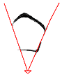 Next, you want to draw in the lower
part of the eye. To help you place the lower half, lightly draw diagonal lines
pointing down, starting at the edges of the top part of the eye. The steepness
of the slope of these lines will determine how large and wide the eye will be.
If you look at the other tutorials on this page, you will see that the
steepness of these lines varies. Using these lines as a guide, draw the lower
part of the eye. It should slope down to the right a little, and should be
thicker at the right corner.
Next, you want to draw in the lower
part of the eye. To help you place the lower half, lightly draw diagonal lines
pointing down, starting at the edges of the top part of the eye. The steepness
of the slope of these lines will determine how large and wide the eye will be.
If you look at the other tutorials on this page, you will see that the
steepness of these lines varies. Using these lines as a guide, draw the lower
part of the eye. It should slope down to the right a little, and should be
thicker at the right corner.  Erase the guidelines and draw a long
oval within the eye. Some characters have large circles for irises, but this
particular one has thin ovals. You can adjust the shape so it's wider, if you
like. Make part of the oval obscured by the upper part of her eye. With all
styles, the complete iris is rarely visible; part of it almost always is
concealed by the border of the eye.
Erase the guidelines and draw a long
oval within the eye. Some characters have large circles for irises, but this
particular one has thin ovals. You can adjust the shape so it's wider, if you
like. Make part of the oval obscured by the upper part of her eye. With all
styles, the complete iris is rarely visible; part of it almost always is
concealed by the border of the eye.  Next, draw the outline of the light
glares. Anime characters' eyes should always have at least some sort of
shading. Anime females in particular tend to have really heavy shading and lots
of shiny areas. Make sure you choose a light source, and stick with it
throughout your picture. For example, since the light is coming from the left
in this picture, I have to make sure all the highlights on the rest of the picture
originate from the left, or the lighting will be inconsistent (unless I'm using
multiple light sources, but I won't get into that). Draw two long ovals: a
large one on the left side of the iris (which overlaps the outline of the iris,
as you can see), and a very small one on the other side of the eye.
Next, draw the outline of the light
glares. Anime characters' eyes should always have at least some sort of
shading. Anime females in particular tend to have really heavy shading and lots
of shiny areas. Make sure you choose a light source, and stick with it
throughout your picture. For example, since the light is coming from the left
in this picture, I have to make sure all the highlights on the rest of the picture
originate from the left, or the lighting will be inconsistent (unless I'm using
multiple light sources, but I won't get into that). Draw two long ovals: a
large one on the left side of the iris (which overlaps the outline of the iris,
as you can see), and a very small one on the other side of the eye.  Next, draw the pupil underneath the
light glares. The highlights are always on top; never draw the pupil on top of
the light glares. Draw the eyelashes, too; with this particular eye, the
eyelashes are a series of spikes coming off of the top-right part of the eye.
Make the spikes follow the curve of the eye, so it looks like they are coming
off of the eye; don't just draw zig-zag lines sticking out of her eye. ^_~ Also, draw the eyelid on the left part of the eye. Its just a thin, curved line originating from the top of her
eye.
Next, draw the pupil underneath the
light glares. The highlights are always on top; never draw the pupil on top of
the light glares. Draw the eyelashes, too; with this particular eye, the
eyelashes are a series of spikes coming off of the top-right part of the eye.
Make the spikes follow the curve of the eye, so it looks like they are coming
off of the eye; don't just draw zig-zag lines sticking out of her eye. ^_~ Also, draw the eyelid on the left part of the eye. Its just a thin, curved line originating from the top of her
eye.  Set Layer 1 to 'Preserve
Transparency' by checking the box on the Layers menu, as shown at the
left. This allows you to paint on top of the existing lines without coloring
over them and messing them up. Its a very handy
feature. :) Select a big paintbrush and paint over the entire picture with pure
black. The outline should be back to its former darkened self. :)
Set Layer 1 to 'Preserve
Transparency' by checking the box on the Layers menu, as shown at the
left. This allows you to paint on top of the existing lines without coloring
over them and messing them up. Its a very handy
feature. :) Select a big paintbrush and paint over the entire picture with pure
black. The outline should be back to its former darkened self. :)  Okay, now we are going to draw
another style, one that isn't as common. This eye is much more slender,
elegant, and realistic looking, and is used in more serious anime and manga.
This particular eye belongs to Deedlit from Record of Lodoss War, which is a
considerably more serious show than Slayers (which is where the previous eye
came from). Begin by drawing a long, slightly curved line. The left side should
be lower than the right, and the line should curve in sharply at the left edge.
Okay, now we are going to draw
another style, one that isn't as common. This eye is much more slender,
elegant, and realistic looking, and is used in more serious anime and manga.
This particular eye belongs to Deedlit from Record of Lodoss War, which is a
considerably more serious show than Slayers (which is where the previous eye
came from). Begin by drawing a long, slightly curved line. The left side should
be lower than the right, and the line should curve in sharply at the left edge. 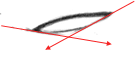 To help you define the sides and
bottom of the eye, lightly draw two diagonal guidelines that originate from the
edges of the eye. Unlike the previous tutorial, these lines are not very steep;
the more horizontal the lines are, the smaller the eye
will be. Don't make them too flat, though, because you don't want this eye to
be too squinty. Using the guidelines, draw the bottom line of the eye.
To help you define the sides and
bottom of the eye, lightly draw two diagonal guidelines that originate from the
edges of the eye. Unlike the previous tutorial, these lines are not very steep;
the more horizontal the lines are, the smaller the eye
will be. Don't make them too flat, though, because you don't want this eye to
be too squinty. Using the guidelines, draw the bottom line of the eye. ![]() Erase the guidelines and draw the
outline of the iris. If there were no eyelids, the iris would be a perfect
circle. However, since the iris is bordered by the eyelids, the top and bottom
of the iris will be hidden from view. The iris should not be so small that you
can see the entire thing (unless you wanted to convey certain emotions like
anger or surprise, but that is covered in another section).
Erase the guidelines and draw the
outline of the iris. If there were no eyelids, the iris would be a perfect
circle. However, since the iris is bordered by the eyelids, the top and bottom
of the iris will be hidden from view. The iris should not be so small that you
can see the entire thing (unless you wanted to convey certain emotions like
anger or surprise, but that is covered in another section). ![]() Next, draw the light glares on the
iris. The placement is the same as in the previous tutorial, but like the iris
itself, the glares are much smaller and more circular. Draw the eyelid above
the top line of the eye, as well.
Next, draw the light glares on the
iris. The placement is the same as in the previous tutorial, but like the iris
itself, the glares are much smaller and more circular. Draw the eyelid above
the top line of the eye, as well. 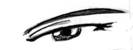 Draw the eyebrow and shading in the
rest of the iris. Remember to draw the pupil beneath the light glares, and to
make it stand out from the rest of the eye a little no matter how darkly you
shade the rest of the iris.Here are a variety of other styles of female eyes
you
Draw the eyebrow and shading in the
rest of the iris. Remember to draw the pupil beneath the light glares, and to
make it stand out from the rest of the eye a little no matter how darkly you
shade the rest of the iris.Here are a variety of other styles of female eyes
you 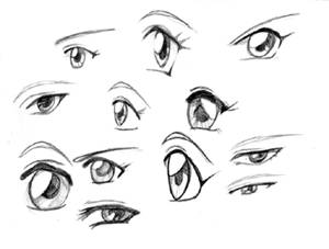 can make using the same methods. Try
to see the differences between each style, as well as the similarities. Though
the shape and proportions change, the top border of the eyes is always thicker,
there are always multiple layers of shading on the irises, etc. Some of these
were sketched fairly quickly and are a little messy, but I hope they are still
helpful. ^.^;
can make using the same methods. Try
to see the differences between each style, as well as the similarities. Though
the shape and proportions change, the top border of the eyes is always thicker,
there are always multiple layers of shading on the irises, etc. Some of these
were sketched fairly quickly and are a little messy, but I hope they are still
helpful. ^.^; 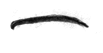 Male Eyes Next we will draw some male eyes. Male characters are
sometimes neglected by fan artists, because many fan artists have trouble
drawing guys. They really aren't that hard, though, just different. Most male
eyes are more thin and narrow than female eyes, though there are several
exceptions. This particular eye (which I think belongs to Hotohori from Fushigi
Yuugi) is narrower than other female eyes, without being so thin that it looks
like it belongs to a more shady, suspicious character.
^_^ Begin by drawing a thick, very slightly curved line.
Its almost horizontal, but still has a slight curve to
it. The edges should curve inwards a little, more so on the left.
Male Eyes Next we will draw some male eyes. Male characters are
sometimes neglected by fan artists, because many fan artists have trouble
drawing guys. They really aren't that hard, though, just different. Most male
eyes are more thin and narrow than female eyes, though there are several
exceptions. This particular eye (which I think belongs to Hotohori from Fushigi
Yuugi) is narrower than other female eyes, without being so thin that it looks
like it belongs to a more shady, suspicious character.
^_^ Begin by drawing a thick, very slightly curved line.
Its almost horizontal, but still has a slight curve to
it. The edges should curve inwards a little, more so on the left. 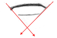 Lightly draw two diagonal lines,
starting from the edges of the top line, to help define the lower part of the
eye. The lines are almost perpendicular to each other. Don't make them too
steep or too flat, or the size of the eye will be off. Draw the lower line of
the eye, using the guidelines to help you position it.
Lightly draw two diagonal lines,
starting from the edges of the top line, to help define the lower part of the
eye. The lines are almost perpendicular to each other. Don't make them too
steep or too flat, or the size of the eye will be off. Draw the lower line of
the eye, using the guidelines to help you position it. ![]() Erase the guidelines and draw the
iris. The iris is a perfect circle, but is paritally covered up by the eyelids.
Do not draw the iris so small that you can see the entire thing (unless trying
to convey a strong emotion like surprise or anger, which is covered in the expressions section).
Erase the guidelines and draw the
iris. The iris is a perfect circle, but is paritally covered up by the eyelids.
Do not draw the iris so small that you can see the entire thing (unless trying
to convey a strong emotion like surprise or anger, which is covered in the expressions section). ![]() Male characters have light glares in
their eyes, too, though they often are not as large or obvious. Draw one oval
light glare on the left side of the eye, and a pointed one on the right side.
Male characters have light glares in
their eyes, too, though they often are not as large or obvious. Draw one oval
light glare on the left side of the eye, and a pointed one on the right side. 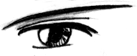 Draw the pupil benath the light
glares and shade heavily, especailly if the character has darker colored eyes.
Draw the eyelid and eyelash. Male characters tend to have darker, thicker
eyebrows, so make sure they aren't too thin. There, that wasn't too hard, was
it? ^_^ Don't worry if the eyes look too 'girly';
often times its hard to tell if some eyes belong male or female characters.
Some styles of eyes are interchangable and can be used for either gender.
Draw the pupil benath the light
glares and shade heavily, especailly if the character has darker colored eyes.
Draw the eyelid and eyelash. Male characters tend to have darker, thicker
eyebrows, so make sure they aren't too thin. There, that wasn't too hard, was
it? ^_^ Don't worry if the eyes look too 'girly';
often times its hard to tell if some eyes belong male or female characters.
Some styles of eyes are interchangable and can be used for either gender.  Slender, narrow eyes are often (but
not always) associated with darker, brooding characters. Villains often have
narrower eyes, but not all characters with such eyes are antagonistic. To draw
this style of eye, start with a long, curved line. Notice that the curve is
steeper on the left hand side than the right.
Slender, narrow eyes are often (but
not always) associated with darker, brooding characters. Villains often have
narrower eyes, but not all characters with such eyes are antagonistic. To draw
this style of eye, start with a long, curved line. Notice that the curve is
steeper on the left hand side than the right.  Next, draw two diagonal guidelines from the edges of
the top of the eye. The angle of these lines are different from the ones in the
three previous tutorials; the left one is much flatter than the the right. Draw
in the lower part of the eye using the guidelines; it should be curved, rather
than a straight line, so that the entire eye is like an elongated, pointy oval.
Next, draw two diagonal guidelines from the edges of
the top of the eye. The angle of these lines are different from the ones in the
three previous tutorials; the left one is much flatter than the the right. Draw
in the lower part of the eye using the guidelines; it should be curved, rather
than a straight line, so that the entire eye is like an elongated, pointy oval. ![]() Erase the guidelines and draw the
iris. The iris is covered up by the upper eyelid; if the eyelids weren't there,
the iris would be a perfect circle. Thicken the lines on the right side of the
eye.
Erase the guidelines and draw the
iris. The iris is covered up by the upper eyelid; if the eyelids weren't there,
the iris would be a perfect circle. Thicken the lines on the right side of the
eye. ![]() Draw in the light glares, as well as
the upper eyelid on top of the eye.
Draw in the light glares, as well as
the upper eyelid on top of the eye. 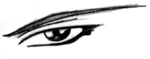 Finish up the eye by adding the
pupil and shading the iris, and adding the eyebrow. Smooth and darken your
lines, and you're done. ^_^
Finish up the eye by adding the
pupil and shading the iris, and adding the eyebrow. Smooth and darken your
lines, and you're done. ^_^  Here is a collection of male eyes.
Notice that some could be mistaken for female eyes; the difference between the
two genders isn't always that distinct, especially in young children. Most of
the eyes here are narrower than the female eyes, and the tops of their eyes
aren't as thick. Male characters don't always have light glares on their eyes,
but I tend to draw them in anyway. ;)
Here is a collection of male eyes.
Notice that some could be mistaken for female eyes; the difference between the
two genders isn't always that distinct, especially in young children. Most of
the eyes here are narrower than the female eyes, and the tops of their eyes
aren't as thick. Male characters don't always have light glares on their eyes,
but I tend to draw them in anyway. ;) 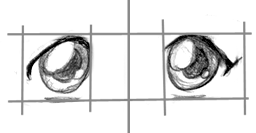 Once you have the right eye drawn,
you're probably going to want to draw the left eye, too. ^_^ All you have to do
is draw the mirror image of the exact same eye. The placement of the second eye
can be tricky, though. Anime eyes, no matter what style, are always drawn about
one eye length apart. The distance may be a little more or less, but one eye
length is a good measurement.
Once you have the right eye drawn,
you're probably going to want to draw the left eye, too. ^_^ All you have to do
is draw the mirror image of the exact same eye. The placement of the second eye
can be tricky, though. Anime eyes, no matter what style, are always drawn about
one eye length apart. The distance may be a little more or less, but one eye
length is a good measurement. 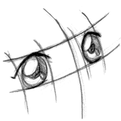 You probably are not always going to
draw your characters facing towards you, though, so you'll need to know how to
line up eyes at different angles. On the head
portion of this general face tutorial, you will see that I use curved
guidelines to define where I'm going to place the eyes. Always draw guidelines
to help you position the eyes, until you are really good at it and no longer
need them. You don't want the eyes to be off-center. Notice that in this
picture, the right eye is smaller and flatter than the left since it's further
away from you.
You probably are not always going to
draw your characters facing towards you, though, so you'll need to know how to
line up eyes at different angles. On the head
portion of this general face tutorial, you will see that I use curved
guidelines to define where I'm going to place the eyes. Always draw guidelines
to help you position the eyes, until you are really good at it and no longer
need them. You don't want the eyes to be off-center. Notice that in this
picture, the right eye is smaller and flatter than the left since it's further
away from you. 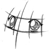 This is pretty much the same thing,
except the head is tilted in the other direction. In this picture, the left eye
is smaller than the right. Both eyes still follow the curve of the face. Eyes
that don't line up properly can look very sloppy, so be careful.
This is pretty much the same thing,
except the head is tilted in the other direction. In this picture, the left eye
is smaller than the right. Both eyes still follow the curve of the face. Eyes
that don't line up properly can look very sloppy, so be careful. 

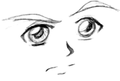
Anime style noses and mouths are
pretty straightforward, so rather than taking you through various styles step
by step, I have several examples for you to use.  Here is your basic anime style nose
and mouth. It consists of three basic simple shapes: a wedge for the nose, a
long, thin line for the mouth, and a shorter line to define the lower lip (this
lower line is not always included, though). In frontal views like this, you can
get away with using very few lines to define the nose and mouth. The size and
shape of each feature varies with each character. Always make sure the features
line up; to help you line them up, draw vertical guidelines as shown. In the
second picture, the face is turned to the side, but the features are still
aligned along the curved guideline that represents the center of the face.
Here is your basic anime style nose
and mouth. It consists of three basic simple shapes: a wedge for the nose, a
long, thin line for the mouth, and a shorter line to define the lower lip (this
lower line is not always included, though). In frontal views like this, you can
get away with using very few lines to define the nose and mouth. The size and
shape of each feature varies with each character. Always make sure the features
line up; to help you line them up, draw vertical guidelines as shown. In the
second picture, the face is turned to the side, but the features are still
aligned along the curved guideline that represents the center of the face. 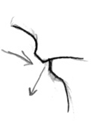 Drawing the nose and mouth for a
profile is more difficult than drawing them from the front or at a 3/4 view.
The main reason for this is because you can't get away with not defining the
lips as much. ^_^ You have to draw them in, rather
than using just simple straight lines. Despite the difficultly, if you get it
right, it can look really nice. The main thing to consider is the curve of the
nose, lips, and chin. The upper lip curves inward, and lower lip (which is
slightly receded on the face) curves outward. It may take some practice before
you can get it to look like the character isn't making a weird face or
puckering their lips or anything like that. ^_~
Drawing the nose and mouth for a
profile is more difficult than drawing them from the front or at a 3/4 view.
The main reason for this is because you can't get away with not defining the
lips as much. ^_^ You have to draw them in, rather
than using just simple straight lines. Despite the difficultly, if you get it
right, it can look really nice. The main thing to consider is the curve of the
nose, lips, and chin. The upper lip curves inward, and lower lip (which is
slightly receded on the face) curves outward. It may take some practice before
you can get it to look like the character isn't making a weird face or
puckering their lips or anything like that. ^_~ 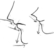 The lower half of
the face consists of a series of contrasting curves. Notice that how in both pictures, the nose curves in towards the face, then
curves back slightly out right above the upper lip. The upper lip curves
inward, and the lower lip curves outward. The chin is not just a straight line;
it is round and curves outward.
The lower half of
the face consists of a series of contrasting curves. Notice that how in both pictures, the nose curves in towards the face, then
curves back slightly out right above the upper lip. The upper lip curves
inward, and the lower lip curves outward. The chin is not just a straight line;
it is round and curves outward.  Here is a selection of examples of
different styles of mouths and noses. Several of these can be used for either
gender, do I didn't bother separating them. ^_^ Notice that with some styles,
the mouth is defined by only a thin, straight line, while with other styles, the lips are more well defined. Anime mouths are not
often very large, unless the character is yelling or shouting, so keep them
relatively small. The noses vary quite a lot, as well; some are drawn as
wedges, some are defined solely with shading, and some are detailed enough that
you can see the nostrils. Female characters will tend to have smaller, less
defined noses, while male characters will often have longer, angular noses.
Here is a selection of examples of
different styles of mouths and noses. Several of these can be used for either
gender, do I didn't bother separating them. ^_^ Notice that with some styles,
the mouth is defined by only a thin, straight line, while with other styles, the lips are more well defined. Anime mouths are not
often very large, unless the character is yelling or shouting, so keep them
relatively small. The noses vary quite a lot, as well; some are drawn as
wedges, some are defined solely with shading, and some are detailed enough that
you can see the nostrils. Female characters will tend to have smaller, less
defined noses, while male characters will often have longer, angular noses. 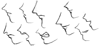 Here are some more examples of noses
and mouths, drawn at a profile. Even though the proportions and expressions
change, they all stick to the same basic shape as mentioned above. When drawing
faces at this angle, be careful not to make the noses really pointy and the
face too flat. Make sure the features curve properly, or the face is not going
to turn out looking right.
Here are some more examples of noses
and mouths, drawn at a profile. Even though the proportions and expressions
change, they all stick to the same basic shape as mentioned above. When drawing
faces at this angle, be careful not to make the noses really pointy and the
face too flat. Make sure the features curve properly, or the face is not going
to turn out looking right. 
In this tutorial, I'm going to show
you how to draw basic anime faces from various angles. Though the faces here
are standard anime female faces, the proportions I show you here can be
adjusted to fit any sort of character you wish to draw. ^_^ 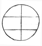 Front View Begin by drawing a large circle. Divide
this circle horizontally into thirds, and cut it in half with a vertical line.
Do not worry if your horizontal lines don't split the face into even pieces;
the proportions will be different depending on the style of face you want to
draw, anyway, so its all right if they aren't exact.
Front View Begin by drawing a large circle. Divide
this circle horizontally into thirds, and cut it in half with a vertical line.
Do not worry if your horizontal lines don't split the face into even pieces;
the proportions will be different depending on the style of face you want to
draw, anyway, so its all right if they aren't exact.  Next, draw a little mark (a short
line, not a dot) directly beneath the circle. In this particular picture, the
distance from the circle to the mark is the same as the length of the lower
third portion of the circle. This mark will represent the chin, so make sure
it's a short line rather than a dot or the chin will be too pointy. Raising or
lowering the chin mark is one way to adjust the shape and appearance of the
face. Next, draw two diagonal guidelines. They should be tangent to the sides
of the circle, and intersect the edges of the chin mark.
Next, draw a little mark (a short
line, not a dot) directly beneath the circle. In this particular picture, the
distance from the circle to the mark is the same as the length of the lower
third portion of the circle. This mark will represent the chin, so make sure
it's a short line rather than a dot or the chin will be too pointy. Raising or
lowering the chin mark is one way to adjust the shape and appearance of the
face. Next, draw two diagonal guidelines. They should be tangent to the sides
of the circle, and intersect the edges of the chin mark. 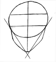 Next, you want to flesh out the face
so it isn't so thin. Draw two rounded triangular shapes on each side of the
face. Adjusting the thickness of the triangles and the height of the cheekbones
(the place where the triangle bends) are ways to alter the shape and appearance
of the face and draw different types of characters.
Next, you want to flesh out the face
so it isn't so thin. Draw two rounded triangular shapes on each side of the
face. Adjusting the thickness of the triangles and the height of the cheekbones
(the place where the triangle bends) are ways to alter the shape and appearance
of the face and draw different types of characters. 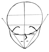 Now that you have the shape of the
face down, you will want to add the eyes, nose and mouth. The placement of the
eyes varies slightly with each character, but they generally should be located
within the lower half of the circle. The nose is about halfway down the lower
part of the face (the area below the circle), and the mouth is drawn directly
beneath that.
Now that you have the shape of the
face down, you will want to add the eyes, nose and mouth. The placement of the
eyes varies slightly with each character, but they generally should be located
within the lower half of the circle. The nose is about halfway down the lower
part of the face (the area below the circle), and the mouth is drawn directly
beneath that. 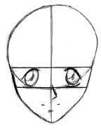 Next, erase those diagonal
guidelines and fill in the detail on the eyes. Now you have the basic shape of
the face completed, and you can add whatever details you like, such as hair,
clothing, jewelry, tattoos, scars, etc.
Next, erase those diagonal
guidelines and fill in the detail on the eyes. Now you have the basic shape of
the face completed, and you can add whatever details you like, such as hair,
clothing, jewelry, tattoos, scars, etc. 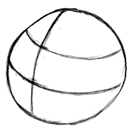 3/4 View Begin with a
large circle, just like you did with the frontal view, except now rotate all
the guidelines up and to the left. This part of the head is a three
dimensional sphere, so when you rotate it in any direction, the guidelines
should follow the curves of the sphere. Divide the face up horizontally into
thirds, and vertically into halves. Of course, because of the angle we are
drawing this circle at, the guidelines are not going to divide the shape into
equal sections, but just remember that if you rotated this shape back to a
front view, it should look the same as in the first step of the tutorial for
the frontal view.
3/4 View Begin with a
large circle, just like you did with the frontal view, except now rotate all
the guidelines up and to the left. This part of the head is a three
dimensional sphere, so when you rotate it in any direction, the guidelines
should follow the curves of the sphere. Divide the face up horizontally into
thirds, and vertically into halves. Of course, because of the angle we are
drawing this circle at, the guidelines are not going to divide the shape into
equal sections, but just remember that if you rotated this shape back to a
front view, it should look the same as in the first step of the tutorial for
the frontal view. 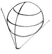 Next, extend the curved vertical
guideline down the sphere, and select a point beneath the sphere to represent
the chin. The distance from the circle to the chin should be a little bit more
than the length of the lower third of the circle. Draw two diagonal guidelines
tangent to the edges of the circle that intersect the chin mark. Make sure the
left guideline is steeper than the right.
Next, extend the curved vertical
guideline down the sphere, and select a point beneath the sphere to represent
the chin. The distance from the circle to the chin should be a little bit more
than the length of the lower third of the circle. Draw two diagonal guidelines
tangent to the edges of the circle that intersect the chin mark. Make sure the
left guideline is steeper than the right. 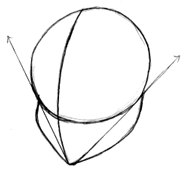 To flesh out the face a little more,
draw round triangles on the sides of each of the diagonal guidelines. The left
side of the face should curve out where it touches the circle, and the curve of
the right side should be more gentle and sloping. It may take some practice to
get this to look right.
To flesh out the face a little more,
draw round triangles on the sides of each of the diagonal guidelines. The left
side of the face should curve out where it touches the circle, and the curve of
the right side should be more gentle and sloping. It may take some practice to
get this to look right. 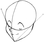 Next, draw the eyes, nose, and
mouth. The eyes are located within the lower half of the circle. For more
information on how the eyes line up at this angle, go to the anime eye
tutorial. All of the features should line up along the central guideline. Do
not let your features become lopsided! It won't look right, trust me. ;) The
nose generally starts right beneath the eyes, and the mouth right beneath the
nose. Notice, though, that the mouth does not extend to the left of the nose;
at this angle, most of it stays on the right side of the curved vertical
guideline.
Next, draw the eyes, nose, and
mouth. The eyes are located within the lower half of the circle. For more
information on how the eyes line up at this angle, go to the anime eye
tutorial. All of the features should line up along the central guideline. Do
not let your features become lopsided! It won't look right, trust me. ;) The
nose generally starts right beneath the eyes, and the mouth right beneath the
nose. Notice, though, that the mouth does not extend to the left of the nose;
at this angle, most of it stays on the right side of the curved vertical
guideline. 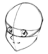 Refine the lines a little more, and
you have completed drawing the basic shape of the head at a 3/4 angle. From
this point, you can add whatever details you like, such as hair, jewelry, etc.
Refine the lines a little more, and
you have completed drawing the basic shape of the head at a 3/4 angle. From
this point, you can add whatever details you like, such as hair, jewelry, etc. 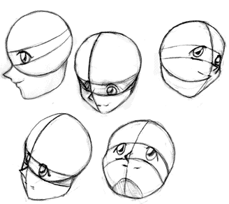 Here are some
more heads, drawn at various angles. With every single one, I started with a
basic circle and added the guidelines as I did in the previous tutorials (for
more info on drawing heads at a profile, such as in the picture at the top
left, check out the nose and mouth
turorial. The proportions for these faces probably aren't perfect, because the
pictures I used as examples had completely different sized features (a lot of
them were guys ^ ).
Here are some
more heads, drawn at various angles. With every single one, I started with a
basic circle and added the guidelines as I did in the previous tutorials (for
more info on drawing heads at a profile, such as in the picture at the top
left, check out the nose and mouth
turorial. The proportions for these faces probably aren't perfect, because the
pictures I used as examples had completely different sized features (a lot of
them were guys ^ ).  Of course, there are many other
types of characters other than simple anime girls ^_^ Here is a very small
sampling of some other proportions you can try out. They all have the same
basic shape, except some of the lines have been lengthened or shortened. In the
top left picture, for example, the lower half of the face is longer and
thinner, the cheeks are more sharply angled, and the eyes are narrower. On the
top right picture, the lower half of the face is much smaller and the eyes are
huge. Male faces tend to be longer and more angular, while female faces tend to
be smaller and more rounded. Childrens faces, either male or female, are very
small and round.
Of course, there are many other
types of characters other than simple anime girls ^_^ Here is a very small
sampling of some other proportions you can try out. They all have the same
basic shape, except some of the lines have been lengthened or shortened. In the
top left picture, for example, the lower half of the face is longer and
thinner, the cheeks are more sharply angled, and the eyes are narrower. On the
top right picture, the lower half of the face is much smaller and the eyes are
huge. Male faces tend to be longer and more angular, while female faces tend to
be smaller and more rounded. Childrens faces, either male or female, are very
small and round. 
Changing the expression of an anime
character isn't particularly difficult, but it helps to know which features
need to be adjusted for each type of emotion. In this tutorial, I will show you
how the various parts of the face work together to convey different emotions.
Once you learn what features to change to achieve the look you want, you should
be able to draw any emotion you like. Please read through my other facial
tutorials, though, since it helps to have a working knowledge of how the
features should be aligned before you begin. 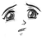 First, we'll start off going over
sadness, a fairly common emotion. This is a trypical anime
face, but notice the changes that have been made. The most obvious
indicator of the character's emotion, in this case, are
the eyebrows. Notice how the inner tips of the eyebrows curve upwards. Also,
her lower eyelids curve upward slightly, while her upper eyelids have a more large, round curve. Curving the lower eyelid can
indicate stress, sorrow, or anger; in this case, the shape of the eyebrows
shows us that it is sorrow. ^_^ Also, notice the shape of the mouth; it is
small, and curves downward. Overall, the character looks like she's about to
burst into tears.
First, we'll start off going over
sadness, a fairly common emotion. This is a trypical anime
face, but notice the changes that have been made. The most obvious
indicator of the character's emotion, in this case, are
the eyebrows. Notice how the inner tips of the eyebrows curve upwards. Also,
her lower eyelids curve upward slightly, while her upper eyelids have a more large, round curve. Curving the lower eyelid can
indicate stress, sorrow, or anger; in this case, the shape of the eyebrows
shows us that it is sorrow. ^_^ Also, notice the shape of the mouth; it is
small, and curves downward. Overall, the character looks like she's about to
burst into tears.  This form of sadness is more
subdued. The character seems depressed, but not as sad as the previous example.
The eyes are smaller here (partly because this is a guy ^_^), and the mouth is
larger and does not curve down so far. The angle of the eyebrows and the arch
of the lower eyelid still let you know that this character is upset about
something.
This form of sadness is more
subdued. The character seems depressed, but not as sad as the previous example.
The eyes are smaller here (partly because this is a guy ^_^), and the mouth is
larger and does not curve down so far. The angle of the eyebrows and the arch
of the lower eyelid still let you know that this character is upset about
something. 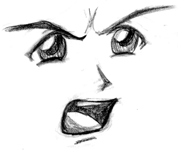 This picture is sort of a transition
between sadness and anger. The eyebrows curve down sharply and his mouth is
drawn so it looks like he is shouting, both of which indicates that he is mad,
yet his irises are still very large. This sort of makes him look like he is
angry, yet hurt or upset at someone or something.
This picture is sort of a transition
between sadness and anger. The eyebrows curve down sharply and his mouth is
drawn so it looks like he is shouting, both of which indicates that he is mad,
yet his irises are still very large. This sort of makes him look like he is
angry, yet hurt or upset at someone or something. 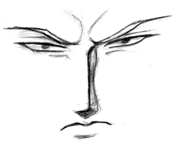 This guy is clearly very ticked off,
even though he isn't shouting. ^_~ You can draw angry
people without them screaming their heads off. In this picture, the eyebrows
are close to the eyes and angle down sharply (I also drew the folds in the skin
caused by drawing ones eyebrows together like that), and the mouth angles
downwards sharply. The eyes have been narrowed, and irises are very small,
which helps to make a character look even more angry.
^_^
This guy is clearly very ticked off,
even though he isn't shouting. ^_~ You can draw angry
people without them screaming their heads off. In this picture, the eyebrows
are close to the eyes and angle down sharply (I also drew the folds in the skin
caused by drawing ones eyebrows together like that), and the mouth angles
downwards sharply. The eyes have been narrowed, and irises are very small,
which helps to make a character look even more angry.
^_^  I'm not sure about this one; he looks
both confused and ticked off. Alternating the angles of the eyebrows like this
indicates confusion or incredulity. To add to the expression, draw the mouth
slightly off-center, as well.
I'm not sure about this one; he looks
both confused and ticked off. Alternating the angles of the eyebrows like this
indicates confusion or incredulity. To add to the expression, draw the mouth
slightly off-center, as well.  Its surprising how often anime
characters talk with their eyes closed ^_^ I wonder how many people actually
talk like that? Anyway, closed eyes can express a variety of emotions. Here,
they express impatience or annoyance, but they can also express calmness,
happiness, or smugness. Flip the eyes around and have them
curve upwards, and they can express extreme sadness, as well as excitement. For
this particular picture, I made the eyebrows angle downwards and drew the mouth
open. Notice how I drew the upper left lip slightly raised; this helps whatever
emotion you are trying to convey seem more negative, whether you are drawing
anger, unhappiness, or impatience. ^_^
Its surprising how often anime
characters talk with their eyes closed ^_^ I wonder how many people actually
talk like that? Anyway, closed eyes can express a variety of emotions. Here,
they express impatience or annoyance, but they can also express calmness,
happiness, or smugness. Flip the eyes around and have them
curve upwards, and they can express extreme sadness, as well as excitement. For
this particular picture, I made the eyebrows angle downwards and drew the mouth
open. Notice how I drew the upper left lip slightly raised; this helps whatever
emotion you are trying to convey seem more negative, whether you are drawing
anger, unhappiness, or impatience. ^_^  Happiness is one of the most common
emotions you see with pictures of anime characters. Excessive happiness or
excitement can be expressed by large eyes, highly arched eyebrows, and a big
smiling mouth. Other features such as extra shinies in the eyes and the upward
curving of the lower eyelid are also common. On a side note, more kawaii
characters tend to have huge eyes, and small noses and mouths (unless their
mouth is open, as in this picture).
Happiness is one of the most common
emotions you see with pictures of anime characters. Excessive happiness or
excitement can be expressed by large eyes, highly arched eyebrows, and a big
smiling mouth. Other features such as extra shinies in the eyes and the upward
curving of the lower eyelid are also common. On a side note, more kawaii
characters tend to have huge eyes, and small noses and mouths (unless their
mouth is open, as in this picture). 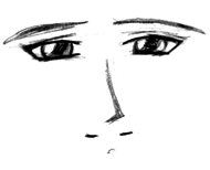 This character is happy, as well,
but not to the extent as in the previous example. The emotion is much more
subtle. Notice that the eyebrows have been lowered (though they still arch
slightly) and the curve of the mouth is very slight. The lower eyelids are
arched, though, and the irises are still pretty large, so though the
characters' contentment is not as obvious, it is still clear he's in a good
mood. ^_^
This character is happy, as well,
but not to the extent as in the previous example. The emotion is much more
subtle. Notice that the eyebrows have been lowered (though they still arch
slightly) and the curve of the mouth is very slight. The lower eyelids are
arched, though, and the irises are still pretty large, so though the
characters' contentment is not as obvious, it is still clear he's in a good
mood. ^_^ 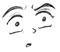 To express
surprise or shock, enlarge the eyes and make the pupils smaller. This is
particularly apparent in anime face faults, when a character is so suprised
that his/her eyes become almost as large as the rest of the face ^_^ In this particular example, the mouth is drawn really small,
but other sizes will work too.
To express
surprise or shock, enlarge the eyes and make the pupils smaller. This is
particularly apparent in anime face faults, when a character is so suprised
that his/her eyes become almost as large as the rest of the face ^_^ In this particular example, the mouth is drawn really small,
but other sizes will work too. 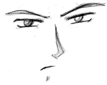 This guy isn't particularly
exciting, he just looks irritated. The irises are small, the eyebrows are
arched down, and the mouth is small and slightly off center. I can't think of
much else to say for this one ^_^
This guy isn't particularly
exciting, he just looks irritated. The irises are small, the eyebrows are
arched down, and the mouth is small and slightly off center. I can't think of
much else to say for this one ^_^ 
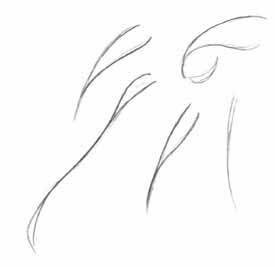 Depending on the style, anime hair can be very
complex. However, if you break it down into its basic components, the process
of drawing anime hair becomes a little simpler. Like real hair, anime hair is composed of many
strands. However, rather than drawing each individual strand, the hair is often
drawn in various sized/shaped clumps, as shown here. These are some of the
simplest forms of each hair style. Notice that in most cases, the outline is more curvy on the bottom of the hair clump. This is
especially apparent on the top leftmost example; the lower line is curvier than
the top line, giving the hair more depth and more of that anime-ish look. Sometimes this is highly exaggerated, and other times
it is hardly noticable, but for most anime hair styles, each individual strand
of hair will have this basic shape.
Depending on the style, anime hair can be very
complex. However, if you break it down into its basic components, the process
of drawing anime hair becomes a little simpler. Like real hair, anime hair is composed of many
strands. However, rather than drawing each individual strand, the hair is often
drawn in various sized/shaped clumps, as shown here. These are some of the
simplest forms of each hair style. Notice that in most cases, the outline is more curvy on the bottom of the hair clump. This is
especially apparent on the top leftmost example; the lower line is curvier than
the top line, giving the hair more depth and more of that anime-ish look. Sometimes this is highly exaggerated, and other times
it is hardly noticable, but for most anime hair styles, each individual strand
of hair will have this basic shape. 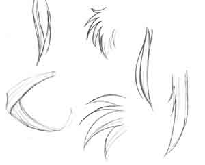 Once you know how to draw each strand/clump of hair,
you can start putting them together to form more something that more resembles
anime hair. Look at each example here (well, exept maybe for that one on the
lower left; I'm not sure why I left that in), and notice how the basic strands
from the first step are used. The same similar shapes generally persist
throughout many different hairstyles. Making one line curve out more than the
other on each strand can really help to flesh it out. Another thing to keep in mind is that you can make the
hair as detailed as you like; just keep adding more strands. I'll go over this
more shortly. ^_^
Once you know how to draw each strand/clump of hair,
you can start putting them together to form more something that more resembles
anime hair. Look at each example here (well, exept maybe for that one on the
lower left; I'm not sure why I left that in), and notice how the basic strands
from the first step are used. The same similar shapes generally persist
throughout many different hairstyles. Making one line curve out more than the
other on each strand can really help to flesh it out. Another thing to keep in mind is that you can make the
hair as detailed as you like; just keep adding more strands. I'll go over this
more shortly. ^_^ 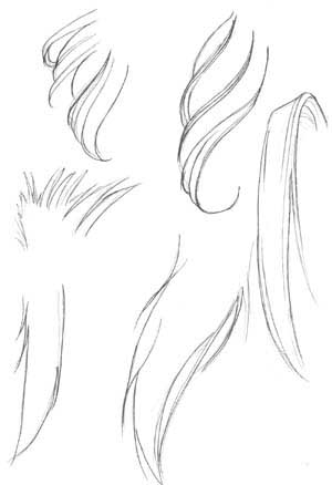 Now, we are getting into some slightly more complex
shapes. Notice how varying the size and shape of each strand gives the hair
different character; the strands can be long and thin, thick and curvy, or
sharp and spiky. Again, notice that you can either make the hair very detailed,
or very simple, depending on how many individual strands you draw.
Now, we are getting into some slightly more complex
shapes. Notice how varying the size and shape of each strand gives the hair
different character; the strands can be long and thin, thick and curvy, or
sharp and spiky. Again, notice that you can either make the hair very detailed,
or very simple, depending on how many individual strands you draw. 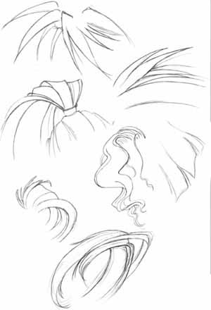 Here are more examples of different basic shapes of
hair. Take note of how the hair overlaps and is nested in itself
when it bends or twists. You can make some really interesting hair by having it
twist and turn all over the page. ^_^
Here are more examples of different basic shapes of
hair. Take note of how the hair overlaps and is nested in itself
when it bends or twists. You can make some really interesting hair by having it
twist and turn all over the page. ^_^
 The most important thing to consider
whenever you are drawing clothing or any type of fabric is the direction the
fabric is going to be pulled in. Folds are caused wherever the fabric is being
stretched or pulled; figure out how exactly you want the fabric to move, and
the rest is pretty easy. Always remember to consider the figure beneath the
clothing; the cloth should reveal the shape of the figure beneath. I'll go into
more detail on this later. At the left are some examples of basic types of folds.
Notice the movement of each example shown; the fabric flows downward on the top
left two, for they are being pulled down by gravity. This type of fold would be
on something that hangs loosely, such as a cape or long shirt. On the lower
left and upper right examples, the fabric is not only pulled by gravity, but
stretched to the left (probably by an arm that is underneath the clothing). The
folds become more horizontal than vertical the further it is stretched. Also
notice how sometimes the folds are nested within one another. This will often
occur at joints or areas in which loose clothing is bunched up. The lower right
picture is a slightly more complex example of a more inert piece of cloth being
pulled in a viarety of directions. Notice how the folds follow the direction
that the cloth is being pulled in.
The most important thing to consider
whenever you are drawing clothing or any type of fabric is the direction the
fabric is going to be pulled in. Folds are caused wherever the fabric is being
stretched or pulled; figure out how exactly you want the fabric to move, and
the rest is pretty easy. Always remember to consider the figure beneath the
clothing; the cloth should reveal the shape of the figure beneath. I'll go into
more detail on this later. At the left are some examples of basic types of folds.
Notice the movement of each example shown; the fabric flows downward on the top
left two, for they are being pulled down by gravity. This type of fold would be
on something that hangs loosely, such as a cape or long shirt. On the lower
left and upper right examples, the fabric is not only pulled by gravity, but
stretched to the left (probably by an arm that is underneath the clothing). The
folds become more horizontal than vertical the further it is stretched. Also
notice how sometimes the folds are nested within one another. This will often
occur at joints or areas in which loose clothing is bunched up. The lower right
picture is a slightly more complex example of a more inert piece of cloth being
pulled in a viarety of directions. Notice how the folds follow the direction
that the cloth is being pulled in.  Here are a few more examples of basic fold shapes. On
the left, the cloth is being pulled downwards by gravity and to the right by
wind or motion. One the left, the long strip of cloth is bunched up near the
top. Remember to use shading to give your subjects more form. Generally, you
shade along a fold line, or on any places that you think a shadow would be
cast. This takes some getting used to. It helps to look at actual folds
sometimes to see where to shade. Sometimes, I'll sketch the drapes or a towel
hung over a chair just to practice and get a better feel for how clothing is
shaded.
Here are a few more examples of basic fold shapes. On
the left, the cloth is being pulled downwards by gravity and to the right by
wind or motion. One the left, the long strip of cloth is bunched up near the
top. Remember to use shading to give your subjects more form. Generally, you
shade along a fold line, or on any places that you think a shadow would be
cast. This takes some getting used to. It helps to look at actual folds
sometimes to see where to shade. Sometimes, I'll sketch the drapes or a towel
hung over a chair just to practice and get a better feel for how clothing is
shaded.  Here are a few more random examples, of a bow and some
sleeves. The most important thing to note here is the shape of the folds at the
joint of the sleeve in the middle.
Here are a few more random examples, of a bow and some
sleeves. The most important thing to note here is the shape of the folds at the
joint of the sleeve in the middle. 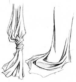 These are some more complex, overlapping and nested
folds. The more detail you put into it the folds, the more interesting it will
look. On the left, notice how the fabric bunches up where it is tied together;
the weight of the fabric pulls it down and causes extra creases and folds to
form where it is gathered together. The tie itself is drawn with lots of
detail, and the cloth beneath it blows loosely in the wind. The fabric is
shaded around the folds and in the crevasses formed by the cloth. On the
picture to the right, a length of fabric is draped upon the floor; notice how
the folds nest in one another and overlap, creating an interesting effect.
These are some more complex, overlapping and nested
folds. The more detail you put into it the folds, the more interesting it will
look. On the left, notice how the fabric bunches up where it is tied together;
the weight of the fabric pulls it down and causes extra creases and folds to
form where it is gathered together. The tie itself is drawn with lots of
detail, and the cloth beneath it blows loosely in the wind. The fabric is
shaded around the folds and in the crevasses formed by the cloth. On the
picture to the right, a length of fabric is draped upon the floor; notice how
the folds nest in one another and overlap, creating an interesting effect. 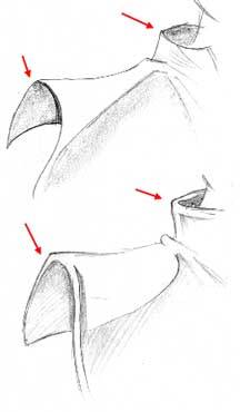 Another thing I want to point out is the thickness of
the fabric in question. The fabric on the top example appears thinner than the
fabric in the lower example. Take note of both collars. On the top, the
circular rim of the collar connects directly to the rest of the collar, while
on the bottom, there is a space between the circular
rim and the vertical part. The same applies to the edges of the cape. While on
the top example, the edge is crisp and thin, on the bottom example there is
extra space between the rim and the rest of the cape. This extra space makes
the clothing look more thick and heavy.
Another thing I want to point out is the thickness of
the fabric in question. The fabric on the top example appears thinner than the
fabric in the lower example. Take note of both collars. On the top, the
circular rim of the collar connects directly to the rest of the collar, while
on the bottom, there is a space between the circular
rim and the vertical part. The same applies to the edges of the cape. While on
the top example, the edge is crisp and thin, on the bottom example there is
extra space between the rim and the rest of the cape. This extra space makes
the clothing look more thick and heavy. 
|
Politica de confidentialitate | Termeni si conditii de utilizare |

Vizualizari: 4077
Importanta: ![]()
Termeni si conditii de utilizare | Contact
© SCRIGROUP 2025 . All rights reserved