| CATEGORII DOCUMENTE |
GRAPHING WITH POWERPOINT
While you may think of Powerpoint as a tool for making presentations, it can be used to create graphs as well. The following are instructions for creating the graph that appears below:
Begin by opening Powerpoint. Then choose 'Create a new presentation using Blank Presentation. In the New Slide dialog box, you can choose the default AutoLayout.
Select the graphing icon from the standard toolbar.
A prototype graph and spreadsheet will appear. You will find that there are many similarities between Excel and Powerpoint.
To create the graph, begin by editing the spreadsheet. Enter the labels for the five bars in the first row of the spreadsheet beginning with Column A for 'Strongly Agree.'
In the next row, enter the percentages for the five bars beginning with 16.0 in Column A (the five values are 16.0, 54.3, 21.8 7.4 and 0.5 for Strongly Agree, Agree, Unsure, Disagree and Strongly Disagree, respectively). Delete the data in the remaining cells (the initial data in rows three and four inserted by Powerpoint for the prototype graph).
Notice that the value 16.0 does not show the decimal. You must highlight the cell containing 16.0 and click on FORMAT T NUMBER. Click on the Category 'Number' and change the number of decimal places to one. Then click on 'OK.'
You are now ready to edit the graph itself. Move the spreadsheet out of the way so that you can see the entire graph.
Right click on the legend and select "clear" to remove the legend from the graph.
To change from a 3-D bar to a flat bar, first click on one of the bars in the graph. Next, click on the CHART pulldown menu. Next, click on CHART TYPE and choose the first selection, Column, and then click on 'OK.'
Next, we will change the font and font size for the bar labels and for the vertical axis (Y). Double click on one of the bar labels. A Format Axis dialog box will open. Click on Font and choose Arial and font size 12. Then click on 'OK.' Next, click on one of the numbers in the vertical (Y) axis (e.g., 40.0). A Format Axis dialog box will open. Again change the font to Arial and change the font size to 14. Remove the decimal place: double click on the percentages on the Y axis, click on NUMBER, and change the decimals places to zero (0).
To add the values within each bar, double click on one of the bars. The Format Data Series dialog box will open. Click on Data Labels. Then choose 'show value' and click on 'OK.'
To be consistent, we will change the font and font size of the values appearing above each bar. Double click on one of the values. The Format Data Labels dialog box will open. Again, select Arial and set the font size to 12.
The individual bars are too narrow. To widen the bars, double click on one. Format Data Series dialog box will open. Click on Options. Change the "Overlap" to 100 and the 'gap width' to 60. Click on 'OK.'
To remove the horizontal gridlines, click on CHART T CHART OPTIONS. Click on 'gridlines' and remove the Y axis major gridlines (click to remove the checkmark).
The last step is to move the data labels into the bars. Before doing this, we want to set the labels against a white background. Double click on one of the values (e.g., 54.3). Under 'patterns', click on 'shadow.' Click on 'OK.' Next, one-by-one, slide the data labels into the bars.
Create a title above the graph. Click on the "text box" icon on the toolbar near the bottom of the screen (Note: If you chose a presentation format that already has a text box for the title, ignore this step.) Create a text box above the graph. Type in the title. Change the font and size to Arial 18. Alternatively, a title can be created in Word.
Double click on one of the bars and change the color of the bars to red.
You are now ready to copy and paste the graph into a document.
Use Chart Type (under the Chart pulldown menu) to work with other types of graphs.
Media
focus too much attention on the
"horse race" in presidential campaigns 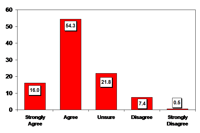
Exercise 11
Create two graphs. Each graph should portray a different variable or variables. Each graph should use a different program (SPSSWIN, Excel, or Powerpoint). Edit the graphs to make them "report ready." Be sure they have titles and are self-explanatory. Also, note somewhere on the page which program was used to create the graph.
E-mail the graphs as an attachment to your instructor. Be sure 'Exercise 11' appears in the subject line of the email.
|
Politica de confidentialitate | Termeni si conditii de utilizare |

Vizualizari: 1445
Importanta: ![]()
Termeni si conditii de utilizare | Contact
© SCRIGROUP 2025 . All rights reserved