| CATEGORII DOCUMENTE |
| Asp | Autocad | C | Dot net | Excel | Fox pro | Html | Java |
| Linux | Mathcad | Photoshop | Php | Sql | Visual studio | Windows | Xml |
Using Type
About type
Type consists of mathematically defined shapes that describe the letters, numbers, and symbols of a typeface. Many typefaces are available in more than one format, the most common formats being Type 1 (also called PostScript fonts), TrueType, OpenType, and CID
(Japanese only).
When you add type to an image, the characters are composed of pixels and have the same resolution as the image file-zooming in on characters shows jagged edges. However, Photoshop and ImageReady preserve the vector-based type outlines and use them when you scale or resize type, save a PDF or EPS file, or print the image to a PostScript printer.
As a result, it's possible to produce type with crisp, resolution-independent edges.
Creating type
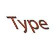
You can create horizontal or vertical type anywhere in an image. Depending on how you use the type tools, you can enter point type or paragraph type. Point type is useful for entering a single word or a line of characters; paragraph type is useful for entering and formatting the type as one or more paragraphs.

Type entered as point type (top) and in a bounding box
When you create type, a new type layer is added to the Layers palette. In Photoshop, you can also create a selection border in the shape of the type.
Note: In Photoshop, a type layer is not created for images in Multichannel, Bitmap, or Indexed Color mode, because these modes do not support layers. In these image modes, type appears on the background.
About using the type tools (Photoshop)
Clicking in an image with a type tool puts the type tool
in edit mode. You can enter and edit characters when the tool is in edit mode; however,
you must commit changes to the
type layer before you can perform some operations. To determine
if a type tool is in edit mode,
look in the options bar-if you see
the Commit button ![]() and Cancel button
and Cancel button
![]() , the type tool is in edit mode.
, the type tool is in edit mode.
To commit changes to a type layer:
Do one of the following:
. Click the Commit button ![]() in the options bar.
in the options bar.
. Press the Enter key on the numeric keypad.
. Press Ctrl+Enter on the main keyboard ( Windows) or Command+Return (Mac OS).
. Select any tool in the toolbox, click in the Layers, Channels, Paths, Actions, History, or Styles palette, or select any available menu command.
Entering point type
When you enter point type, each line of type is independent-the length of a line grows or shrinks as you edit it, but it doesn't wrap to the next line. The type you entered appears in a new type layer.
To enter point type:
1 Do one of the following:
. (Photoshop) Select the horizontal type tool ![]() or the vertical type tool
or the vertical type tool ![]() .
.
.
(ImageReady) Select the type tool ![]() .
.
2 Click in the image to set an insertion point for the type. The small line through the
I-beam marks the position of the type baseline. For horizontal type, the baseline marks the line on which the type rests; for vertical type, the baseline marks the center axis of the type characters.
To show the baseline in ImageReady, choose View > Show > Text Baseline.
3 Select additional type options in the options bar, Character palette, and Paragraph palette. (See "Formatting characters" on section 349 and "Formatting paragraphs" on section 358.)
4 Enter the characters you want. Press Enter on the main keyboard ( Windows) or Return
(Mac OS) to begin a new line.
5 Commit the type layer. (See "About using the type tools (Photoshop)" on section 343.)
Entering paragraph type
When you enter paragraph type, the lines of type wrap to fit the dimensions of the bounding box. You can enter multiple paragraphs and select a paragraph justification option.
You can resize the bounding box, which causes the type to reflow within the adjusted rectangle. You can adjust the bounding box while you're entering type or after you create the type layer. You can also rotate, scale, and skew type using the bounding box.
To enter paragraph type:
1 Do one of the following:
. (Photoshop) Select the horizontal type tool ![]() or the vertical type tool
or the vertical type tool ![]() .
.
.
(ImageReady) Select the type tool ![]() .
.
2 Do one of the following:
. Drag diagonally to define a bounding box for the type.
. Hold down Alt ( Windows) or Option (Mac OS) as you click or drag to display the Text Box
Size dialog box. Enter values for Width and Height, and click OK.
3 Select additional type options in the options bar, Character palette, Paragraph palette, and Layer > Type submenu. (See "Formatting characters" on section 349 and "Formatting paragraphs" on section 358.)
4 Enter the characters you want. Press Enter on the main keyboard ( Windows) or Return
(Mac OS) to begin
a new paragraph. If you enter
more type than can fit in the
bounding box, the overflow icon appears on the bounding box.
![]()
5 (Photoshop) If desired, resize, rotate, or skew the bounding box.
6 (Photoshop) Commit the type layer. (See "About using the type tools (Photoshop)" on section 343.)
The type you entered appears in a new type layer.
To resize or transform a type bounding box:
1 Display the bounding box handles:
. (Photoshop) With the type tool active, select the type layer in the Layers palette, and click in the text flow in the image.
. (ImageReady) With the type tool active, select the type layer. If the bounding box handles don't appear, make sure that the Text Bounds option is selected in the View > Show submenu.
2 Drag to achieve the desired effect:
. To resize
the bounding box, position the pointer over a handle-the
pointer turns into a double arrow ![]() -and drag. Shift-drag
to maintain the proportion of the bounding box.
-and drag. Shift-drag
to maintain the proportion of the bounding box.
. (Photoshop) To rotate the bounding box, position the pointer outside of the bounding border-the pointer turns into a curved, two-sided
arrow ![]() -and drag. Shift-drag
-and drag. Shift-drag
to constrain the rotation to 15 increments. To change the center of rotation,
Ctrl-drag ( Windows) or Command-drag (Mac OS) the center point to a new location. The center point can be outside the bounding box.
.
(Photoshop) To
skew the bounding box, hold down
Ctrl+Shift ( Windows) or Command+Shift
(Mac OS) and drag a side handle. The pointer
turns into an arrowhead with a small double arrow
![]() .
.
Illustration of skewing type using the bounding box
. (Photoshop) To scale the type as you resize the bounding box, Ctrl-drag ( Windows) or
Command-drag (Mac OS) a corner handle.
Note: You can also transform type layers using the transformation commands in the Edit menu, except for Perspective and Distort.
To show or hide the type bounding box (ImageReady):
Do one of the following:
. Choose View > Show > Text Bounds.
. Choose View > Extras. This command shows or hides all selected items in the View > Show submenu. (See "Working with Extras" on section 47.)
Creating a type selection border (Photoshop)
When you use the horizontal type mask tool ![]() or vertical
type mask tool
or vertical
type mask tool ![]() , you create a
selection in the shape of the type. Type
selections appear on the active layer, and can be moved, copied,
filled, or stroked just like
any other selection.
, you create a
selection in the shape of the type. Type
selections appear on the active layer, and can be moved, copied,
filled, or stroked just like
any other selection.
To create a type selection border:
1 Select the layer on which you want the selection to appear. For best results, create the type selection border on a normal image layer, not a type layer.
2 Select the
horizontal type mask tool ![]() or the vertical type mask tool
or the vertical type mask tool
![]() .
.
3 Select additional type options, and enter type at a point or in a bounding box.
(See "Entering point type" on section 343 and "Entering paragraph type" on section 343.) The type selection border appears in the image on the active layer.
Working with type layers
Once you create a type layer, you can edit the type and apply layer commands to it. You can change the orientation of the type, apply anti-aliasing, convert between point type and paragraph type, create a work path from type, or convert type to shapes. You can move, restack, copy, and change the layer options of a type layer as you do for a normal layer. You can also make the following changes to a type layer and still edit the type:
. Apply transformation commands from the Edit menu, except for Perspective and Distort. ( To apply the Perspective or Distort commands, or to transform part of the type layer, you must rasterize the type layer, making the type uneditable.)
. Use layer styles.
. Use fill shortcuts. To fill with the foreground color, press Alt+Backspace ( Windows) or
Option+Delete (Mac OS); to fill with the background color, press Ctrl+Backspace
(Windows) or Command+Delete (Mac OS).
. Warp type to conform to a variety of shapes.
Editing text in type layers
You can insert new text, change existing text, and delete text in type layers.
To edit text in a type layer:
1 Select the
horizontal type tool ![]() or the vertical type tool
or the vertical type tool ![]() .
.
2 Select the type layer in the Layers palette, or click in the text flow to automatically select a type layer.
3 Position the insertion point in the text, and do one of the following:
. Click to set the insertion point.
. Select one or more characters you want to edit.
4 Enter text as desired.
5 Commit the changes to the type layer. (See "About using the type tools (Photoshop)"
on section 343.)
Rasterizing type layers
Some commands and tools-such as filter effects and painting tools-are not available for type layers. You must rasterize the type prior to applying the command or using the tool. Rasterizing converts the type layer to a normal layer and makes its contents uneditable as text. A warning message appears if you choose a command or tool that requires a rasterized layer. Some warning messages provide an OK button that you can click to rasterize the layer.
To convert a type layer to a normal layer:
1 Select the type layer in the Layers palette.
2 Choose Layer > Rasterize > Type.
Changing type layer orientation
The orientation of a type layer determines the direction of type lines in relation to the document window (for point type) or the bounding box (for paragraph type). When a type layer is vertical, the type lines flow up and down; when a type layer is horizontal, the type lines flow from left to right. Don't confuse the orientation of a type layer with the direction of characters in a type line. (See "Rotating vertical type" on section 357.)
To change the orientation of a type layer:
1 Select the type layer in the Layers palette.
2 Do one of the following:
. Select a
type tool and click the Text Orientation button ![]() in the options bar.
in the options bar.
. Choose Layer > Type > Horizontal, or choose Layer > Type > Vertical.
. Choose Change Text Orientation from the Character palette menu.
Specifying anti-aliasing
Anti-aliasing lets you produce smooth-edged type by partially filling the edge pixels. As a result, the edges of the type blend into the background.


Anti-aliasing None, and Strong
When creating type for online use, consider that anti-aliasing greatly increases the number of colors in the original image. This limits your ability to reduce the number of colors in the image and thus reduce the optimized file size, and may cause stray colors to appear along the edges of the type. When file size and limiting the number of colors is most important, leaving type without anti-aliased edges may be preferable, despite the jagged edges. Also, consider using larger type than you would use for printed works. Larger type can be easier to view online and gives you more freedom in deciding whether to apply anti-aliasing to type.
Note: When you use anti-aliasing, type may be rendered inconsistently at small sizes and low resolutions (such as the resolution used for Web graphics). To reduce this inconsis- tency, deselect the Fractional Width option in the Character palette menu.
Anti-aliasing options include:
. None to apply no anti-aliasing.
. Sharp to make type appear the most sharp.
. Crisp to make type appear somewhat sharp.
. Strong to make type appear heavier.
. Smooth to make type appear smoother.
To apply anti-aliasing to a type layer:
1 Select the type layer in the Layers palette.
2 Do one of the following:
. Choose an option from the anti-aliasing menu ![]() in the options bar or the Character
palette.
in the options bar or the Character
palette.
. Choose Layer > Type, and choose an option from the submenu.
Converting between point type and paragraph type
You can convert point type to paragraph type to adjust the flow of characters within a bounding box. Or you can convert paragraph type to point type to make each text line flow independently from the others.
When you convert from paragraph type to point type, a carriage return is added at the end of each line of type (with the exception of the last line).
Important: When you convert paragraph type to point type, all characters that overflow the bounding box are deleted. To avoid losing text, adjust the bounding box so that all type is visible prior to conversion.
To convert between point type and paragraph type:
1 Select the type layer in the Layers palette.
2 Choose Layer > Type > Convert to Point Text, or Layer > Type > Convert to Paragraph
Text.
Warping type layers
Warping allows you to distort type to conform to a variety of shapes; for example, you can warp type in the shape of an arc or a wave. The warp style you select is an attribute of the type layer-you can change a layer's warp style at any time to change the overall shape of the warp. Warping options give you precise control over the orientation and perspective of the warp effect.
Note: You cannot warp type layers that include Faux Bold formatting or use fonts that do not include outline data (such as bitmap fonts).


Example of type warped with Fish style
To warp type:
1 Select a type layer.
2 Do one of the following:
. Select a
type tool, and click the Warp button
![]() in the options bar.
in the options bar.
. Choose Layer > Type > Warp Text.
3 Choose a warp style from the Style pop-up menu.
4 Select the orientation of the warp effect-Horizontal or Vertical.
5 If desired, specify values for additional warping options:
. Bend to specify how much warp is applied to the layer.
. Horizontal Distortion and Vertical Distortion to apply perspective to the warp.
To unwarp type:
1 Select a type layer that has warping applied to it.
2 Select a
type tool, and click the Warp button
![]() in the options bar; or choose Layer > Type > Warp Text.
in the options bar; or choose Layer > Type > Warp Text.
3 Choose None from the Style pop-up menu, and click OK.
Creating a work path from type (Photoshop)
Creating a work path from type lets you work with characters as vector shapes. A work path is a temporary path that appears in the Paths palette. Once you create a work path from a type layer, you can save and manipulate it like any other path. (See "Selecting paths
(Photoshop)" on section 211.) You cannot edit characters in the path as text; however, the original type layer remains intact and editable.
To create a work path from type:
Select a type layer, and choose Layer > Type > Create Work Path.
Note: You cannot create work paths from fonts that don't include outline data (such as bitmap fonts).
Converting type to shapes (Photoshop)
When you convert type to shapes, the type layer is replaced by a layer with a vector mask. You can edit the vector mask and apply styles to the layer; however, you cannot edit characters in the layer as text. (See "Creating and editing vector masks" on section 317.)
To convert type to shapes:
Select a type layer, and choose Layer > Type > Convert to Shapes.
Note: You cannot create shapes from fonts that don't include outline data (such as bitmap fonts).
Formatting characters
Photoshop and ImageReady give you precise control over individual characters in type layers, including font, size, color, leading, kerning, tracking, baseline shift, and alignment. You can set type attributes before you enter characters or reset them to change the appearance of selected characters in a type layer.
Selecting characters
Before you can format individual characters, you must select them. You can select one character, a range of characters, or all characters in a type layer.
To select characters:
1 Do one of the following:
. (Photoshop) Select the horizontal type tool ![]() or the vertical type tool
or the vertical type tool ![]() .
.
.
(ImageReady) Select the type tool ![]() .
.
2 Select the type layer in the Layers palette, or click in the text flow to automatically select a type layer.
3 Position the insertion point in the text, and do one of the following:
. Drag to select one or more characters.
. Click in the text and then shift-click to select a range of characters.
. Choose Select > All to select all the characters in the layer.
. Double-click a word to select it. Triple-click a line to select it. Quadruple-click a paragraph to select it. Quintuple-click anywhere in the text flow to select all characters in a bounding box.
. To use the arrow keys to select characters, hold down Shift and press the Right arrow or Left arrow key. To use the arrow keys to select words, hold down Shift+Ctrl ( Windows) or Shift+Command (Mac OS) and press the Right arrow or Left arrow key.
4 To select all the characters
in a layer without positioning the
insertion point in the text flow, select the type layer in the Layers
palette, and then
double-click the layer's type icon .
![]()
Note: In Photoshop, selecting and formatting characters in a type layer puts the type tool into edit mode. (See "About using the type tools (Photoshop)" on section 343.)
To show or hide selection highlighting (ImageReady):
Do one of the following:
. Choose View > Show > Text Selection.
. Choose View > Extras. This command shows or hides all selected items in the View > Show submenu. (See "Working with Extras" on section 47.)
Using the Character palette
The Character palette provides options for formatting characters. Some formatting options are also provided in the options bar.
To display the Character palette:
Do one of the following:
. Choose Window > Character, or click the Character palette tab if the palette is visible but not active.
. With a type tool selected,
click the palette button ![]() in the options bar.
in the options bar.
Choosing a font
A font is a complete set of characters-letters, numbers, and symbols-that share a common weight, width, and style. When you select a font, you can select the font family and its type style independently. The font family is a collection of fonts sharing an overall typeface design; for example, Times. A type style is a variant version of an individual font in the font family, for example, Regular, Bold, or Italic. The range of available type styles varies with each font. If a font doesn't include the style you want, you can apply faux styles- simulated versions of bold, italic, superscript, subscript, all caps, and small caps styles.
In addition to the fonts installed on your system, Photoshop uses font files in these local folders:
Windows Program Files/Common Files/Adobe/Fonts
Mac OS 9.x System Folder/Application Support/Adobe/Fonts
Mac OS X Library/Application Support/Adobe/Fonts
If you install a Type 1, TrueType, OpenType, or CID font into the local Fonts folder, the font appears in Adobe applications only.
To choose a font family and style:
1 Choose a font family from the Font Family pop-up menu in the Character palette or options bar. If more than one copy of a font is installed on your computer, an abbreviation follows the font name: ( T1) for Type 1 fonts, ( TT ) for TrueType fonts, or (OT ) for OpenType fonts.
In Photoshop, you can choose a font family and style by typing the desired name in the text box. As you type, the name of the first font or style beginning with that letter appears. Continue typing until the correct font or style name appears. Be sure to deselect
the font name before entering new type in the image.
2 Do one of the following:
. Choose a font style from the Font Style pop-up menu in the Character palette or options bar.
. If the font family you chose
does not include a bold or italic style, click the Faux Bold button ![]() or the Faux Italic
button
or the Faux Italic
button ![]() in the Character palette to apply a simulated style. Alternately, choose Faux
Bold or Faux Italic from the Character palette menu.
in the Character palette to apply a simulated style. Alternately, choose Faux
Bold or Faux Italic from the Character palette menu.
Note: You cannot apply Faux Bold formatting to warped type. (See " Warping type layers"
on section 348.)
Choosing a type size
The type size determines how large the type appears in the image:
. In Photoshop, the default unit of measurement for type is points. One PostScript point is equal to 1/72 of an inch in a 72-ppi image; however, you can switch between using the PostScript and traditional definitions of point size. You can change the default unit of measurement for type in the Units & Rulers section of the Preferences dialog box.
. In ImageReady, pixels are the only unit of measurement for type. This is because the ImageReady application is tailored to creating images for online media, in which pixels are the standard unit of measurement.
To choose a type size:
In
the Character palette or options
bar,
enter or select a new value for
Size ![]() . To
use an alternate unit of measurement,
enter the unit (in, cm,
mm, pt, px, or pica) after the value in the Size text
box.
The value you enter is converted to
the default unit of measurement.
. To
use an alternate unit of measurement,
enter the unit (in, cm,
mm, pt, px, or pica) after the value in the Size text
box.
The value you enter is converted to
the default unit of measurement.
To specify the default unit of measurement for type (Photoshop):
1 Do one of the following:
. In Windows and Mac OS 9.x, choose Edit > Preferences > Units & Rulers.
. In Mac OS X, choose Photoshop > Preferences > Units & Rulers.
2 Select a unit of measurement for Type.
To specify the point size definition (Photoshop):
1 Do one of the following:
. In Windows and Mac OS 9.x, choose Edit > Preferences > Units & Rulers.
. In Mac OS X, choose Photoshop > Preferences > Units & Rulers.
2 Select an option for Point/Pica Size. Traditional points are slightly smaller than
PostScript points.
Changing the type color
The type you enter gets its color from the current foreground color; however, you can change the type color before or after you enter type. When editing existing type layers, you can change the color of individual, selected characters or all type in a layer.
To change the type color:
Do one of the following:
. Click the Color selection box in the options bar or Character palette, and select a color using the color picker. In ImageReady, you can also select an option from the Color selection box pop-up menu: Foreground Color, Background Color, Other (to use the color picker), or a color from the pop-up palette.
. Use fill shortcuts. To fill with the foreground color, press Alt+Backspace ( Windows) or
Option+Delete (Mac OS); to fill with the background color, press Ctrl+Backspace
(Windows) or Command+Delete (Mac OS).
. Apply an overlay layer style to the type layer to apply a color, pattern, or gradient on top of the existing color. (See "Using layer effects and styles" on section 301.) In ImageReady, you can drag a color from the toolbox color selection box, the Color palette, the Color Table palette, or the Swatches palette, and drop it onto a type layer to automatically apply a color overlay style. Applying an overlay layer style affects all characters in the type layer; you cannot use this method to change the color of individual characters.
. Click the foreground color selection box in the toolbox, and select a color using the color picker. Or click a color in the Color palette, the Swatches palette, or the Color Table palette (ImageReady). To use this method to change the color of an existing type layer, you must first select characters on that layer.
Specifying leading
The amount of space between lines of type is called leading. For Roman type, leading is measured from the baseline of one line of type to the baseline of the next line. The baseline is the invisible line on which most type lies. You can apply more than one leading amount within the same paragraph; however, the largest leading value in a line of type determines the leading value for that line.
You can use other options to set leading for Chinese, Japanese, or Korean type. (See
"Specifying how leading is measured" on section 364.)


5-point type with 6-point leading, and with 12-point leading
To change the leading:
In the Character palette, do one of the following:
. Choose the
desired leading from the Leading
menu ![]() .
.
. Select the existing leading value, and enter a new value.
To change the default auto leading percentage:
1 Display the Paragraph palette.
2 Choose Justification from the palette menu.
3 For Auto Leading, specify a new default percentage.
Specifying kerning and tracking
Kerning is the process of adding or subtracting space between specific letter pairs. You can control kerning manually, or you can use automatic kerning to turn on the kerning built into the font by the font designer. Tracking is the process of creating an equal amount of spacing across a range of letters.
Positive kerning or tracking values move characters apart (adding to the default spacing); negative values move characters closer together (reducing the default spacing). Kerning and tracking values are measured in units that are 1/1000 of an em space. The width of an em space is relative to the current type size. In a 1-point font, 1 em corresponds to 1 point; in a 10-point font, 1 em corresponds to 10 points. Because kerning and tracking units are
1/1000 em, 100
units in a 10-point font are equivalent
to 1 point.


Default, and tracking set to 350
To use a font's built-in kerning information:
In the Character palette, choose Metrics (Photoshop) or Auto (ImageReady) from the
Kerning
menu ![]() .
.
Note: The Metrics option replaces the Auto Kern option in previous versions of Photoshop.
To adjust kerning manually:
1 Click with a type tool to set an insertion point between two characters.
Note: If a range of type is selected, you can't manually kern the characters. Instead, use tracking.
2 In the Character
palette, enter or select a numeric value for
Kerning ![]() .
.
3 Commit the changes to the type layer. (See "About using the type tools (Photoshop)"
on section 343.)
To specify tracking:
In
the Character palette,
enter or select a numeric value for Tracking ![]() .
.
Adjusting horizontal or vertical scale
Horizontal scale and vertical scale specify the proportion between the height and width of the type. Unscaled characters have a value of 100%. You can adjust scale to compress or expand selected characters in both width and height.
To adjust the horizontal or vertical scale of type:
In
the Character palette,
enter a new percentage for Horizontal Scale ![]() or
Vertical
or
Vertical
Scale .
![]()
Specifying baseline shift

Baseline shift controls the distance that type appears from its baseline, either raising or lowering the selected type to create superscripts or subscripts.

Default, and baseline shift of 10 points
To specify baseline shift:
In
the Character palette,
enter a value for Baseline
Shift ![]() . A
positive value moves horizontal type above and vertical type
to the right of the baseline; a negative
value moves type below or to the left of the baseline.
. A
positive value moves horizontal type above and vertical type
to the right of the baseline; a negative
value moves type below or to the left of the baseline.
To show or hide the baseline (ImageReady):
Do one of the following:
. Choose View > Show > Text Baseline.
. Choose View > Extras. This command shows or hides all selected items in the View > Show submenu. (See "Working with Extras" on section 47.)
Changing case
You can enter or format type as uppercase characters, either all caps or small caps. When you format type as small caps, Photoshop and ImageReady use the small caps designed as part of the font, if available. If the font does not include small caps, Photoshop and ImageReady generate faux small caps.
To change the case of type:
Do one of the following:
.
Click the All Caps
button or the Small Caps
button
![]()
![]() in the Character palette.
in the Character palette.
. Choose All Caps or Small Caps from the Character palette menu. A check mark indicates that the option is selected.
Note: Selecting Small Caps will not change characters that were originally typed in uppercase.
Making characters superscript or subscript
You can enter or format type as superscript or subscript characters. Superscript characters are reduced in size and shifted above the type baseline; subscript characters are reduced in size and shifted below the type baseline. If the font does not include superscript or subscript characters, Photoshop generates faux superscript or subscript characters.
To specify superscript or subscript characters:
Do one of the following:
. Click the
Superscript button ![]() or the Subscript button
or the Subscript button ![]() in the Character palette.
in the Character palette.
. Choose Superscript or Subscript from the Character palette menu. A check mark indicates that the option is selected.
Applying underline and strikethrough
You can apply a line under horizontal type, or to the left or right of vertical type. You can also apply a line through horizontal or vertical type. The line is always the same color as the type color.
To apply an underline or strikethrough:
Choose an option:
. Click the Underline button ![]() in the Character palette to
apply an underline beneath horizontal
type.
in the Character palette to
apply an underline beneath horizontal
type.
. Choose Underline Left or Underline Right from the Character palette menu to apply an underline to the left or right of vertical type. You can apply an underline to the left or right, but not to both sides. A check mark indicates that an option is selected.
Note: The Underline Left and Underline Right options only appear in the Character palette menu when a type layer that contains vertical type is selected.
. Click the Strikethrough button ![]() in the Character palette to
apply a horizontal line through horizontal
type or a vertical line through vertical
type.
Alternately, choose Strikethrough from the Character
palette menu.
in the Character palette to
apply a horizontal line through horizontal
type or a vertical line through vertical
type.
Alternately, choose Strikethrough from the Character
palette menu.
Using ligatures and old style numerals
When working with OpenType fonts, you can use ligatures and old style typographic numerals in your type, if the font provides them. Ligatures are typographic replacements for certain pairs of characters, such as "fi" and "fl." Old style numerals are shorter than regular numerals, and some old style numerals descend below the type baseline.
In Photoshop, you can also use alternate ligatures when working with OpenType fonts that provide them. Alternate ligatures are extra ligatures that aren't in regular use, such as "st."
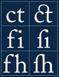
Type with Ligatures option unselected and selected
To use ligatures or old style numerals:
Choose Ligatures or Old Style from the Character palette menu. A check mark indicates that the option is selected.
To use alternate ligatures (Photoshop):
Choose Alternate Ligatures from the Character palette menu. A check mark indicates that the option is selected.
Using fractional character widths
By default, type is displayed using fractional character widths. This means that the spacing between characters varies, with fractions of whole pixels between some characters. In most situations, fractional character widths provide the best spacing for type appearance and readability. However, for type in small sizes (less than 20 points) displayed online, fractional character widths can cause type to run together or have too much extra space, making it difficult to read.
You can turn off fractional character widths to fix type spacing in whole-pixel increments and prevent small type from running together. The fractional character width setting applies to all characters on a type layer-you cannot set the option for selected characters.
To turn fractional character widths on or off:
Choose Fractional Widths from the Character palette menu. A check mark indicates that the option is selected.
Viewing text using the operating system layout
The System Layout command lets you preview text using the operating system's default text handling. This is useful when designing user interface elements, such as dialog boxes and menus.
To turn system layout on or off:
Choose System Layout from the Character palette menu. A check mark indicates that the option is selected.
Rotating
vertical type

When working with vertical type, you can rotate the direction of characters by 90. Rotated characters appear upright; unrotated characters appear sideways (perpendicular to the type line).

Original, and type without vertical rotation
To rotate characters in vertical type:
Choose Rotate Character from the Character palette menu. A check mark indicates that the option is selected.
Note: You cannot rotate double-byte characters (full width characters only available in Chinese, Japanese, and Korean fonts). Any double-byte characters in the selected range will not be rotated.
Checking for spelling errors (Photoshop)
When you spell-check a document, Photoshop questions any words that aren't in its dictionary. If a questioned word is spelled correctly, you can confirm its spelling by adding the word to the dictionary. If a questioned word is misspelled, you can correct it.
To check and correct spelling:
1 In the Character palette, choose a language from the pop-up menu at the bottom of the palette. This sets the dictionary for spell-checking.
2 Do one of the following:
. Select a type layer.
. To check specific text, select the text.
. To check a word, place an insertion point in the word.
3 Choose Edit > Check Spelling.
4 As Photoshop finds unfamiliar words and other possible errors, do one of the following:
. Click Ignore to continue checking spelling without changing text. Click Ignore All to ignore the word for the rest of the spell-check.
. To correct a misspelling, make sure the correctly spelled word is in the Change To text box and click Change. If the suggested word is not the word you want, you can select a different word in the Suggestions text box or enter the word in the Change To text box.
. To correct a repeated misspelling in a document, make sure the correctly spelled word is in the Change To text box and click Change All.
. Click Add to have Photoshop store the unrecognized word in the dictionary, so that subsequent occurrences are not flagged as misspellings.
. If you selected a type layer and want to spell-check only that layer, deselect Check All
Layers.
Finding and replacing text (Photoshop)
You can search for a single character, a word, or group of words. Once you find what you're looking for, you can change it to something else.
To find and replace a word:
1 Select the layer that contains the text you want to find and replace.
2 Choose Edit > Find and Replace.
3 In the Find What box, type or paste the text you want to find. To change the text, type the new text in the Change To text box.
4 Select Case Sensitive if you want to search for a word or words that exactly match the case of the text in the Find What text box. For example, a search for "PrePress" will not find
"Prepress" or "PREPRESS."
5 Select Whole Word Only if you want to disregard the search text if it is embedded within a larger word. For example, if you are searching for "any" as a whole word,"many" will be disregarded.
6 Click Find Next to begin the search.
7 Click the button that reflects what you want to do next.
. Change replaces the found text with the revised text. To repeat the search, select Find
Next.
. Change/Find replaces the found text with the revised text and then searches for the next occurrence.
. Change All searches for and replaces all occurrences of the found text.
Formatting paragraphs
A paragraph is any range of type with a carriage return at the end. You use the Paragraph palette to set options that apply to entire paragraphs, such as the alignment, indentation, and space between lines of type. For point type, each line is a separate paragraph. For paragraph type, each paragraph can have multiple lines, depending on the dimensions of the bounding box.
Selecting paragraphs and showing the Paragraph palette
You can use the Paragraph palette to set formatting options for a single paragraph, multiple paragraphs, or all paragraphs in a type layer.
To select paragraphs for formatting:
Select
the horizontal type tool ![]() or the vertical type tool
or the vertical type tool ![]() and do one of the following:
and do one of the following:
. Click in a paragraph to apply formatting to a single paragraph.
. Make a selection within a range of paragraphs to apply formatting to multiple paragraphs.
. Select the type layer in the Layers palette to apply formatting to all paragraphs in the layer.
To show the Paragraph palette:
Do one of the following:
. Choose Window > Paragraph, or click the Paragraph palette tab if the palette is visible but not active.
. With a type tool selected,
click the palette button ![]() in the options bar.
in the options bar.
Aligning and justifying type
You can align type to one edge of a paragraph (left, center, or right for horizontal type; top, center, or bottom for vertical type) and justify type to both edges of a paragraph. Alignment options are available for both point type and paragraph type; justification options are only available for paragraph type.
To specify alignment:
In the Paragraph palette or options bar, click an alignment option. The options for horizontal type are:
Aligns type to the left, leaving
the right edge of the paragraph ragged.
![]()
Aligns type to the center, leaving
both edges of the paragraph ragged.
![]()
Aligns type to right, leaving
the left edge of the paragraph ragged. The
options for vertical type are:
![]()
Aligns type to the top,
leaving the bottom edge of the paragraph ragged.
![]()
Aligns type to the center, leaving
both the top and bottom edges of the paragraph ragged.
![]()
Aligns type to bottom, leaving
the top edge of the paragraph
ragged.
![]()
To specify justification for paragraph type:
In the Paragraph palette, click a justification option. The options for horizontal type are:
Justifies all
lines except the last, which is left-aligned.
![]()
Justifies all
lines except the last, which is center-aligned.
![]()
Justifies all
lines except the last, which is right-aligned.
![]()
Justifies all
lines including the last, which is force-justified. The
options for vertical type are:
![]()
Justifies all
lines except the last, which is top-aligned.
![]()
Justifies all
lines except the last, which is center-aligned.
![]()
Justifies all
lines except the last, which is bottom-aligned.
![]()
Justifies all
lines including the last, which is force-justified.
![]()
Indenting paragraphs
Indentation specifies the amount of space between type and the bounding box or line that contains the type. Indentation affects only the selected paragraph or paragraphs, so you can easily set different indentations for paragraphs.
To specify paragraph indentation:
In the Paragraph palette, enter a value for an indentation option:
.
Left
Indent to indent from the left
edge of the paragraph.
For vertical
type, this option controls the indentation from the top
of the paragraph.
![]()
.
Right Indent to indent from the right edge of the paragraph.
For vertical
type, this option controls the indentation from the bottom of the paragraph.
![]()
.
First Line
Indent to indent the first line of type in the paragraph. For
horizontal type, the first line indent is relative to the left indent; for vertical type, the first
line indent is relative to
the top indent. To
create
a first line hanging indentation,
enter a negative value.
![]()
Changing space above or below paragraphs
You can control the space above and below paragraphs using the paragraph spacing options.
To specify paragraph spacing:
![]()
In the Paragraph
palette, enter a value
for Space Before
and Space After .
![]()
Specifying hanging punctuation
Hanging punctuation controls whether punctuation marks fall inside or outside the margins. If hanging punctuation is turned on for Roman fonts, periods, commas, single- quotation marks, double-quotation marks, apostrophes, hyphens, em dashes, en dashes, colons, and semicolons appear outside the margins.
To use hanging punctuation for Roman fonts:
Choose Roman Hanging Punctuation from the Paragraph palette menu. A check mark indicates that the option is selected.
Note: When you use Roman Hanging Punctuation, any double-byte punctuation marks available in Chinese, Japanese, and Korean fonts in the selected range will not hang.
(See "Using burasagari" on section 367.)
Controlling hyphenation and justification
The settings you choose for hyphenation and justification affect the horizontal spacing of lines and the aesthetic appeal of type on a page. Hyphenation options determine whether words can be hyphenated and, if they can, what breaks are allowable. Justification options determine word, letter, and glyph spacing.
Note: Hyphenation and justification settings apply only to Roman characters; double-byte characters available in Chinese, Japanese, and Korean fonts are not affected by these settings. (See " Working with Japanese composition" on section 365.)
Adjusting hyphenation
You can hyphenate words manually or automatically.
To choose a hyphenation dictionary:
Choose a language from the pop-up menu at the bottom of the Character palette
To turn automatic hyphenation on or off:
In the Paragraph palette, select or deselect the Hyphenate option.
To set automatic hyphenation options:
1 Choose Hyphenation from the Paragraph palette menu.
2 Enter values for the following options:
. Words Longer Than _ Letters to specify the minimum number of characters for hyphenated words.
. After First _ Letters and Before Last _ Letters to specify the minimum number of characters at the beginning or end of a word that can be broken by a hyphen. For example, by specifying 3 for these values, aromatic would be hyphenated as aro- matic instead of ar- omatic or aromat- ic.
. Hyphen Limit to specify the maximum number of hyphens that can appear on consec- utive lines. Zero means unlimited hyphens.
. Hyphenation Zone to specify the distance at the end of a line that will cause a word to break in unjustified type. This option applies only when using the single-line composer.
(See "About composition methods" on section 362.)
3 To prevent capitalized words from being hyphenated, deselect Hyphenate Capitalized
Words. Then click OK.
Preventing unwanted word breaks
You can prevent words from breaking at the end of lines-for example, proper names or words whose break might have a misleading appearance. You also can keep multiple words from breaking-for example, clusters of initials and a last name.
To prevent characters from breaking:
1 Select the characters you want to prevent from breaking.
2 Choose No Break from the Character palette menu.
Note: If many contiguous characters use the No Break option, the type may be forced to wrap in the middle of a word.
Adjusting spacing
You can precisely control the way in which Photoshop and ImageReady space letters and words and scale characters. Adjusting spacing options is especially useful when working with justified type, although you can also adjust spacing for unjustified type.
Word spacing refers to the space between words that is created by pressing the spacebar. Letter spacing refers to the distance between letters and includes kerning or tracking values. Glyph spacing refers to the width of characters (a glyph is any font character). Spacing options are always applied to an entire paragraph. To adjust the spacing in a few characters but not an entire paragraph, use the Tracking option.
To set justification options:
1 Choose Justification from the Paragraph palette menu.
2 Enter values for Word Spacing, Letter Spacing, and Glyph Spacing:
. For justified type only, enter values for Minimum and Maximum to define a range of acceptable spacing.
. Enter a value for Desired to set the spacing for both justified and unjustified paragraphs.
Word Spacing values can range from 0% to 1000%; at 100%, no additional space is added between words. Letter Spacing values can range from -100% to 500%; at 0%, no space is added between letters. Glyph Spacing values can range from 50% to 200%; at 100%, the width of characters is not scaled.
Working with composition
The appearance of type on the page depends on a complex interaction of processes called composition. Using the word spacing, letter spacing, glyph spacing, and hyphenation options you've selected, Photoshop and ImageReady evaluate possible line breaks and choose the one that best supports the specified parameters.
About composition methods
Photoshop and ImageReady offer two composition methods: the Adobe Every-line Composer and the Adobe Single-line Composer. Both composition methods evaluate possible breaks and choose the one that best supports the hyphenation and justification options you've specified for a given paragraph.
The Every-line Composer Considers a network of break points for a range of lines and thus can optimize earlier lines in the paragraph in order to eliminate especially unattractive breaks later on. Working with multiple lines of type results in more even spacing and fewer hyphens.
The Every-line composer approaches composition by identifying possible breakpoints, evaluating them, and assigning a weighted penalty based on these principles:
. Highest importance is given to evenness of letter and word spacing. Possible break- points are evaluated and penalized according to how much they deviate from optimal spacing.
. Hyphenation is avoided when possible. Breakpoints that require hyphenation are penalized more than those that create uneven spacing.
. Good breakpoints are preferred over bad breakpoints. After breakpoint penalty values are identified for a range of lines, they are squared, magnifying the bad breakpoints. The composer then uses the good breakpoints.
The Single-line Composer Offers a traditional approach to composing type one line at a time. This option is useful if you prefer to have manual control over how lines break. The Single-line composer uses the following principles when considering a breakpoint:
. Compressed or expanded word spacing is preferable to hyphenation.
. Hyphenation is preferable to compressed or expanded letter spacing.
. If spacing must be adjusted, compression is better than expansion.
Choosing a composition method
You use the Paragraph palette to choose a composition method for selected paragraphs.
To choose a composition method for a paragraph:
Choose Adobe Every-line Composer or Adobe Single-line Composer from the Paragraph palette menu. A check mark indicates which option is selected.
|
Politica de confidentialitate | Termeni si conditii de utilizare |

Vizualizari: 1074
Importanta: ![]()
Termeni si conditii de utilizare | Contact
© SCRIGROUP 2025 . All rights reserved