| CATEGORII DOCUMENTE |
| Bulgara | Ceha slovaca | Croata | Engleza | Estona | Finlandeza | Franceza |
| Germana | Italiana | Letona | Lituaniana | Maghiara | Olandeza | Poloneza |
| Sarba | Slovena | Spaniola | Suedeza | Turca | Ucraineana |
|
Creative Specification Atkins Prepared
for Atkins by Amaze

Preparation
Release
Introduction
Purpose and scope
Design and branding approach
Tone
Visual signpost
Quality and Performance
Page Structures
The use of grids
Grid templates
Home page grid layout
Grid Sizes:
Content page grid layout
Grid Sizes:
Sizing and spacing
Home page sizing and spacing
Content page sizing and spacing
Templates structures
Home page template
Site navigation types
Resolution
Navigation styles
Default State
Rollover State/ Visiting State
Visiting state sub-section
Main Homepage Navigation
Promo block navigation
3rd Level links
Function buttons
Content links
Latest News links
When to use visited links
Colours
Default colour palette
Tinted Colours
Typography
Relative text sizing
Text samples
Heading images
Composition
Image types
GIF format
JPEGs formats
Structuring tabular/complex data
Writing for the web
Scanning
Headers and indicators
Persuasive writing
Links and further material
Asset naming conventions
Asset names
Appendix A Sample pages
Home page
Section Homepage
Content Page
External system templates
Document Version Control
|
Action |
Name |
Date |
|
Prepared by: |
Amaze |
June 2007 |
|
Version |
Date Released |
Pgs |
Remarks |
|
|
V 0.1 |
DRAFT version for client review | |||
|
V 0.2 |
Version for Client Review | |||
|
V 0.3 |
Version for Client Review |
This document explains the design rationale for the main visual design elements of the Atkins Global website. In addition, it provides guidelines on how the final site will appear in terms of layout, typography, branding, imagery, colour and accessibility. The examples given in the main body of this document are style guides and may not reflect the latest iteration of the page layouts. The Appendix contains a list of all the screen designs that have been produced; this section will be kept up-to-date with the latest design revisions as a point of reference. These guidelines are designed to be flexible enough to accommodate all expected content formats and future adaptations, yet are robust enough to ensure consistency.
The new Atkins Global website launch will coincide with the launch of the new Atkins Branding. The Atkins brand has been redesigned in order to ensure Atkins is perceived as a modern and forward thinking company, the website has been design and developed to enhance how Atkins is perceived and to ensure a positive user experience gained through interacting with the site helps maintain a positive impression of Atkins Global.
The site has been produced to appear visually consistent with other new Atkins collateral whether this is in electronic or printed formats. This visual consistency will ensure users know they have found the right information as soon as they access the site, this may be via search engine, link or directly from the URL.
The site reflects the performance and vision of Atkins. Below are some key phrases that describe how the site will appear to users; these are consistent with Atkins values.
Approachable
Easy to use
High quality
Friendly
Professional
Effective
Consistent
Proactive
Modern
Positive
Accessible
Ambitious
In touch with heritage
As users browse web sites they subconsciously construct mental models of the structure and positioning of important assets. To assist users to create these mental models a strict grid structure has been implemented into the new Atkins site. The grid provides the foundations for all subsequent templates and designs. It ensures consistency of design in terms of alignment, gutter sizes and composition. In addition, a grid helps to minimise the number of different templates required for different content types within the site.
The Atkins website is constructed using a 4 column grid structure, with areas of colours and text-based content and navigation. These simple elements will ensure the design does not impact on the performance quality, and therefore the overall usability of the site. The modular design will enable new content items to be added and removed when required. The flexibility of the design will ensure the site remains equally as effective regardless of any future adaptations.
Sample 4-column grid (home page)
W = 188
W = 174
W = 174
W = 214
Gutter Sizes:
1-2. W = 6px
2-3. W = 6px
3-4. W = 6px
Sample 3-column grid (content page)
W = 188
W = 354
W = 214
Gutter Sizes:
1-2. W = 6px
2-3. W = 6px
All sizing and spacing will be implemented in the CSS to ensure validation to HTML 4.0 standards. The measurements here have been added as a guide only.
All vertical spacing is shown below in pixels. Although only two templates have been illustrated it is possible to translate these measurements to additional layouts. The spacing is presented as a guide for the development team and as a reference for future adaptations. Most sizes, for example type leading, in the actual development will be implemented using relative sizes to ensure the Atkins website is flexible, enabling it to view consistently across a variety of different end user environments and accommodating any increase in text size.
Home page vertical size and spacing
Content page vertical size and spacing
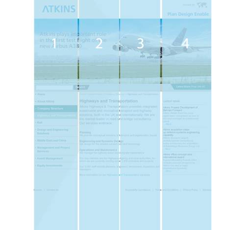
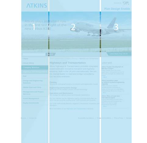
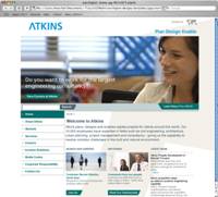
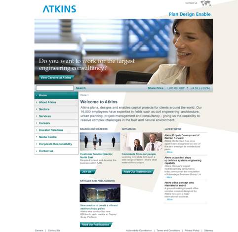
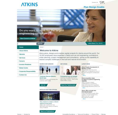
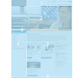
Home page template | |
|
|
Branding Focus Window Search Bar and Share Pricing Site Navigation Main Content area, Promo Blocks, Latest News Footer |
As previously mentioned the Atkins site can be created using just 3 main templates.
Home-navigation
This
navigation remains consistent through out the site and is the main navigation
used by users, to get to specific information relative to them.
Content-navigation
The
content navigation is used for Related Links, Site tools and Promo blocks.
Home navigation
Content navigation
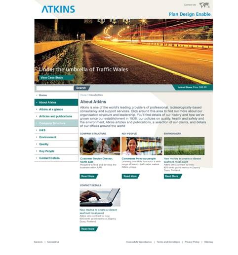
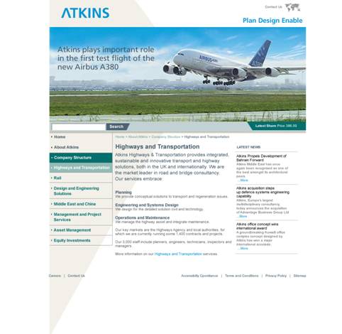
Template designs have been produced for the following representative pages: (See appendix for further details)
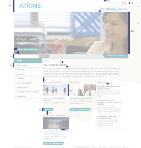
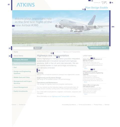
Home page
Section homepage
Content page
The Atkins site design uses the most popular screen resolution, which is currently 1024 x 768, this resolution will give the best results. At higher resolutions the site will sit in the middle of the screen with extended white borders.
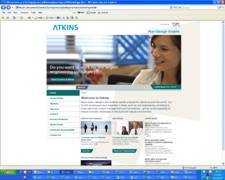
Atkins Homepage at 1024 x 768 resolution Atkins Homepage at 1280 x 1024 resolution
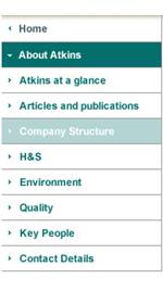
There are a number of navigational elements simply created as text links. These links will be familiar to the majority of users, as they are consistent with text links used on the web. To aid users not familiar with the web, the text will change colour when rolled over to indicate that the link is active.
Default State |
Rollover State/ Visiting State |
Visiting state sub-section |
Main Homepage Navigation | ||
|
|
|
|
|
The main global navigation appears as a green link on a white background. These will be CSS based navigation. |
On rollover the text colour changes to e2760a with 00a4de |
The visited state appears the same as the rollover state. |
Promo block navigation | ||
|
|
|
|
|
Sub navigation is situated in the main content areas under each promo block |
On rollover the gradient will flip to appear as a rollover state. These will be supplied as graphics |
Once clicked the button will still appear in its rollover state |
| ||
|
|
|
|
|
The main second-level content links appear in 00a4de |
On rollover state will show an underline |
The visited link will show as a |
Function buttons | ||
|
|
|
|
|
This component will be the same the promo links button and will work in the same way |
On rollover the gradient will flip to appear as a rollover state. These will be supplied as graphics |
The button appears in its default state once it has been pressed. |
| ||
|
|
|
|
|
Content links, those that are within content, are 593f2a and underlined, the bold is removed to ensure reading patterns are not interrupted, while the underline ensures they can still be easily identified as links. |
On rollover the link colour changes to Blue ( 00a4de), the link remains underlined to show the link is active. |
A visited link shows as Blue ( 00a4de), the link remains Underlined to show the link is active. |
| ||
|
|
|
|
|
Related links and News links are those that appear in the right hand navigation and are preceded by a cross. |
On rollover the text will appear with an underline. |
The clickable state appears with an underline. |
A distinctive styling for visited links is essential to enable visitors to put their browsing in the proper past, present, future context, however, this is only the case at a content level. For example, a user would need to know that they had already visited a certain piece of content but it would not be appropriate to show them they had visited the Selling, About Atkins sections. So, visited links should be used at the lowest level when they can inform the users what content they have viewed.
The site colours are based on the new Atkins brand identity colour palate. The palate is dominated by the dark blue and Ivory so this is the main colour used on the site, it has also been implemented in tints to ensure the usability of the content is maintained. The main colour is supported by different tints of brown, using such a neutral colour allows different areas of content to be distinguished from each other without removing any emphasis from the corporate colour.
Self-service areas have been implemented using colours from the supporting palate. These colours add emphasis to key pieces of functionality as well as creating an over all look and feel that appears contemporary and inviting.
These colours should be considered for external applications to make them feel part of the overall Atkins site. As well as adding visually consistency the user will still feel as though they are in the Atkins domain and are less likely to feel lost.
|
|
|
|
|
|
R65, G89, B104 |
R0, G164, B222 00a4de |
R0, G102, B102 |
|
|
|
|
| |
|
R240, G139, B29 #f08b1d |
R153, G153, B153 |
R0, G0, B0 | |
Tinted Colours | |||
|
|
|
| |
|
R242, G240, B233 f2f0e9 |
R178, G223, B242 #b2dff2 |
R165, G207, B221 #88aaab |
00a4de |
 00a4de
 00a4de
 00a4de
The majority of the site is constructed using text based elements to ensure the site can be easily updated and expanded as well as being quick to download and accessible. The primary font used for body text is Arial 11-point, a sans-serif font that provides good on screen readability. All heading are implemented in Aerial or as a graphic they appear in various sizes.
Text elements will be implemented using style sheets. By setting the text size using relative font sizes, the user will be able to increase or decrease the size of the text to suit their personal preferences. In addition, this method of implementation will allow the site to be consistently viewed on a range of monitors from large 21-inch monitors to hand-held devices.
To ensure the users are able to exercise this browser feature the site must be
implemented using style sheets that contain relative and not absolute
font-sizes. Absolute sizes are those implemented in pixels, for example 11px.
Relative sizes can be implemented using a number of methods including:
Percentages (60%); Keywords (small, strong etc); Em font sizes (0.7em).
Note: All percentages in the table below have been documented based on CSS standards at this stage have been added in complete isolation to development. As a result these measurement may need amending once CSS development begins.
Colour has been written using the American spelling in this table, as this is the correct spelling for CSS formatting.
|
Html: 100% |
||
|
|
Heading 1 title found in main copy. |
Text-size: 110%; (16px) |
|
|
Promo subtitle and main content sub headings - Heading 2 title found in main copy |
Text-size:
76%; (11px) |
|
|
Main body text |
Text-size:
76% (11px) |
|
|
Small text used on footer. |
Text-size:
63% (10px) |
|
|
Section Paragraph |
Text-size:
93%; (14 px) |
|
|
Right hand navigation link Header |
Text-size:
63% (11px) |
 Text
samples
Text
samples Text-size: 76% (10px) Font-family:
Arial; Font-weight:
Bold; Colour: Text-size: 63% (10px) Text-size:
63%; (11px) Text-size:
93%; (14 px) Text-size: 63%
(11px) Text-size: 63%
(11px) Text-size:
87%; (10px) Text-size:
110%; (16px) Font-family:
Arial Font-weight:
Bold; Colour: Text-size:
98%; (18px) Font-family:
Palatino Font-weight:
Normal; Colour: ffffff Text-size: 63%
(11px) Text-size: 76% (11px) Font-family:
Arial; Font-weight:
Regular; Colour: ffffff Text-size: 87%; (11px) Font-family:
Arial; Font-weight:
Bold; Colour: ffffff Text-size: 76% (11px) Font-family:
Arial; Font-weight:
Bold; Colour: Text-size: 76% (11px) Font-family:
Arial; Font-weight:
Regular; Colour: ffffff 
Font-family: Arial;
Font-weight: Regular;
Colour: 


Font-family: Arial;
Font-weight: Normal;
Colour: ffffff
Font-family: Arial;
Font-weight: Regular;
Colour:
Font-family: Arial;
Font-weight: Bold;
Color: 000000
Text-decoration: none;
Font-family: Arial;
Font-weight: Bold;
Colour:
Font-family: Arial;
Font-weight: regular;
Colour: 999999
Font-family: Arial;
Font-weight: Regular
Colour: 999999

Imagery
Where possible all images must portray the true demographic of Atkins. As the images on the home page and other promotional areas set the tone of the site they must reflect this standard, however in such a small content container and with a need to generate a great visual impact this can be challenging. To overcome this issue a number of images can be used to portray the same message.
It can sometimes be quite difficult to portray key messages within the small and narrow area of the header images so it is important that the composition of each image is carefully considered. The image content should be large enough for the user to be able to interpret the message of the image.
There are 3 types of images used on the Atkins web site, firstly there are images that make up the furniture for the site, for example, the logo, the buttons and the link arrows. These images would normally be created in gif format. Secondly, there are images that support the message of the content or to support features, as is the case with the homepage feature image, this type of image is more likely to be in a jpg format. Below is a brief overview of the different file types.
Below are some examples of images and how they are to be used:
Image size: 768px X 284px
1. Home
Page / Landing Page Main Image Examples (jpeg)

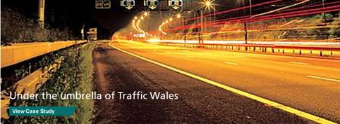
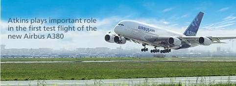
Image size: 174px X 80px
2. Promo Block (jpeg)


2. Content image (jpeg)

Image size: 174px X 126px
Graphics Interchange Format, or GIF, is a popular web graphic format. Although it can contain only 256 colours, GIF offers good, lossless image compression. Also, GIFs can contain a transparent area and multiple frames for animation. Images compressed with lossless compression normally lose no image quality when they are compressed. A GIF compresses by scanning horizontally across a row of pixels, finding solid areas of colour, and then abbreviating identical areas of pixels in the file. Therefore, images with repetitive areas of solid colour compress best when exported as GIFs. A GIF is usually ideal for images that contain text, large areas of flat colours, vector shapes and graphics with transparent areas.
All non-photographic images are saved in GIF format because they contain solid blocks of similar colours. It is important to keep the file sizes as low as possible, this can be achieved by saving the files with as few colours as possible without sacrificing the quality of the image.
Note: Dithering or anti-aliasing GIF images produces larger files.
JPEG is an alternative to GIF developed by the Joint Photographic Experts Group specifically for photographic images. JPEG supports millions of colours (24-bit). JPEG is a lossy format, which means that some image data is discarded when it is compressed, reducing the quality of the final file. However, some image data can often be discarded with little or no noticeable difference in quality. All photographic images should be created as JPEG format, unless a transparent background is also required.
Some complex information is better presented in a tabular format. This structured approach makes the content much easier for the user to digest. Colours and separating techniques such as horizontal and vertical lines maximise the ability to simplify the content.
Although not tabular data the same process can be applied to other complex area of functionality, this is especially important for any forms. The examples below show how the form functionality of the site has been visually simplified using simple colours and visual emphasis on key areas, such as the search button itself. The user is now easily able to read from a form label to the appropriate field.
Creating and publishing good quality web content will allow the Atkins to reinforce their online brand by creating a reliable and high quality website allowing users to easily and independently source relevant content. Therefore the following recommendations should be considered when adding or revising content
Jacob Nielsen (See links below) identifies three main user behaviours that should strongly influence the production of web content:
Users do not read on the Web; they tend to scan the pages to pick out the few segments that appear to be of immediate relevance to their reason for visiting the site.
Users do not like long, uninterrupted passages of text: they prefer the text to be short and to the point
Users prefer factual information to overtly promotional or commercial language that does nothing to satisfy their needs, be they task based or informational.
According to expert research by the Poynter Institute the first thing most people look at when they first access a web page is not the logo, the navigation menu or any imagery within the page - the first thing they look at is the words in the middle of the screen. The content writer, in addition to a design that takes this theory into consideration, can have a marked influence on how the user scans the content and can also influence the amount of time the user spends on a page which might make the difference between them understanding the entire message or not.
To ensure the page scans as easily as possible, content editors should ensure that the opening copy of any content describes the content itself. The design accommodates this by suggesting that the first paragraph of each page is implemented in bold, this is the area that should describe the content of the page.
Additional recommendations are:
The remaining copy should be broken into digestible chunks
Each main point should be headlined in bold and with a sensible and informative header. The design uses headers formatted in bold and at various sizes to visually break up the text.
All main points should be outlined at the beginning of the paragraph.
Any important elements should not be aligned with the main content of the page the conflict for eye time will negate the impact of both. Lists and tables are a good way of overcoming this issue.
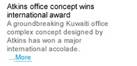
Headings have a powerful impact upon the browsing eye. It is worthwhile dedicating time to producing headings and indicators that have meaning and significance and that are in keeping with the context of the content the user is viewing. A good way of achieving this is to use as many of the keywords that are applicable to the piece of content in the heading for that piece of content. The screen shot that follows illustrates how the design incorporates headings to break the page into smaller digestible chunks of content. In addition an introductory text style gives the user a summary of the information they are about the read, this is particularly appropriate for users accessing the site using access technologies.
Heading 1 Heading 2

The value of ensuring the tone of the generic content of the Atkins website is correctly polished to ensure the user responds as intended cannot be underestimated. Some tips for persuasive writing techniques that may help address this issue include:
Focus on the needs, wants and desires of the users
Grab attention in line 1
Personalise the tone - don't write to people in general
Concentrate on the benefits (not the features) of the product or service.
Give specific, relevant information: don't be tempted to
include hype at the
expense of substance.
Use active verbs and a conversational tone.
Be concise: say a lot in a few words.
Keep sentences very short. (Aim for a maximum of 16 words average.)
Keep paragraphs short.
Tell users exactly what they need to do to perform the
task/read more/contact
you/buy the product/
Headlines in bold, white space, left aligned.
The following are a selection of online information resources that may prove useful:
The Poynter Institute
https://poynter.org/
Jakob Nielsen - Applying writing guidelines to web pages
https://www.useit.com/papers/webwriting/rewriting.html
Official Web Writing Accessibility Guidelines
https://www.w3.org/TR/WAI-WEBCONTENT/
Ten Tips for Writing on the Web
https://www.alistapart.com/stories/writeliving/
The following guidelines promote good practice for image file naming and will be used consistently throughout the Atkinss website. Guidelines for choosing suitable file names include:
All file names should be lower case
No spaces should be included within files names
Other forms of publication and special characters should be avoided
In addition to general good practices the following naming conventions will ensure files are easily located and identified. Common prefixes and suffixes will be used for assets containing similar content.
E.g. promo_01_hamp_mort.jpg
Promo = asset
01 = number of asset (there could be multiple promo items)
atk = Atkins
serv = area of the site the asset belongs to
jpg = asset suffix
Where possible the new Atkins design should be implemented across all external systems, this will give the user a seamless experience enabling them to navigate around the site without feeling lost or like they have left the Atkins domain. The following screen illustrate a best practice approach, however it is appreciated that they maybe some limitations to the integration and application of design.
Conventions such as the use and design of headings, links colours and styles and form designs should be implemented consistently to aid usability.
|
Politica de confidentialitate | Termeni si conditii de utilizare |

Vizualizari: 1694
Importanta: 
Termeni si conditii de utilizare | Contact
© SCRIGROUP 2025 . All rights reserved


