| CATEGORII DOCUMENTE |
| Asp | Autocad | C | Dot net | Excel | Fox pro | Html | Java |
| Linux | Mathcad | Photoshop | Php | Sql | Visual studio | Windows | Xml |
Making Color and Tonal
Adjustments
Basic steps for correcting images
Photoshop and ImageReady give you a range of commands and features for adjusting the tonal quality and color balance of images. For simple image correction, use one of the quick adjustment commands. (See "Making quick overall adjustments to an image" on section 150.) For more precise and flexible adjustments, use the following color-correction workflow.
1. Calibrate your monitor.
In preparation for adjusting images, characterize and calibrate your monitor to a color- display standard suited to your working needs. Otherwise, the image on your monitor may look very different from the same image when printed or when viewed on another monitor. (See "Creating an ICC monitor profile" on section 117.)
2. Check the scan quality and tonal range.
Before making adjustments, look at the image's histogram to evaluate whether the image has sufficient detail to produce high-quality output. The greater the range of values in the histogram, the greater the detail. Poor scans and photographs without much detail can be difficult if not impossible to correct. Too many color corrections can also result in a loss of pixel values and too little detail.
The histogram also displays the overall distribution of shadows, midtones, and highlights to help you determine which tonal corrections are needed. (See "Checking scan quality and tonal range (Photoshop)" on section 131.)
3. Adjust the tonal range.
Begin tonal corrections by adjusting the values of the extreme highlight and shadow pixels in the image, setting an overall tonal range that allows for the sharpest detail possible throughout the image. This process is known as setting the highlights and shadows or setting the white and black points.
Setting the highlights and shadows typically redistributes the midtone pixels appropri- ately. When pixel values are concentrated at either end of the tonal range, however, you may need to adjust your midtones manually. It is not usually necessary to adjust midtones in images that already have a concentrated amount of midtone detail.
There are several different ways to set an image's tonal range:
. You can drag sliders along the histogram in the Levels dialog box. (See "Using Levels to set highlights, shadows, and midtones" on section 137.)
. (Photoshop) You can adjust the shape of the graph in the Curves dialog box. This method lets you adjust any point along a 0-255 tonal scale and provides the greatest
control over an image's tonal quality. For more information, see "Using the Curves dialog box (Photoshop)" on section 139.
. (Photoshop) You can assign target values to the highlight and shadow pixels using either the Levels or Curves dialog box. This can be a useful method for images intended for printing on a press. For more information, see "Using target values to set highlights and shadows (Photoshop)" on section 141.
4. Adjust the color balance.
After correcting the tonal range, you can adjust the image's color balance to remove unwanted color casts or to correct oversaturated or undersaturated colors. Examine your image with reference to the color wheel to determine which color adjustments you need to make. (See "About the color wheel" on section 146.) You can choose from the following color adjustment methods:
. (Photoshop) The Auto Color command automatically corrects the color balance in an image. For more information, see "Using the Auto Color command (Photoshop)" on section 151.
. (Photoshop) The Color Balance command changes the overall mixture of colors in an image. For more information, see "Using the Color Balance command (Photoshop)" on section 146.
. The Hue/Saturation command adjusts the hue, saturation, and lightness values of the entire image or of individual color components. (See "Using the Hue/Saturation command" on section 147.)
. (Photoshop) The Replace Color command replaces specified colors in an image with new color values. See "Using the Replace Color command (Photoshop)" on section 149.
. (Photoshop) The Selective Color command is a high-end color-correction method that adjusts the amount of process colors in individual color components. For more infor- mation, see "Using the Selective Color command (Photoshop)" on section 149.
. The Levels dialog box lets you adjust color balance by setting the pixel distribution for individual color channels. In Photoshop, you can also use the Curves dialog box to make these adjustments. For more information, see "Using Levels to adjust color
(Photoshop)" on section 139 and "Using the Curves dialog box (Photoshop)" on section 139.
. (Photoshop) The technique of blending colors from different channels can also produce color adjustments. For more information, see "Mixing color channels (Photoshop)" on section 271.
(Photoshop) To best preserve the original detail in your image as you make color adjustments, convert the image to 16 bits per channel. (See "Converting between bit
depths" on section 93.) When you finish making color adjustments, convert it back to an
8-bit-per-channel image.
5. Make other special color adjustments.
Once you have corrected the overall color balance of your image, you can make optional adjustments to enhance colors or produce special effects. (See "Applying special color effects to images" on section 152.)
6. Sharpen the edges of the image.
As a final step, use the Unsharp Mask filter to sharpen the clarity of edges in the image. This step helps restore focus to images that have undergone resampling as a result of tonal adjustments. (See "Sharpening images" on section 155.)
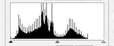
Checking scan quality and tonal range (Photoshop)
A histogram illustrates how pixels in an image are distributed by graphing the number of pixels at each color intensity level. This can show you whether the image contains enough detail in the shadows (shown in the left part of the histogram), midtones (shown in the middle), and highlights (shown in the right part) to make a good correction.
![]()
The histogram
also gives a quick picture of the tonal
range of the image,
or the image key type.
A low-key image has detail concentrated in the shadows; a high-key
image has detail concentrated in the highlights; and an average-key
image has detail concentrated in the midtones. An image with full tonal range
has a high number of pixels in all areas. Identi- fying the tonal range
helps determine appropriate
tonal corrections.
![]()
![]()
Original with insufficient
detail, and sufficient detail
![]()
![]()
Original, and corrected
average-key image
![]()
![]()
Original, and corrected
high-key image
![]()
Original, and corrected low-key image
To display the histogram for an image:
1 To display histogram data for a portion of the image, first select that portion. By default, the histogram displays the tonal range of the entire image.
2 Choose Image > Histogram.
To include data from spot channels and alpha channels, hold down Alt ( Windows) or Option (Mac OS) when you choose Image > Histogram; then choose the desired channel from the pop-up menu.
The horizontal axis of the histogram represents the intensity values, or levels, from darkest
(0) at the far left to brightest (255) at the far right; the vertical axis represents the total number of pixels with a given value.
Note: The histogram for an adjustment layer reflects the data for all visible layers beneath it.
3 For RGB, CMYK, and indexed-color images, choose an option from the Channel menu. You can plot either the luminance of the composite channel (Luminosity) or the intensity values of an individual channel.
4 To view information about a specific point on the histogram, place the pointer there.
To view information about a range of values, drag in the histogram to highlight the range. When you are finished, click OK to close the histogram.
Statistical information about the intensity values of the pixels appears below the histogram:
Mean Represents the average intensity value.
Standard deviation (Std Dev) Represents how widely intensity values vary.
Median Shows the middle value in the range of intensity values.
Pixels Represents the total number of pixels used to calculate the histogram.
Level Displays the intensity level of the area underneath the pointer.
Count Shows the total number of pixels corresponding to the intensity level underneath the pointer.
Percentile Displays the cumulative number of pixels at or below the level underneath the pointer. This value is expressed as a percentage of all the pixels in the image, from 0% at the far left to 100% at the far right.
Cache Level Shows the setting for the image cache. If the Use Cache for Histograms option is selected in the Memory and Image Cache ( Windows) or Image Cache (Mac OS) preferences, the histogram displays more quickly and is based on a representative sampling of pixels in the image (based on the magnification), rather than on all of the pixels (equivalent to a cache level of 1). Deselect this option if you want to check for posterization in the image. You can press Shift while choosing Image > Histogram to generate the histogram using all pixels in the image.
Using the color adjustment tools
All Photoshop and ImageReady color adjustment tools work essentially the same way:
by mapping an existing range of pixel values to a new range of values. The difference between the tools is the amount of control they provide. For an overview summary of the color adjustment tools, see "Basic steps for correcting images" on section 129.
Making color adjustments
There are two ways to adjust the colors in an image. The first method is to choose a command from the Image > Adjustments submenu. This method permanently alters the pixels in the active layer.
The second method is to use an adjustment layer. Adjustment layers let you experiment with color and tonal adjustments without permanently modifying the pixels in the image. The color and tonal changes reside within the adjustment layer, which acts as a veil through which the underlying image layers appear. You must use Photoshop to create and edit adjustment layers; however, you can view existing adjustment layers in ImageReady. To open a color adjustment dialog box:
1 If you want to make adjustments to just a portion of your image, select that portion. If you make no selection, the adjustment will be applied to the entire image.
2 Do one of the following:
. Choose Image > Adjustments, and choose a command from the submenu.
. (Photoshop) Create an adjustment layer. (See "Creating adjustment layers or fill layers"
on section 312.)
. (Photoshop) Double-click the thumbnail of an existing adjustment layer in the Layers palette.
3 To see your adjustments in the image before accepting them, select Preview in the color adjustment dialog box.
To cancel changes without closing a color adjustment dialog box, hold down
Alt ( Windows) or Option (Mac OS) to change the Cancel button to Reset; then click
Reset. This resets the dialog box to the values it had prior to your changes.
Seeing the color values of pixels (Photoshop)
You can use the Info palette and the Color palette to see the color value of pixels as you make color corrections.
When you work with a color adjustment dialog box, the Info
palette displays two sets of color values
for the pixels under the pointer. The value
in the left column is the original color value. The value
in the right column is the color value
after the adjustment is made. You can view the color of a single location
using the eyedropper tool, or you can use up to four
color samplers to display
color information for one or more locations in the image. These
samplers are saved in the image,
so you can refer to them repeatedly as you
work, even if you close and reopen the image.
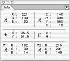
Color samplers and Info palette
To use the Info palette and the eyedropper or color sampler tool to see color values:
1 Choose Window > Info to open the Info palette.
2 Select the eyedropper tool ![]() or color sampler tool
or color sampler tool ![]() , and choose a sample size in the options bar:
, and choose a sample size in the options bar:
. Point Sample to read the value of a single pixel.
. 3 by 3 Average to read the average value of a 3-by-3 pixel area.
. 5 by 5 Average to read the average value of a 5-by-5 pixel area.
3 If you selected the color sampler tool, place up to four color samplers on the image. Click where you want to place a sampler.
4 Open an adjustment dialog box. (See "Making color adjustments" on section 132.)
5 Make your adjustments in the dialog box, and before applying them, view the before and after color values in the Info palette:
. To view color values using the eyedropper tool, move the pointer over the area of the image you want to examine. Opening an adjustment dialog box activates the eyedropper tool outside the dialog box. You still have access to the scroll controls and to the hand and zoom tools by using keyboard shortcuts.
. To view the color values under the color samplers, look at the lower half of the Info palette. To place additional color samplers in the image while the adjustment dialog box is open, Shift-click in the image.
To move, delete, or hide a color sampler:
Do any of the following:
. To move a color sampler, select the color sampler tool, and drag the sampler to the new location.
. To delete a color sampler, select the color sampler tool. Drag the sampler out of the document window, or hold down Alt ( Windows) or Option (Mac OS) and click the sampler. To delete all color samplers, click Clear in the options bar.
. To delete a color sampler while an adjustment dialog box is open, hold down Alt+Shift
(Windows) or Option+Shift (Mac OS), and click the sampler.
. To toggle the display of all color samplers in an image, choose View > Extras. A check mark indicates that color samplers are showing.
To change the display of color sampler information in the Info palette:
Do any of the following:
. To display or hide color sampler information in the Info palette, choose Color Samplers from the palette menu. A check mark indicates that the color sampler information is showing.
. To change the color space in which a color sampler displays values, move the pointer onto the color sampler icon in the Info palette, hold down the mouse button, and choose another color space from the menu.
To use the eyedropper tool and Color palette to see color values:
1 Choose Window > Color to open the Color palette.
2 Open the color adjustment dialog box. This activates the eyedropper tool outside the dialog box and over the image.
3 Click the pixel you want to check in the image.
4 Make the adjustments in the dialog box, and before applying them, view the adjusted color values in the Color palette.
Saving and reapplying settings
The Save and Load buttons in the Levels, Curves (Photoshop), Hue/Saturation, Replace Color (Photoshop), Selective Color (Photoshop), and Variations dialog boxes let you save your settings and apply them to other images.
To save and reapply settings:
1 Click Save in the adjustment dialog box you are using, and name and save the settings.
2 Close the adjustment dialog box, and open the image to which you want to apply the adjustments.
3 Reopen the adjustment dialog box, and click Load. Locate and load the saved adjustment file.
If you often apply the same adjustment, consider recording and running the adjustment as an action.
Comparing corrections in CMYK and RGB (Photoshop) Even though you can perform all color and tonal corrections in either CMYK or RGB mode, you should choose a mode carefully. Whenever possible, avoid multiple conversions between modes, because color values are rounded and lost with each conversion. If an RGB image is to be used on-screen, you needn't convert it to CMYK mode. Conversely, if a CMYK scan is to be separated and printed, you needn't perform corrections in RGB mode. If you must convert your image from one mode to another, it makes sense to perform most of your tonal and color corrections in RGB mode and use CMYK mode for fine-tuning. Advantages of working in RGB mode include the following:
. You can save memory and improve performance because you are working with fewer channels.
. You have more device independence, because RGB color spaces are not dependent on inks. Corrections made to the image are preserved regardless of the monitor, computer, or output device used.
. The gamut of RGB spaces is much larger than that of CMYK spaces, so more colors are likely to be preserved after adjustments.
Using the Proof Setup commands, you can preview composite CMYK colors and separation plates using the CMYK working space defined in the Color Settings dialog box. Or, you can preview colors using a custom CMYK color profile. (See "Soft-proofing colors" on section 113.)
Monitor CMYK colors as you edit in RGB mode by choosing Window > Documents > New Window to open a second window. Turn on the CMYK preview in one window
and leave it off in the other.
Identifying out-of-gamut colors (Photoshop)
The gamut is the range of colors that a color system can display or print. A color that can be displayed in RGB or HSB models may be out-of-gamut, and therefore unprintable, for your CMYK setting. (See "Color gamuts (Photoshop)" on section 91.)
Photoshop automatically brings all colors into gamut when you convert an image to CMYK. But you might want to identify the out-of-gamut colors in an image or correct them manually before converting to CMYK.
In RGB mode, you can identify out-of-gamut colors in the following ways:
. In the Info palette, an exclamation point appears next to the CMYK values whenever you move the pointer over an out-of-gamut color.
. In both the color picker and the Color palette, an alert triangle appears and the closest CMYK equivalent is displayed whenever you select an out-of-gamut color. To select the CMYK equivalent, click the triangle or the color patch.
You can also quickly identify all out-of-gamut colors in an RGB image by using the Gamut
Warning command.
To turn on or off the highlighting of out-of-gamut colors:
1 Choose View > Proof Setup, and choose the proof profile on which you want to base the gamut warning. (See "Soft-proofing colors" on section 113.)
2 Choose View > Gamut Warning. All pixels outside the gamut of the current proof profile space are highlighted.
To change the gamut warning color:
1 Do one of the following:
. In Windows or Mac OS 9.x, choose Edit > Preferences > Transparency & Gamut.
. In Mac OS X, choose Photoshop > Preferences > Transparency & Gamut.
2 Under Gamut Warning, click the color box to display the color picker. Then choose a new warning color, and click OK. For best results, use a color that is not already present in the image.
3 Enter a value in the Opacity text box. Values can range from 0 to 100%. Use this setting to reveal more or less of the underlying image through the warning color. Then click OK.
Original image, and preview of out-of-gamut colors
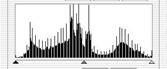
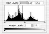
Using the Levels dialog box
The Levels dialog box lets you correct the tonal range and color balance of an image by adjusting intensity levels of the image's shadows, midtones, and highlights. The Levels histogram serves as a visual guide for adjusting the image's key tones.
Using Levels to set highlights, shadows, and midtones
You can set the highlights and shadows in an image by moving Input sliders to the first group of pixels on both ends of the Levels histogram. This maps these pixels-the darkest and lightest pixels in each channel-to black and white, increasing the tonal range of the image. The corresponding pixels in the other channels are adjusted proportionately to avoid altering the color balance. You can use the middle Input slider to change the intensity values of the middle range of gray tones without dramatically altering the highlights and shadows.
Although the Levels sliders are not as exact as assigning target values or using the Curves dialog box, they often yield good results.
To adjust tonal range using Levels:
1 Open the Levels dialog box. (See "Making color adjustments" on section 132.)
2 To adjust tones for a specific color channel, choose an option from the Channel menu. To edit a combination of color channels at the same time, Shift-select the channels in the Channels palette before choosing the Levels command. The Channel menu then displays the abbreviations for the target channels-for example, CM for cyan and magenta. The menu also contains the individual channels for the selected combination. You can only edit spot channels and alpha channels individually.
3 To adjust the shadows and highlights manually, do one of the following:
. Drag the black and white Input Levels sliders to the edge of the first group of pixels on either end of the histogram. You can also enter values directly into the first and third Input Levels text boxes.
. Drag the black and white Output Levels sliders to define new shadow and highlight values. You can also enter values directly in the Output Levels text boxes.
For example,
suppose you want to increase
the contrast in an image with pixels
that currently cover
a range of only 0-233. If you
drag the Input Levels
white triangle to 233, pixels
with intensity values of 233 and higher (in each channel
of the image) are mapped to 255; pixels with lower intensity values are mapped to corresponding
lighter values. This remapping
lightens the image,
increasing the contrast
in highlight areas.

Original

Resulting histogram and image
Suppose instead you want to decrease the contrast in the image. If you drag the Output Levels white triangle to 220, pixels with intensity values of 255 are remapped to 220, and pixels with lower intensity values are mapped to corresponding darker values. This darkens the image, decreasing the contrast in highlight areas.
4 To adjust the shadows and highlights automatically, click Auto.
In Photoshop, clicking Auto applies settings specified in the Auto Correction Options dialog box. For more information, see "Setting auto correction options (Photoshop)" on section 144. In ImageReady, clicking Auto is the same as using the Auto Levels command.
(See "Using the Auto Levels command" on section 150.)
5 If your image needs midtone corrections, use the gray Input Levels slider. Drag the slider to the right to darken the midtones; drag it to the left to lighten the midtones. You can also enter values directly in the middle Input Levels text box.
6 Click OK.
7 To view the adjusted histogram, reopen the Levels dialog box.
The gaps in the adjusted histogram do not indicate a perceptible problem in the image unless they are large or accompanied by a low pixel count.
Using Levels to adjust color (Photoshop)
In addition to setting the tonal range, you can use Levels to adjust the color balance of an image.
To use Levels to adjust color balance:
1 Place a color sampler on an area of neutral gray in the image.
2 Open the Levels dialog box. (See "Making color adjustments" on section 132.)
3 Do one of the following:
. Double-click the eyedropper tool ![]() in the Levels dialog box to display the Color Picker. Enter
the values you want to assign to the neutral gray, and click OK. Then click the color sampler in the image.
in the Levels dialog box to display the Color Picker. Enter
the values you want to assign to the neutral gray, and click OK. Then click the color sampler in the image.
. Click Options in the Levels dialog box. Click the Midtones color swatch to display the
Color Picker. Enter the values you want to assign to the neutral gray, and click OK. In general, assign equal color component values to a neutral gray. For example, assign equal red, green, and blue values to produce a neutral gray in an RGB image.
Using the Curves dialog box (Photoshop)
Like the Levels dialog box, the Curves dialog box lets you adjust the entire tonal range of an image. But instead of making adjustments using only three variables (highlights, shadows, midtones), with Curves you can adjust any point along a 0-255 scale while keeping up to 15 other values constant. You can also use Curves to make precise adjust- ments to individual color channels in an image.
To adjust tonal range and color balance using Curves:
1 Open the Curves dialog box. (See "Making color adjustments" on section 132.)
A
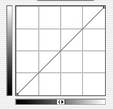
B
C
Points along a curve:
A. Highlights B. Midtones C. Shadows
The horizontal axis of the graph represents the original intensity values of the pixels (Input levels); the vertical axis represents the new color values (Output levels). In the default diagonal line, all pixels have identical Input and Output values.
Note: For RGB images, Cur ves displays intensity values from 0 to 255, with shadows (0) on the left. For CMYK images, Cur ves displays percentages from 0 to 100, with highlights (0) on the left. To reverse the display of shadows and highlights at any time, click the double arrow below the cur ve.
2 To adjust the color balance of the image, choose the channel (or channels) you want to adjust from the Channel menu.
To edit a combination of color channels at the same time, Shift-select the channels in the Channels palette before choosing Curves. The Channel menu then displays the abbrevia- tions for the target channels-for example, CM for cyan and magenta. The menu also contains the individual channels for the selected combination.
3 To make the Curves grid finer, hold down Alt ( Windows) or Option (Mac OS), and click the grid. Alt/Option-click again to make the grid larger.
4 Click any points on the curve that you want to remain fixed. For example, if you want to adjust the midtones while minimizing the effect on the highlights and shadows, click the quarter and three-quarter points on the curve.
You can add up to 14 control points to the curve, locking those values. To remove a control point, drag it off the graph, select it and press Delete, or Ctrl-click ( Windows) or
Command-click (Mac OS) it. You cannot delete the endpoints of the curve.
To determine the lightest and darkest areas in the image, drag over the image. The intensity values of the area under the pointer, along with the corresponding location
on the curve, are displayed in the Curves dialog box.
5 Do any of the following to adjust the curve:
. Drag the curve until the image looks the way you want it.
. Click a point on the curve, and enter Input and Output values for the point.
. Select the pencil at the bottom of the dialog box, and drag to draw a new curve. You can hold down Shift to constrain the curve to a straight line, and click to define endpoints. When you're finished, click Smooth if you want to smooth the curve.
. Click Auto to adjust the image using the settings specified in the Auto Correction
Options dialog box. For more information, see "Setting auto correction options
(Photoshop)" on section 144.
The following shortcuts work with the Curves dialog box:
. Ctrl-click ( Windows) or Command-click (Mac OS) in the image to set a point on the curve in the current channel specified in the Curves dialog box.
. Shift+Ctrl-click ( Windows) or Shift+Command-click (Mac OS) in the image to set a point on the curve for the selected color in each color component channel (but not in the composite channel).
. Shift-click points on the curve to select multiple points. Selected points appear filled with black.
. Click in the grid, or press Ctrl-D ( Windows) or Command-D (Mac OS) to deselect all points on the curve.
. Press arrow keys to move selected points on the curve.
. Press Ctrl+Tab ( Windows) or Control+Tab (Mac OS) to move forward through control points on the curve.
. Press Shift+Ctrl+Tab ( Windows) or Shift+Control+Tab (Mac OS) to move backward through control points on the curve.
Using target values to set highlights and shadows
(Photoshop)
Professional color technicians typically set the highlights and shadows in an image by assigning their lightest and darkest CMYK ink values to the lightest and darkest areas of detail in the image.
When identifying the lightest and darkest areas of an image, it's important to identify representative highlights and shadows. Otherwise the tonal range may be expanded unnecessarily to include extreme pixel values that don't give the image detail. A highlight area must be a printable highlight, not specular white. Specular white has no detail, and so no ink is printed on the paper. For example, a spot of glare is specular white, not a printable highlight.
Note: You can do the following procedure in ImageReady in the Levels dialog box.
To use target values to set highlights and shadows:
1 Select the eyedropper tool, and choose 3 by 3 Average from the Sample Size menu in the eyedropper tool options. This ensures a representative sample of an area rather than the value of a single screen pixel.
2 Open the Levels
or Curves dialog box. (See "Making color adjustments" on section 132.)
When you open Levels
or Curves, the eyedropper tool
![]() is still active outside the dialog box. You
still have access to the scroll
controls
and to the hand and zoom tools
by using keyboard shortcuts.
is still active outside the dialog box. You
still have access to the scroll
controls
and to the hand and zoom tools
by using keyboard shortcuts.
3 Do one of the following to identify areas of representative highlights and shadows in the image:
. Move the pointer around the image, and look at the Info palette to find the lightest and darkest areas. (See "Seeing the color values of pixels (Photoshop)" on section 133.)
. Drag the pointer in the image, and look at the Curves dialog box to find the lightest and darkest points in the range of values. This method does not work if the Curves dialog box is set to the CMYK composite channel.
You can also use the Threshold command to identify representative highlights and shadows before opening Levels or Curves. (See "Using the Threshold command
(Photoshop)" on section 154.)
4 Do one of the following to assign color values to the lightest area of the image:
. Double-click the Set White
Point eyedropper tool ![]() in the Levels or Curves
dialog box to display the Color Picker. Enter the values
you want to assign to the lightest area
in the image, and click OK. Then click the highlight you identified in step 3.
in the Levels or Curves
dialog box to display the Color Picker. Enter the values
you want to assign to the lightest area
in the image, and click OK. Then click the highlight you identified in step 3.
If you accidentally click the wrong highlight, hold down Alt ( Windows) or Option
(Mac OS), and click Reset in the Levels or Curves dialog box.
. Click Options in the Levels or Curves dialog box. Click the Highlights color swatch to display the Color Picker. Enter the values you want to assign to the lightest area in the image, and click OK.
In most situations when you are printing on white paper, you can achieve a good highlight in an average-key image using CMYK values of 5, 3, 3, and 0, respectively. An approximate RGB equivalent is 244, 244, 244, and an approximate grayscale equivalent is a 4% dot. You can approximate these target values quickly by entering 96 in the Brightness (B) text box under the HSB section of the Color Picker.
With a low-key image, you might want to set the highlight to a lower value to avoid too much contrast. Experiment with Brightness values between 96 and 80.
![]()
Original
![]()
Highlight set using average-key target brightness values (B: 96); and highlight set using lower target brightness values (B: 80)
The pixel values throughout the image are adjusted proportionately to the new highlight values. Any pixels lighter than the area you clicked become specular white. The Info palette shows the values both before and after the color adjustment.
5 Do one of the following to assign color values to the darkest area of the image:
. Double-click the Set Black Point eyedropper tool
![]() in the Levels or Curves
dialog box to display the Color Picker. Enter the values you want to assign to the darkest area in the
image, and click OK. Then click the shadow you
identified in step 3.
in the Levels or Curves
dialog box to display the Color Picker. Enter the values you want to assign to the darkest area in the
image, and click OK. Then click the shadow you
identified in step 3.
. Click Options in the Levels or Curves dialog box. Click the Shadows color swatch to display the Color Picker. Enter the values you want to assign to the darkest area in the image, and click OK.
In most situations when you're printing on white paper, you can achieve a good shadow in an average-key image using CMYK values of 65, 53, 51, and 95. An approximate RGB equiv- alent is 10, 10, 10, and an approximate grayscale equivalent is a 96% dot.You can approx- imate these same values quickly by entering 4 in the Brightness (B) text box under the HSB section of the Color Picker.
With a high-key image, you might want to set the shadow to a higher value to maintain detail in the highlights. Experiment with Brightness values between 4
and 20.
![]()
Original
![]()
Shadow set using average-key target brightness values (B: 4); and shadow set using higher target brightness values (B: 20)
To use Threshold mode to identify the lightest and darkest areas in an image:
1 Open the Levels dialog box, and select Preview.
Note: The Threshold mode in Levels is not available for CMYK images.
2 Hold down Alt ( Windows) or Option (Mac OS), and drag the white or black Input Levels triangle.
The image
changes to Threshold mode, and a high-contrast
preview image appears. The visible areas of the image indicate
the lightest parts of the image if you are
dragging the white slider, and the darkest parts if you are
dragging the black slider.
If a color channel is selected in the Levels dialog box,
the black area indicates where
none of the given color component
exists.
Image preview in Threshold mode
3 Slowly drag the slider to the center of the histogram to identify the light or dark areas in the image. Use these pixels for targeting the black point and white point in your image.
Setting auto correction options (Photoshop)
The Auto Correction Options dialog box lets you automatically adjust the overall tonal range of an image, specify clipping percentages, and assign color values to shadows, midtones, and highlights. You can apply the settings during a single use of the Levels dialog box or Curves dialog box, or you can save the settings for future use with the Levels, Auto Levels, Auto Contrast, Auto Color, and Curves commands.
To set auto correction options:
1 Click Options in the Levels dialog box or Curves dialog box.
2 Specify the algorithm you want Photoshop to use to adjust the overall tonal range of an image:
. Enhance Monochromatic Contrast clips all channels identically. This preserves the overall color relationship while making highlights appear lighter and shadows appear darker. The Auto Contrast command uses this algorithm.
. Enhance Per Channel Contrast maximizes the tonal range in each channel to produce a more dramatic correction. Because each channel is adjusted individually, Enhance Per Channel Contrast may remove or introduce color casts. The Auto Levels command uses this algorithm.
. Find Dark & Light Colors finds the average lightest and darkest pixels in an image and uses them to maximize contrast while minimizing clipping. The Auto Color command uses this algorithm.
3 Select Snap Neutral Midtones if you want Photoshop to find an average nearly neutral color in an image and then adjust the gamma values to make the color neutral. The Auto Color command uses this algorithm.
4 To specify how much to clip black and white pixels, enter percentages in the Clip text boxes. A value between 0.5% and 1% is recommended.
By default, Photoshop clips the black and white pixels by 0.5%-that is, it ignores the first
0.5% of either extreme when identifying the lightest and darkest pixels in the image. This ensures that white and black values are based on representative rather than extreme pixel values.
5 To assign color values to the darkest, neutral, and lightest areas of an image, click a color swatch. For guidelines on setting color values, see "Using target values to set highlights and shadows (Photoshop)" on section 141.
6 Do one of the following:
. To save the settings for use in the current Levels or Curves dialog box, click OK. If you subsequently click the Auto button, Photoshop will reapply the same settings to the image.
. To save the settings as the default, select Save as Defaults, then click OK. The next time you open the Levels or Curves dialog box, you can apply the same setting by clicking the Auto button. The default clipping percentages are also used by the Auto Level, Auto Contrast, and Auto Color commands.
Adjusting the gamma value of an image (ImageReady) Gamma measures the brightness of midtone values produced by a device (often a monitor). A higher gamma value yields an overall darker image. Windows systems use a higher gamma value than Mac OS systems, with the result that the same image is noticeably darker on a Windows system than on a Mac OS system.
Image with Windows gamma and Mac OS gamma
Designers, particularly those who use Mac OS systems to create images that will be viewed primarily on Windows systems, must consider the issue of cross-platform gamma. You can modify the gamma value of an image to compensate for the differences between Windows and Mac OS monitors.
Note: The Gamma dialog box modifies the pixel values in an image. By contrast, the View > Preview commands adjust the appearance of the image on your monitor but do not change the image's pixel values.
To adjust the gamma value automatically:
1 Choose Image > Adjustments > Gamma.
2 Select Preview to preview the adjustment in the image.
3 Adjust the gamma:
. Select Windows to Macintosh to adjust gamma for display in Mac OS.
. Select Macintosh to Windows to adjust gamma for display in Windows.
Note: Images created in Photoshop 4.0 or earlier use Mac OS gamma value (1.8) by default and should be adjusted for display in Windows (unless gamma was adjusted when the image was created). Images created in Photoshop 5.0 or later use Windows gamma value
(2.2) by default and will be at the correct gamma for display in Windows with no adjustment.
To adjust the gamma value manually:
1 Choose Image > Adjustments > Gamma.
2 Select Preview to preview the adjustment in the image.
3 Drag the Gamma slider, or enter a value in the text box between 0.1 and 9.99. The Gamma slider measures the amount of change from the current gamma value. ( The slider does not indicate the actual gamma value.)
About the color wheel
Because there are numerous ways to achieve similar results in color balance, it's useful to consider the type of image you have and the effect you want to produce. If you're new to adjusting color components, it helps to keep a diagram of the color wheel on hand. You can use the color wheel to predict how a change in one color component affects other colors and also how changes translate between RGB and CMYK color models.
A B
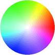
F C
E D
Color wheel:
A. Green B. Yellow C. Red D. Magenta E. Blue F. Cyan
For example, you can decrease the amount of any color in an image by increasing the amount of its opposite on the color wheel-and vice versa. Similarly, you can increase and decrease a color by adjusting the two adjacent colors on the wheel, or even by adjusting the two colors adjacent to its opposite.
In a CMYK image, you can decrease magenta either by decreasing the amount of magenta or its complement (by adding cyan and yellow). You can even combine these two correc- tions, minimizing their effect on overall lightness. In an RGB image, you can decrease magenta by removing red and blue or by adding green. All of these adjustments result in an overall color balance containing less magenta.
Using the Color Balance command (Photoshop)
The Color Balance command changes the overall mixture of colors in an image for gener- alized color correction.
To use the Color Balance command:
1 Make sure the composite channel is selected in the Channels palette. This command is available only when you're viewing the composite channel.
2 Open the Color Balance dialog box. (See "Making color adjustments" on section 132.)
3 Select Shadows, Midtones, or Highlights to select the tonal range on which you want to focus the changes.
4 Select Preserve Luminosity to prevent changing the luminosity values in the image while changing the color. This option maintains the tonal balance in the image.
5 Drag a slider toward a color you want to increase in the image; drag a slider away from a color you want to decrease in the image.
The values above the color bars show the color changes for the red, green, and blue channels. (For Lab images, the values are for the a and b channels.) Values can range from
-100 to +100.
Using the Hue/Saturation command
The Hue/Saturation command lets you adjust the hue, saturation, and lightness of the entire image or of individual color components in an image. Adjusting the hue, or color, represents a move around the color wheel. Adjusting the saturation, or purity of the color, represents a move across its radius.
A

B
C
D

Color wheel and radius of color wheel:
A. Saturation B. Hue C. Brightness D. Hues
You can also use the Colorize option to add color to a grayscale image converted to RGB, or to an RGB image-for example, to make it look like a duotone by reducing its color values to one hue.
To use the Hue/Saturation command:
1 Open the Hue/Saturation dialog box. (See "Making color adjustments" on section 132.) The two color bars in the dialog box represent the colors in their order on the color wheel. The upper color bar shows the color before the adjustment; the lower bar shows how the adjustment affects all of the hues at full saturation.
2 (Photoshop) For Edit, choose which colors to adjust:
. Choose Master to adjust all colors at once.
. Choose one of the other preset color ranges listed for the color you want to adjust. An adjustment slider appears between the color bars, which you can use to edit any
range of hues. (For information on how to modify the slider's range, see the instructions following this procedure.)
3 For Hue, enter a value or drag the slider until the colors appear as you want.
The values displayed in the text box reflect the number of degrees of rotation around the wheel from the pixel's original color. A positive value indicates clockwise rotation, a negative value counterclockwise rotation. Values can range from -180 to +180.
4 For Saturation, enter a value or drag the slider to the right to increase the saturation or to the left to decrease it.
The color shifts away from or toward the center of the wheel, relative to the beginning color values of the selected pixels. Values can range from -100 to +100.
5 For Lightness, enter a value or drag the slider to the right to increase the lightness or to the left to decrease it. Values can range from -100 to +100.
To modify the range of an adjustment slider (Photoshop):
1 Choose an individual color from the Edit menu in the dialog box.
2 Do any of the following to the adjustment slider:
. Drag one of the white triangles to adjust the amount of color fall-off without affecting the range.
. Drag the area between the triangle and the vertical bar to adjust the range without affecting the amount of fall-off.
. Drag the center area to move the entire adjustment slider, selecting a different color area.
. Drag one of the vertical white bars next to the dark gray area to adjust the range of the color component. Increasing the range decreases the fall-off, and vice versa.
. Ctrl-drag ( Windows) or Command-drag (Mac OS) the color bar so that a different color is in the center of the bar.
![]()
A B C D
Hue/Saturation adjustment slider:
A. Adjusts fall-off without affecting range B. Adjusts range without affecting fall-off C. Moves entire slider D. Adjusts range of color component
If you modify the adjustment slider so that it falls into a different color range, the name changes to reflect this. For example, if you choose Yellow and alter its range so that it falls in the red part of the color bar, the name changes to Red 2. You can convert up to six of the individual color ranges to varieties of the same color range (for example, Red through
Red 6).
Note: By default, the range of color selected when you choose a color component is 30 wide, with 30 of fall-off on either side. Setting the fall-off too low can produce banding in the image.
3
To edit the range by choosing colors from the image,
select the eyedropper tool
![]() in the dialog box and click in the image. Use
the eyedropper + tool to add to
the range; use the eyedropper - tool
to subtract from the range.
in the dialog box and click in the image. Use
the eyedropper + tool to add to
the range; use the eyedropper - tool
to subtract from the range.
While the eyedropper tool is selected, you can also press Shift to add to the range or Alt
(Windows) or Option (Mac OS) to subtract from it.
To colorize a grayscale image or create a monotone effect:
1 (Photoshop) If you are colorizing a grayscale image, choose Image > Mode > RGB Color to convert the image to RGB.
2 Open the Hue/Saturation dialog box. (See "Making color adjustments" on section 132.)
3 Select Colorize. The image is converted to the hue of the current foreground color, if the foreground color is not black or white. The lightness value of each pixel does not change.
4 Use the Hue slider to select a new color if desired. Use the Saturation and Lightness sliders to adjust the saturation and lightness of the pixels.
Using the Replace Color command (Photoshop)
The Replace Color command lets you create a mask around specific colors and then replace those colors in the image. You can set the hue, saturation, and lightness of the area identified by the mask. The mask is temporary.
To use the Replace Color command:
1 Open the Replace Color dialog box. (See "Making color adjustments" on section 132.)
2 Select a display option:
. Selection to display the mask in the preview box. Masked areas are black, and unmasked areas are white. Partially masked areas (areas covered with a semitrans- parent mask) appear as varying levels of gray according to their opacity. For more infor- mation, see "Using channel calculations to blend layers and channels (Photoshop)" on section 275.
. Image to display the image in the preview box. This option is useful when you are working with a magnified image or have limited screen space.
3 Click in the image or in the preview box to select the areas exposed by the mask. Shift- click or use the eyedropper + button to add areas; Alt-click ( Windows), Option-click
(Mac OS), or use the eyedropper - button to remove areas.
4 Adjust the tolerance of the mask by dragging the Fuzziness slider or entering a value. This controls the degree to which related colors are included in the selection.
5 Drag the Hue, Saturation, and Lightness sliders (or enter values in the text boxes) to change the color of the selected areas.
Using the Selective Color command (Photoshop)
Selective color correction is a technique used by high-end scanners and separation programs to increase and decrease the amount of process colors in each of the additive and subtractive primary color components in an image. Even though Selective Color uses CMYK colors to correct an image, you can use it on RGB images as well as on images that will be printed.
Selective color correction is based on a table that shows the amount of each process ink used to create each primary color. By increasing and decreasing the amount of a process ink in relation to the other process inks, you can modify the amount of a process color in any primary color selectively-without affecting any other primary colors. For example, you can use selective color correction to dramatically decrease the cyan in the green component of an image while leaving the cyan in the blue component unaltered.
To use the Selective Color command:
1 Make sure the composite channel is selected in the Channels palette. The Selective
Color command is available only when you're viewing the composite channel.
2 Open the Selective Color dialog box. (See "Making color adjustments" on section 132.)
3 Choose the color you want to adjust from the Colors menu at the top of the dialog box. Color sets consist of the primary additive and subtractive colors plus whites, neutrals,
and blacks.
4 For Method, select an option:
. Relative to change the existing amount of cyan, magenta, yellow, or black by its percentage of the total. For example, if you start with a pixel that is 50% magenta and add 10%, 5% is added to the magenta (10% of 50% = 5%) for a total of 55% magenta.
(This option cannot adjust pure specular white, which contains no color components.)
. Absolute to adjust the color in absolute values. For example, if you start with a pixel that is 50% magenta and add 10%, the magenta ink is set to a total of 60%.
Note: The adjustment is based on how close a color is to one of the options in the Colors menu. For example, 50% magenta is midway between white and pure magenta and will receive a proportionate mix of corrections defined for the two colors.
5 Drag the sliders to increase or decrease the components in the selected color.
Making quick overall adjustments to an image
The Brightness/Contrast, Auto Levels, Auto Contrast, Variations, and Auto Color
(Photoshop) commands change colors or tonal values in an image but are not as precise or flexible as the high-end color adjustment tools. They provide a quick and simple way to make overall adjustments.
Using the Brightness/Contrast command
The Brightness/Contrast command lets you make simple adjustments to the tonal range of an image. Unlike Curves and Levels, this command makes the same adjustment to every pixel in the image. The Brightness/Contrast command does not work with individual channels and is not recommended for high-end output, because it can result in a loss of detail in the image.
To use the Brightness/Contrast command:
1 Open the Brightness/Contrast dialog box. (See "Making color adjustments" on section 132.)
2 Drag the sliders to adjust the brightness and contrast.
Dragging to the left decreases the level and to the right increases it. The number at the right of each slider value displays the brightness or contrast value. Values can range from -100 to +100.
Using the Auto Levels command
The Auto Levels command moves the Levels sliders automatically to set highlights and shadows. It defines the lightest and darkest pixels in each color channel as white and black and then redistributes intermediate pixel values proportionately. Because Auto Levels adjusts each color channel individually, it may remove or introduce color casts.
By default, this feature clips the white and black pixels by 0.5%-that is, it ignores the first
0.5% of either extreme when identifying the lightest and darkest pixels in the image. This ensures that white and black values are based on representative rather than extreme pixel values.
Auto Levels gives good results when an image with an average distribution of pixel values needs a simple contrast adjustment or when an image has an overall color cast. However, adjusting the Levels or Curves (Photoshop) controls manually is more precise.
To use the Auto Levels command:
Choose Image > Adjustments > Auto Levels.
To change the amount of white and black values clipped:
Do one of the following:
. (Photoshop) Set clipping values in the Auto Correction Options dialog box. For more information, see "Setting auto correction options (Photoshop)" on section 144.
. (ImageReady) Hold down Alt ( Windows) or Option (Mac OS), and click Options in the Levels dialog box. Enter the percentage of extreme highlight and shadow pixels to ignore, and click OK. A value between 0.5% and 1% is recommended.
Using the Auto Contrast command
The Auto Contrast command adjusts the overall contrast and mixture of colors in an RGB image automatically. Because it does not adjust channels individually, Auto Contrast does not introduce or remove color casts. It maps the lightest and darkest pixels in the image to white and black, which makes highlights appear lighter and shadows appear darker. When identifying the lightest and darkest pixels in an image, Auto Contrast clips the white and black pixels by 0.5%-that is, it ignores the first 0.5% of either extreme. This ensures that white and black values are based on representative rather than extreme pixel values. Auto Contrast can improve the appearance of many photographic or continuous-tone images. It does not improve flat-color images.
To use the Auto Contrast command:
Choose Image > Adjustments > Auto Contrast.
To change the amount of white and black values clipped:
Do one of the following:
. (Photoshop) Set clipping values in the Auto Correction Options dialog box. For more information, see "Setting auto correction options (Photoshop)" on section 144.
. (ImageReady) Hold down Alt ( Windows) or Option (Mac OS), and click Options in the Levels dialog box. Enter the percentage of extreme highlight and shadow pixels to ignore, and click OK. A value between 0.5% and 1% is recommended.
Using the Auto Color command (Photoshop)
The Auto Color command adjusts the contrast and color of an image by searching the actual image rather than the channels' histograms for shadows, midtones, and highlights. It neutralizes the midtones and clips the white and black pixels based on the values set in the Auto Correction Options dialog box. (See "Setting auto correction options
(Photoshop)" on section 144.)
To use the Auto Color command:
Choose Image > Adjustments > Auto Color.
Using the Variations command
The Variations command lets you adjust the color balance, contrast, and saturation of an image by showing you thumbnails of alternatives.
This command is most useful for average-key images that don't require precise color adjustments. It does not work on indexed-color images (Photoshop).
To use the Variations command:
1 Open the Variations dialog box. (See "Making color adjustments" on section 132.)
Note: If the Variations command does not appear in the Adjustments submenu, the Varia- tions plug-in module may not have been installed. (See "Using plug-in modules" on
page 58.)
The two thumbnails at the top of the dialog box show the original selection (Original) and the selection with its currently selected adjustments (Current Pick). When you first open the dialog box, these two images are the same. As you make adjustments, the Current Pick image changes to reflect your choices.
2 Select Show Clipping if you want to display a neon preview of areas in the image that will be clipped by the adjustment-that is, converted to pure white or pure black. Clipping can result in undesirable color shifts, as distinct colors in the original image are mapped to the same color. Clipping does not occur when you adjust midtones.
Note: Clipped colors are not the same as out-of-gamut colors.
3 Select what to adjust in the image:
. Shadows, Midtones, or Highlights to indicate whether you want to adjust the dark, middle, or light areas.
. Saturation to change the degree of hue in the image. If you exceed the maximum saturation for a color, it may be clipped.
4 Drag the Fine/Coarse slider to determine the amount of each adjustment. Moving the slider one tick mark doubles the adjustment amount.
5 Adjust the color and brightness:
. To add a color to the image, click the appropriate color thumbnail.
. To subtract a color, click the thumbnail for its opposite color. (See "About the color wheel" on section 146.) For example, to subtract cyan, click the More Red thumbnail.
. To adjust brightness, click a thumbnail on the right side of the dialog box.
Each time you click a thumbnail, other thumbnails change. The center thumbnail always reflects the current choices.
Applying special color effects to images
The Desaturate, Invert, Equalize (Photoshop), Threshold (Photoshop), and Posterize
(Photoshop) commands change colors or brightness values in an image but are typically used for enhancing color and producing special effects, rather than for correcting color. Note: You can also make color adjustments by blending colors from different channels.
(See "Mixing color channels (Photoshop)" on section 271.)
Using the Desaturate command
The Desaturate command converts a color image to a grayscale image in the same color mode. For example, it assigns equal red, green, and blue values to each pixel in an RGB image to make it appear grayscale. The lightness value of each pixel does not change. This command has the same effect as setting Saturation to -100 in the Hue/Saturation dialog box.
Note: If you are working with a multilayer image, Desaturate converts the selected layer only.
To use the Desaturate command:
Choose Image > Adjustments > Desaturate.
Using the Invert command
The Invert command inverts the colors in an image. You might use this command to make a positive black-and-white image negative or to make a positive from a scanned black- and-white negative.
Note: Because color print film contains an orange mask in its base, the Invert command cannot make accurate positive images from scanned color negatives. Be sure to use the proper settings for color negatives when scanning film on slide scanners.
When you invert an image, the brightness value of each pixel in the channels is converted to the inverse value on the 256-step color-values scale. For example, a pixel in a positive image with a value of 255 is changed to 0, and a pixel with a value of 5 to 250.
To use the Invert command:
Choose Image > Adjustments > Invert, or choose Layer > New Adjustment Layer > Invert
(Photoshop).
Using the Equalize command (Photoshop)
The Equalize command redistributes the brightness values of the pixels in an image so that they more evenly represent the entire range of brightness levels. When you apply this command, Photoshop finds the brightest and darkest values in the composite image and remaps them so that the brightest value represents white and the darkest value repre- sents black. Photoshop then attempts to equalize the brightness-that is, to distribute the intermediate pixel values evenly throughout the grayscale.
You might use the Equalize command when a scanned image appears darker than the original and you want to balance the values to produce a lighter image. Using Equalize together with the Histogram command lets you see before-and-after brightness comparisons.
To use the Equalize command:
1 Choose Image > Adjustments > Equalize.
2 If you selected an area of the image, select what to equalize in the dialog box, and click OK:
. Equalize Selected Area Only to evenly distribute only the selection's pixels.
. Equalize Entire Image Based on Selected Area to evenly distribute all image pixels based on those in the selection.
Using the Threshold command (Photoshop)
The Threshold command converts grayscale or color images to high-contrast, black-and- white images. You can specify a certain level as a threshold. All pixels lighter than the threshold are converted to white; all pixels darker are converted to black. The Threshold command is useful for determining the lightest and darkest areas of an image.
To use the Threshold command to convert images to black and white:
1 Open the Threshold dialog box. (See "Making color adjustments" on section 132.)
The Threshold dialog box displays a histogram of the luminance levels of the pixels in the current selection.
2 Drag the slider below the histogram until the threshold level you want appears at the top of the dialog box, and click OK. As you drag, the image changes to reflect the new threshold setting.
To use the Threshold command to identify representative highlights and shadows:
1 Open the Threshold dialog box. (See "Making color adjustments" on section 132.)
2 Select Preview.
3 To identify a representative highlight, drag the slider to the far right until the image becomes pure black. Drag the slider slowly toward the center until some solid white areas appear in the image, and place a color sampler on one of the areas.
4 To identify a representative shadow, drag the slider to the far left until the image becomes pure white. Drag the slider slowly toward the center until some solid black areas appear in the image, and place a color sampler on one of the areas.
5 Click Cancel to close the Threshold dialog box without applying changes to the image. You can use the Info palette readouts of the two color samplers to determine your highlight and shadow values.
Using the Posterize command (Photoshop)
The Posterize command lets you specify the number of tonal levels (or brightness values) for each channel in an image and then maps pixels to the closest matching level. For example, choosing two tonal levels in an RGB image gives six colors, two for red, two for green, and two for blue.
This command is useful for creating special effects, such as large, flat areas in a photo- graph. Its effects are most evident when you reduce the number of gray levels in a grayscale image. But it also produces interesting effects in color images.
If you want a specific number of colors in your image, convert the image to grayscale and specify the number of levels you want. Then convert the image back to the
previous color mode, and replace the various gray tones with the colors you want.
To use the Posterize command:
1 Open the Posterize dialog box. (See "Making color adjustments" on section 132.)
2 Enter the number of tonal levels you want, and click OK.
Using the Gradient Map command (Photoshop)
The Gradient Map command maps the equivalent grayscale range of an image to the colors of a specified gradient fill. If you specify a two-color gradient fill, for example, shadows in the image map to one of the endpoint colors of the gradient fill, highlights map to the other endpoint color, and midtones map to the gradations in between.
To use the Gradient Map command:
1 Open the Gradient Map dialog box. (See "Making color adjustments" on section 132.)
2 Specify the gradient fill you want to use:
. To choose from a list of gradient fills, click the triangle to the right of the gradient fill displayed in the Gradient Map dialog box. Click to select the desired gradient fill, and then click in a blank area of the dialog box to dismiss the list. (See "Managing libraries with the Preset Manager (Photoshop)" on section 54 for information on customizing the gradient fill list.)
. To edit the gradient fill currently displayed in the Gradient Map dialog box, click the gradient fill. Then modify the existing gradient fill or create a new gradient fill.
(See "Creating smooth gradient fills" on section 245.)
By default, the shadows, midtones, and highlights of the image are mapped respectively to the starting (left) color, midpoint, and ending (right) color of the gradient fill.
3 Select either, none, or both of the Gradient Options:
. Dither adds random noise to smooth the appearance of the gradient fill and reduce banding effects.
. Reverse switches the direction of the gradient fill, reversing the gradient map.
Sharpening images
Unsharp masking, or USM, is a traditional film compositing technique used to sharpen edges in an image. The Unsharp Mask filter corrects blurring introduced during photo- graphing, scanning, resampling, or printing. It is useful for images intended for both print and online viewing.
Unsharp Mask locates pixels that differ from surrounding pixels by the threshold you specify and increases the pixels' contrast by the amount you specify. In addition, you specify the radius of the region to which each pixel is compared. The effects of the Unsharp Mask filter are far more pronounced on-screen than in high-resolution output.
If your final destination is print, experiment to determine what settings work best for your image.
For information on other filters for sharpening images, see "Sharpen filters" on section 333.
To use Unsharp Mask to sharpen an image:
1 Choose Filter > Sharpen > Unsharp Mask. Make sure the Preview option is selected. Click on the image in the preview window to see how the image looks without the sharpening. Drag in the preview window to see different parts of the image,
and click + or - to zoom in or out.
2 Do one of the following:
. Drag the Amount slider or enter a value to determine how much to increase the contrast of pixels. For high-resolution printed images, an amount between 150% and
200% is usually recommended.
. Drag the Radius slider or enter a value to determine the number of pixels surrounding the edge pixels that affect the sharpening. For high-resolution images, a Radius between 1 and 2 is usually recommended. A lower value sharpens only the edge pixels, whereas a higher value sharpens a wider band of pixels. This effect is much less noticeable in print than on-screen, because a 2-pixel radius represents a smaller area
in a high-resolution printed image.
. Drag the Threshold slider or enter a value to determine how different the sharpened pixels must be from the surrounding area before they are considered edge pixels and sharpened by the filter. To avoid introducing noise (in images with fleshtones, for example), experiment with Threshold values between 2 and 20. The default Threshold value (0) sharpens all pixels in the image.
If applying Unsharp Mask makes already bright colors appear overly saturated, convert the image to Lab mode and apply the filter to the Lightness channel only.
This sharpens the image without affecting the color components.
|
Politica de confidentialitate | Termeni si conditii de utilizare |

Vizualizari: 1170
Importanta: ![]()
Termeni si conditii de utilizare | Contact
© SCRIGROUP 2025 . All rights reserved