| CATEGORII DOCUMENTE |
| Bulgara | Ceha slovaca | Croata | Engleza | Estona | Finlandeza | Franceza |
| Germana | Italiana | Letona | Lituaniana | Maghiara | Olandeza | Poloneza |
| Sarba | Slovena | Spaniola | Suedeza | Turca | Ucraineana |
Quality Assessment: Metrics
In Chapter 15, Perry developed ways to assess performance with regard to cost and schedule variances. Quality assessment is the other element in monitoring performance.
Establishing measurements for quality is a way to identify opportunities to reduce waste, determine how the project is achieving its goals, ascertain trends, and establish baselines for future projects.
Quality can have several meanings, so Perry defines the word in terms of his project. After consulting the customer and reviewing project documentation (the statement of work), he defines quality as service that satisfies a defined degree of excellence. In terms of the Smythe Project, quality is satisfying the requirements set by the Smythe family. Focusing on his customers requirements, Perry can determine the measurements to use. Metrics are the tools and techniques he will use to track and assess quality.
Introduction to Metrics
There are two basic categories of metrics, qualitative and quantitative. Qualitative metrics are intangible, noncalibrated measures. Examples include degree of customer satisfaction and degree of importance. These metrics are subjective. Quantitative metrics are tangible, calibrated measures. Examples include financial analysis and parametrics. These metrics are objective.
Qualitative and quantitative metrics can be used to measure the satisfaction of the customers requirements, as well as the efficiency and effectiveness of processes for building a product or delivering a service. In their simplest form, quality metrics measure the relationship between the number of errors and a unit of measure. An error is the difference between what is expected and what has occurredin other words, a variance.
Of course, Perry knows that metrics do not happen spontaneously. He must set up a process for collecting data, then analyzing the results. So Perry takes the following actions.
He determines what to measure. The statement of work provides much information; however, he also interviews the customer and examines the metrics used for earlier projects of a similar nature.
He seeks agreement on what metrics to use. There are quantitative and qualitative metrics, simple and complex. People must see the value of a metric; otherwise, they will not support the collection efforts or respect the results.
He obtains the software to perform the metrics. These include project management software, database applications, and modeling packages.
The Collection and Analysis of Data
Perry must build a good database. Without data he cannot do much. If the data lack reliability and validity, they produce useless results. But having good project management disciplines in place will help in collecting reliable, valid data. Perry has the expertise to collect good data, including statistical knowledge, analytical prowess, and communications skills. Without these skills, establishing the metrics would be extremely difficult. Also, Perry must exercise discipline when implementing the metrics. This means collecting data regularly and using comparable methods over time.
Perry follows five steps to measure quality: (1) identifying what needs to be measured, (2) collecting the data, (3) compiling the data, (4) analyzing the data, and (5) communicating the results.
Identify the Measures
As noted earlier, there are multiple ways to identify what needs to be measured. Perry reviews project and technical documentation. He meets with people directly as well as remotely connected to the project. He reviews the history of similar projects. He selects benchmarks, or examples from other companies against which to compare his results. In any event, he must have buy-in for whatever methods he chooses. Without buy-in, support may decline.
Of course, the audience will largely dictate what metrics to use. The project team may want to measure technical aspects. Senior management and the customer may want measurements of customer satisfaction. Perry is interested in measuring his project management. In any question of determinants, business considerations should be first. Ultimately, customer satisfaction is the quality metric.
A way to determine business metrics is to identify key project indicators, or KPI. These are elements of a project that contribute to successful completion of a project. On the Smythe Project, a KPI is the number of complaints about the bridal shower. To identify KFIs, determine all the processes involved in project management, process management, and technical performance. Then, with selected representatives, rank those processes and select the most important top ten.
|
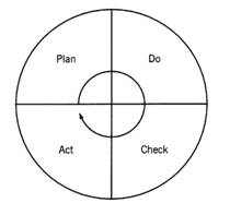
PDCA A useful concept for performing metrics is the Plan, Do, Check, Act cycle, also known as the PDCA Wheel or the Deming Wheel. The Plan is developing an approach for improving a process or implementing a metric or both. The Do is turning the plan into reality by executing it. The Check is determining if the improvement or metric is working. The Act is making any changes to improve the process or metric. The cycle is shown below.
This cycle repeats throughout the process or measurement; it ensures stepwise refinement of the plan. In reality, the PDCA cycle can be applied to any decision-making endeavor. Managing a project lends itself to application of the PDCA cycle; project plans are continually revised to reflect reality. |
Whatever the metrics chosen, Perry answers the following questions for each measurement tool:
Who is the metric for?
What purpose will it serve?
How often will the measurement be taken?
What is the formula?
What is the data source?
Collect the Data
Perry uses data from the project data repository created by his project management software. He ensures the data are current, thanks to input from status review.
In addition to the data repository, he searches the project history files and project library for relevant data. He can access completed forms, past reports, and memos. He also uses alternative sources like the Internet for data in the public domain and available through think tanks.
Compile the Data
Perry must put the data into a usable format. One of his first actions is to cleanse the data, identifying bad (irrelevant) data and standardizing it (putting it into the same format). Perry sorts the data, reviews it to determine any anomalies (e.g., alphabetic characters in a numeric field) and ensures that it has all the decimal points in the right place. While doing this, he avoids introducing bias, which would influence the results. For example, he removes data to which he might respond subjectively, such as data originating from a person or system that he dislikes.
Data are raw, while information is data in a meaningful form. Perry has several tools to convert data into information, including Pareto charts, checksheets, scattergrams, histograms, control charts, and trend charts.
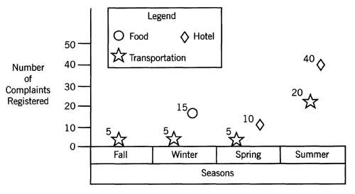
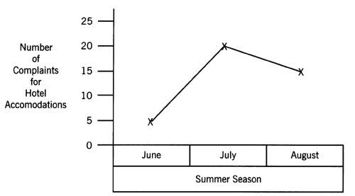
Pareto charts display information to determine the potential causes of a problem. A bar chart (not a Gantt chart) shows the major categories or elements on the x-axis and the prioritized numbers of a result (e.g., number of complaints) on the y-axis, as shown in Exhibit 16-1. The highest bar has the greatest likelihood of being the cause of the problem.
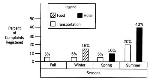
Checksheets are documents that record the frequency of distribution of incidents. Each occurrence is recorded in an interval identified, as shown in Exhibit 16-2. The information identifies what intervals have the greatest and least number of occurrences. The checksheet also graphically displays information in the form of a histogram, as shown in Exhibit 16-3.
Scattergrams, sometimes called scatter or correlation charts, show the relationship between two variables, as shown in Exhibit 16-4. Normal relationships are bunched together; the abnormal relationships are outside the bunch, thereby indicating an anomalous situation.
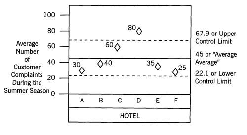
Control charts, like the scattergrams, identify normal and anomalous situations, specifically variance from the average. Upper permissible and lower levels of variation are identified. As with the scattergram, the focus in on variation, with emphasis on reducing erratic behavior. To better understand control charts, heres an example for building one.
Exhibit
16-1. Pareto chart
example.
Exhibit
16-2. Checksheet example.
Six hotels are interested in knowing the average number of complaints during the summer season. The analyst collects data from these six hotels and compiles them in the table on pages 157 and 158.
Exhibit
16-3. Histogram example.
Exhibit
16-4. Scattergram
example.
|
|
|
|
Hotel |
Average Number of Complaints |
|
|
|
|
A | |
|
|
|
|
B | |
|
|
|
|
C | |
|
|
|
|
D | |
|
|
|
|
E | |
|
|
|
|
F | |
|
|
|
Before drawing the control chart, the analyst determines the average average, and the upper and lower limits of the control chart. The average average is the sum of the averages divided by the sample size, or N (the number of hotels participating); thus, 270 divided by 6 equals 45. See the control chart in Exhibit 16-5 for a plotted graph. The equation for the upper control limit is
The equation for the upper control limit is
For the lower control limit, the equation is:
Thus, the average number of complaints for Hotel D is out of control because it falls outside these boundaries.
Exhibit
16-5. Control chart
example.
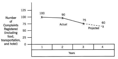
Trend charts track past performance and forecast results based on history. As shown in Exhibit 16-6, the chart shows the relationship between two variables. On the x-axis is a time span and on the y-axis is the value of a variable.
Using trend charts can be dangerous as well as useful. On the one hand, they require assuming that the future environment will be as in the past, thereby permitting forecasting. On the other hand, they enable long-range planning and playing what-if scenarios.
Analyze the Data
After compiling the data, Perry analyzes it. He reviews diagrams and looks at statistical compilations. Below is a table showing the compilation techniques employed and flags for assessing issues dealing with quality.
|
Compilation Technique |
Flag |
|
|
|
|
Pareto chart |
Tallest bar indicates the largest driver for the cause of the problem. |
|
Checksheets |
Longest frequency of occurrences for a variable; thereby reflecting the focus of attention. |
|
Scattergram |
The most frequent occurrences and anomalies; the latter indicating a problem vis--vis normal behavior. |
|
Control chart |
Exceeding the upper control limit or going below the lower control limit, thereby indicating possible erratic, uncontrollable behavior of a process. |
|
Trend chart |
Upward or downward slope of the line, indicating a potential problem if the trend continues. |
|
|
|
When analyzing the data, Perry will use several standard statistical calculationsspecifically, mean, median, mode, and standard deviation. The mean is the average of the values for items in a group of data. The mean is best used when the original data are large enough not to be skewed by extreme values. The median is a position average at the midpoint for a frequency distribution. The median is best used when extreme values in the frequency distribution could distort the data. The mode is the value that appears most frequently in a series of numbers. The mode is used to avoid distortion by extreme values.
Standard deviation is another useful calculation. It determines the degree that each occurrence in a frequency distribution is located from the mean. In other words, it measures dispersion.
Exhibit
16-6. Trend chart example.
Exhibits 16-7 and 16-8 are examples of how to calculate the mean, median, mode, and standard deviation, respectively. In our example, the limousine service providing transportation for the Smythe wedding from the church to the reception wants to know the travel time between the two locations. The data they collected for five transportation times in minutes are shown below:
Another quick, easy way to analyze data is to divide the data into quartiles, or four equal parts, after forming an array. The analyst counts down the array until he identifies the final item in the first 25 percent and then calculates up the array. Then he selects the midpoint between the end of the first and the top of the fourth quartile.
For example, on page 161 is a table of customer responses to a hotel survey of customer satisfaction. The hotel wants to know the results of their questionnaire, by quartiles. The calculation is shown in Exhibit 16-9.
|
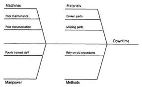
Fishbone Chart Not all quality measurement tools are quantitative. The fishbone chart, also known as the Cause and Effect Diagram, is a diagramming method that identifies the cause of a problem by connecting four Ms: machines, manpower, materials, and methods. At the end of the fishbone is a description of the effect of the problem. An example fishbone diagram is shown below:
The fishbone diagram helps you determine if additional research is necessary to verify a cause. In addition, you can use the diagram to determine another process that will reduce problems associated with machines, manpower, materials, and methods. |
|
Rating |
Value |
Number of Customer Responses |
Quartile 1 |
Quartile 2 |
Quartile 3 |
|
|
|||||
|
Poor | |||||
|
|
|||||
|
Fair | |||||
|
|
|||||
|
Good |
20 (of 25) | ||||
|
|
|||||
|
Very Good |
20 (of 30) | ||||
|
|
|||||
|
Excellent |
15 (of 40) |
||||
|
|
|||||
|
|
|||||
Exhibit 16-7. Mean, median, and mode calculations.
|
Mean The mean, or average, is calculated by summing the numbers from column A (60) and then dividing by the number of samples taken (also called N). The formula is: Average time = sum of column A/N |
|
|
|
= 60/5 = 12, which is the average travel time between the two locations. |
|
Median The median is the middle number in a list of numbers. For our example, Perry arranges the numbers in column A from low to high: 9, 10, 10, 12, 19. The middle number of these five numbers is the third number, which is 10. Thus the median, or average, travel time between the two locations is 10. Mode The mode is the number occurring most frequently in a list of numbers. Again, Perry arranges the numbers in column A from low to high: 9, 10, 10, 12, 19. The number occurring most frequently is 10. Thus the mode, or average, travel time between the two locations is 10. |
|
The Results of Data Analysis
After converting his data into information and analyzing it, Perry win communicate the results. He does that in several ways, such as in a presentation or by sending e-mail. Whichever method he chooses, he states his assumptionshe does not hide them. For example, he might state that the information in the trend chart assumes that the project will proceed at the current pace.
Also, he portrays the data honestly and openly. He does not outlay charts or other information to cover up or skew the messages. Finally, he is consistent when collecting and reporting the information. Consistency ensures timely and useful information. Otherwise, he will have a credibility problem with the metrics.
Summing Up Quality Assessment
Collecting and analyzing metrics takes considerable time and effort. Perry knows, therefore, that it is imperative to define and get agreement upon what quality means, what metrics are necessary, and how to calculate them prior to taking the first step. He then proceeds to implement metrics for the project, which in turn provide a baseline for managing change.
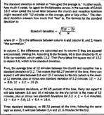
Exhibit
16-8. Standard deviation
calculation.
Questions for Getting Started
Do you know exactly what the customers requirements are? If relevant, the internal customer? The external customer?
Is there an agreed-upon definition of what constitutes quality?
Did you get agreement on what to measure?
Did you get agreement on what metrics to use?
Exhibit 16-9. Quartile example.
|
From the table on page 161, Perry determines a quartile by taking the total number of customer responses (100) and dividing it into fourths. Thus, 100 divided by 4 equals 25. The following calculates the quartiles using the example in the table. Perry now begins to calculate the first quartile. The poor rating contains five responses. The first quartile, however, is 25; therefore, he is 20 responses short (25 - 5). Thus, he must go to fair, the next class, which has 0 responses. When 0 is added to 5, Perry is still 20 responses short of the first quartile. From the next higher class, good, there are 25 responses; Perry needs 20 of those 25 to calculate the first quartile. The formula for the first quartile is: 1 [from the 'poor' rating] + 20/25 [from the 'good' rating] = 1.8 Perry calculates the second quartile by taking the first-half of the responses, or 100 divided by 2, which equals 50. He now needs to add the 5 poor responses, 0 fair responses, 25 good responses, and 20 of the 30 very good responses to equal 50. The formula for the second quartile is: 3 [the good rating] + 20/30 [from the very good rating] = 3.7 Perry calculates the third quartile by taking the first three-fourths of the responses, or three-fourths of 100, which equals 75 responses. He now needs to add the 5 poor responses, 0 fair responses, 25 good responses, 30 very good responses, and 15 of the 40 excellent responses to equal 75. The formula for the third quartile is: 4 [the very good rating] + 15/40 [from the excellent rating] = 4.4 Hence, 25 percent of the respondents, or the first quartile, gave the hotel a rating of 1.8, which is approximately fair. The second quartile, or 50 percent of the respondents, gave the hotel a rating of 3.7, which is almost very good. This means that 50 percent of the customers gave the hotel a rating of very good or lower. For the third quartile, 75 percent of the respondents rated the hotel between very good and excellent. This means that 75 percent of the customers gave the hotel a rating between very good and excellent or lower. |
Have you identified what databases to use for metrics? Are the data reliable and valid?
Have you identified the expertise needed to perform the metrics? Is that expertise available? If not, how will you get that expertise?
Have you identified the hardware and software tools to do metrics? Are those tools available? If not, how will you get those tools?
How often do you plan to collect metrics?
Do you plan to use qualitative or quantitative metrics or both?
Are business considerations the major determinants of what metrics to use? If not, did you get buy-in to the metrics you plan to develop?
Have you identified your key process indicators (KBIs)?
For quantitative metrics, have you developed a formula? Did you get buy-in to the formula?
When using data for calculating metrics, did you cleanse the data? Standardize the data?
If developing Pareto charts, did you define the x- and y-axes? The flags to look for?
If using checksheets, did you determine the intervals to record each occurrence? Do you plan to display this information in the form of a histogram? The flags to look for?
If developing a histogram, did you define the x- and y-axes? The flags to look for?
If developing a control chart, did you identify the upper and lower control limits? The flags to look for?
If developing a trend chart, did you define the x- and y-axes? The flags to look for?
Do you need to calculate the mean? Median? Mode? Standard deviation? Quartile?
Do you have a plan for communicating the results?
|
Politica de confidentialitate | Termeni si conditii de utilizare |

Vizualizari: 1749
Importanta: ![]()
Termeni si conditii de utilizare | Contact
© SCRIGROUP 2025 . All rights reserved