| CATEGORII DOCUMENTE |
| Bulgara | Ceha slovaca | Croata | Engleza | Estona | Finlandeza | Franceza |
| Germana | Italiana | Letona | Lituaniana | Maghiara | Olandeza | Poloneza |
| Sarba | Slovena | Spaniola | Suedeza | Turca | Ucraineana |
DOCUMENTE SIMILARE |
|
TERMENI importanti pentru acest document |
|
Investigation
Report
Electronic Typeface Readability
Introduction
Readability is a
major importance and concern to those who create any type of media that
contains text. The use of the Internet
has increased dramatically and therefore the readability issues of electronic
text affects many people on a daily basis. Readability of electronic text displays is therefore an important factor
to consider when presenting any type of electronic information. The importance of readability on an
electronic monitor mirrors the importance of that in print. Electronic media also gives the designer and
viewer many other advantages such as an added ease of use and accessibility to
media. Text can be presented dynamically
and simultaneously with other types of media like sound and graphics. Electronic media also affords inexpensive
customizability, allows interactivity and connectivity to others. This new technological era has opened up the
way for profusion of media and the best type of presentation for users should
be determined. Muter (1996) suggests
that reading speed of electronic text is 28% slower than of print. He recommends that several variables factor
into the readability of text on a monitor. These factors include image resolution, screen size, color,
anti-aliasing, interline spacing, distance to the screen and font size and
character spacing. Designers do not have
control over many of these factors since image resolution, screen size and
distance to the screen will change with each user and device. The rules that apply to paper media do not
necessarily pertain to that which is viewed electronically. For example, newspapers are printed in serif
fonts, such as Times or Courier. Common
wisdom developed over centuries is that serifs, the little horizontal lines at
the tops and bottoms of characters, make text easier to read. (
There is abundant information on the Internet that contains recommendations about font type and backgrounds as well as commentaries. Unfortunately, there is little evidence other than personal preference to back these recommendations. A few studies and experiments have been done researching digital readability. Chung, Kolatch, Sculimbrene, and Wen (2000) studied the readability of digital media based on different screen sizes, using Personal Data Assistant's (PDA's) and laptops. They showed that reading speed is not affected by screen size and the screen size of a device does not affect the error rate in reading. As the use of small portable computing devices becomes widespread in society, the readability of text on these devices becomes an increasing concern. Text with poor readability may cause slow processing and the reader to leave the display. While most displays have text presented on plain backgrounds, an increasing number use textured backgrounds are found, especially on the Internet. Scharff, Ahamuda, and Hill (1999) have conducted several experiments looking at text width, contrast, and background texture. These authors have shown that single line spacing is read at a significantly slower pace than 1.5 inch spacing or double spacing. They also prove that size 14 font is significantly faster to read than size 12 or 10 font. Significance was found between size 10 and size 14 fonts at single and 1.5 line spacing. They recommend using at least a font size of 12 with 1.5 or double line spacing for the best readability. Tullis, Boynton, and Hersh, (1995) conducted an experiment examining different sizes of fonts in the Windows environment. They found that a decline in display reading performance could be as high as 40 percent when compared to the same text read from paper. These authors proved that MS Sans Serif and Arial fonts are preferred at font size 8.25 to 9.75. Although all of these studies were administered in an experimental situation where the variables were controlled, only Tullis, Boynton, and Hersh studied the readability of font types. This was limited to arial, sans serif and serif in sizes 6.0 to 9.75. Hoffmans (2001) online survey that asked for readers preferences when shown text excerpts in Arial, Helvetica, Times New Roman, Verdana, and Trebuchet MS fonts. Results from the survey have shown a significant preference to the sans serif fonts, specifically Verdana as having the best readability. While Hoffman and Wilson (?) have examined the area of text readability subjectively, the font typeface chosen may not necessarily be the easiest to read since subjective preferences do not necessarily match the true objective data. In order to determine an empirical recommendation for the best typeface, an experiment was conducted testing reaction time versus font typeface in an objective situation.
Methodology
Participants
41 Participants, ages 18 to 53, were selected from the Educational Technology Department. All participated by accessing the online based instrument through a website. 27 were observed in the Educational Technology Laboratory and used Macintosh G4 computers. There is no information on the type of system the other participants used.
Instrument
The instrument design used by Scharff et al. (2000) was replicated since the design had been proven successful in measuring objective data for testing readability. The multimedia-based instrument was created using Macromedias Dreamweaver, Fireworks and Director. Dreamweaver was used for the web page design and Director used to introduce the interactive elements needed to create the objective parameters. The text was taken from Microsoft Word and formatted graphically with Fireworks (figure 1). Data was collected using a FileMaker Pro database.
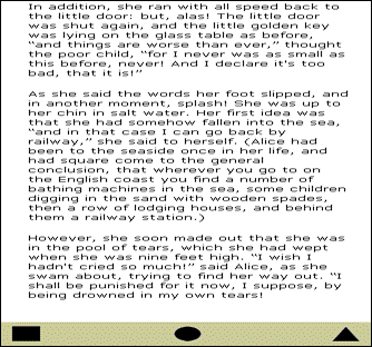
Figure 1 Screenshot of online test
Experiment
The experiment
consisted of 6 types of font with 6 excerpts of text from
Participants were directed to the beginning screen with instructions. The participant read the directions and completed three practice exercises where they were asked to locate the symbol word in the middle paragraph then click on the corresponding symbol. Each experimental section began with a start button on a blank screen (#CCCC99) to facilitate the collection of reaction time. The clock started when the start button was clicked and data was collected when the participant clicked the mouse on the symbol. The database recorded the test, screen number and time. Average time to administer the test was approximately 15 minutes with directions and personal data collection.
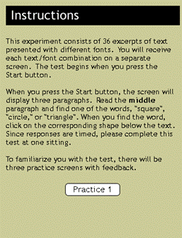
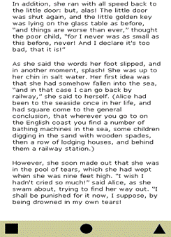
Figure 2 the instructions
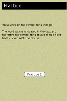
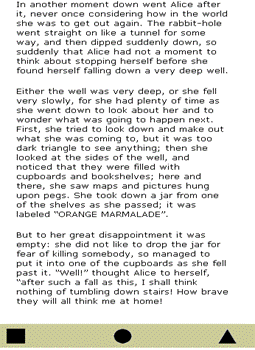
Figure 3 Practices
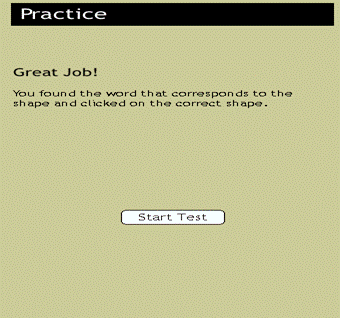
Figure 4 Practices
Data Analysis
Test results
were collected and analyzed using Excel and Statview. Results were analyzed
using repeated factorial ANOVA statistics comparing the six different fonts. A
significance level of 0.05 was set. Data
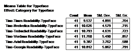
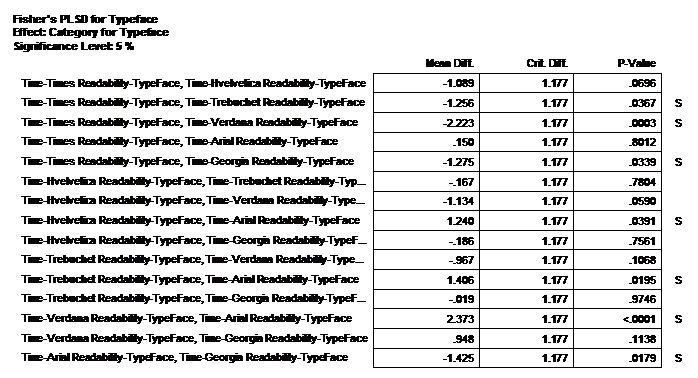
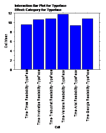
showed that Typeface made a significance difference (F=4.470; DF=5,40; p=.0007)
in Readability. Means for the typeface
were Times (9.537), Helvetica (10.626), Trebuchet (10.793), Verdana (11.760),
Arial (9.387) and


Discussion
Based on our results we recommend that Times or Arial be used as the typeface for display on computer screens. Although subjective research has shown that the sans-serif font, Verdana is the font of choice, this study has shown that Times and Arial are actually easier to read since the reaction times were faster than the other 4 fonts. The results are not significant enough to recommend Times or Arial as being a better font than the other. This experiment needs to be run with more participants before an empirical statement can be made proving that one font is better to read online than another. All participants were not observed and the data collected from those who were unobserved may have variables which would affect the results such as outside stimuli or system difficulty. Since gender proved to be significant when compared to the typeface and readability, the authors suggest that further study be done to determine if there is a difference in the type of typeface objectively preferred by gender.
References
Chung,
Hoffman, Bob. Text Readability.
Lee, A. Reading Electronic Text.
Merriam - Webster Online. 2001. Online reference.
Collegiate Dictionary. Available:
https://www.m-w.com/tools/search/searchboxes.htm.
Muter, P. 'Interface Design and Optimization of
Scharff, L., Hill, A. 'Readability of Computer Displays as a Function of Color, Saturation, and Background Texture.' Engineering Psychology and Cognitive Ergonomics, Vol. 4 (2000): 123-30.
Scharff, L.,
Williams, S. The Effects of Font Size and Line Spacing on Readability of
Computer Displays. 1999. Available:
https://hubel.sfasu.edu/research/SWExp.html.
Tullis, T., Boynton, L. and Hersh, H. (1995). Readability of Fonts in the Windows
Environment [Interactive Poster]. CHI
'95 Proceedings. Retrieved
Wilson,
R. (2001,
|
Politica de confidentialitate | Termeni si conditii de utilizare |

Vizualizari: 2657
Importanta: ![]()
Termeni si conditii de utilizare | Contact
© SCRIGROUP 2026 . All rights reserved