| CATEGORII DOCUMENTE |
| Asp | Autocad | C | Dot net | Excel | Fox pro | Html | Java |
| Linux | Mathcad | Photoshop | Php | Sql | Visual studio | Windows | Xml |
A good chart contains not only data, but also descriptive labels that help the user understand the data. For example, you should be able to tell at a glance that a certain pie slice represents 30 percent of the whole, as well as that it represents the East region.
You may have created charts before in Excel, so some of this may be a review; that's okay, just skip ahead to the material that's new to you.
Before you create a chart, make sure that your worksheet contains text labels for every pertinent value. Other elements, such as legends, data labels, and multiple series, are optional and their use depends on what you're trying to convey.
Next, decide what data is to appear in the chart, and then select both that data and any associated data labels. For example, in Figure 5-6, suppose you want a pie chart containing just the data for the South region, so you've selected the data labels in column A and the South region's data in column C. This shows an important point: the range you select for a chart need not necessarily be one contiguous range. To select a noncontiguous range like this one, hold down the Ctrl key as you drag across the ranges you want.
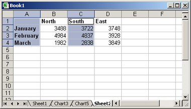
Figure 5-6: Start a chart by selecting the
range(s) containing the data and labels for it.
After selecting the data, follow these steps to make the chart:
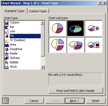
Figure 5-7: Select the desired chart type.
TIP
With a simple range like the one in our example, it's hard to go wrong. If the
range contains multiple rows and columns of numbers, however, you might want to
change the plotting. Back in Figures 5-3 and 5-4,
recall that the presentation was very different when plotted by rows versus by
columns. In this step of the Wizard, you can choose Rows or Columns, whichever
is more appropriate to your message.
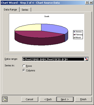
Figure 5-8: Confirm the data range, and switch
between Rows and Columns as needed.
The legend is the key to the chart. It's a little box that shows what each color or pattern in the chart represents; you saw legends in Figures 5-3, 5-4, and 5-5, for example.
TIP
Using data labels is a strategic decision that will
depend on the goal of your chart. If the exact values or percentages are
important, you want them displayed; if the goal is to present a big-picture
overview, you probably don't want them.
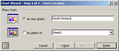
Figure 5-9: Specify where the chart should appear
in the workbook.
The chart might not be exactly the way you want it initially; that's okay. In the next few pages, you learn how to make changes to it.
|
Politica de confidentialitate | Termeni si conditii de utilizare |

Vizualizari: 1186
Importanta: ![]()
Termeni si conditii de utilizare | Contact
© SCRIGROUP 2026 . All rights reserved