| CATEGORII DOCUMENTE |
| Bulgara | Ceha slovaca | Croata | Engleza | Estona | Finlandeza | Franceza |
| Germana | Italiana | Letona | Lituaniana | Maghiara | Olandeza | Poloneza |
| Sarba | Slovena | Spaniola | Suedeza | Turca | Ucraineana |
'PHOTO-COMPOSITION'
PhotoComposition is the foundation upon which we build our Photo
Images by the correct Selection, Arranging, Organizing and Combining the
Visual Elements within the picture area to produce a Harmonious and Pleasing
Photograph.
The following rules of Photo-Composition are for guidance only, not for
absolute and complete obedience by Photographers. No picture was ever made
by rules alone, since Photo-Composition involves your personal tastes and
preferences. Your natural instincts are worth more in photography than many
ridged rules.
However, your must know the rules before you can break them and only
break them when you have a good reason for improving the photographic image.
Photo-Composition is based on Artistic Composition up to a certain point.
The Artists of old have always used composition in all their works and of
course
broke the rules when they thought it was necessary for the improvement of the
painting or drawing.
Artists of course have the advantage over the Photographer. They can move
objects around in their picture frame to suit their own artistic desires. Thus,
if a
tree is not in the right place in Nature, the Artist will move it to another
place on
his canvas to make a better Composition. If a fence or house is not situated
correctly in the natural scene the Artist moves them around to suit his own
artistic needs.
Photographers are limited to the use of objects in the scene before them but
that does not mean they have to photograph them like a tourist, head on,
without
looking around for the best angle and lighting conditions in which to take the
photograph.
A Photographers job is much harder than that of an Artist who can take
artistic liberties by moving objects around to suit their needs. The
Photographer
must find a scene that has the best Composition by finding the right angle,
choosing the right lenses, being there at the right time of day for the
best
lighting conditions and using creative exposures.
The Basic Elements Of Photo-Composition
Photo-Composition Is Composed Of:
MASS - LINE - FORM - VALUE - COLOR
MASS:- Equals objects, such as trees, houses, mountains, lakes or any
other large or small object within the picture area. These are the objects the
Photographer is stuck with and has to do the best with what is in front of
the
cameras lens. MASS comes in two sections: Formal Balance and Informal
Balance.
FORMAL BALANCE:- Sometimes called Equal Balance or Classical
Balance. It has a feeling of Dignity and Repose but makes Static, Unimaginative
photo images as the objects in the picture area are of Equal Size, one
balancing
the other equally like two children of equal size on a playground seesaw. The
seesaw will not move up or down. It stays horizontal with each child balancing
the other on the board.
This type of balance has been used in large public buildings where each side
of the building matches each other with wings and the entrance is in the
middle.
It makes the building uninteresting and boring after the first look.
A photograph with this type of balance will also be boring and very
un-interesting so be sure to avoid it whenever possible, unless you have a
definite reason to use it.
INFORMAL BALANCE: Gives UN-even or UN-equal Balance in the
picture area. If you have a LARGE object in the picture it should be
COUNTER-BALANCED with a smaller object or Objects to make a good
Photo-Composition.
Pictures the seesaw again with a 5 year old boy on one side and his Father
on the other side. The BALANCE will be UN-even as the Father is larger and
will make the seesaw heavier on his side. The boy will be high in the air and
the
Father will be at the ground level. This makes and Informal Balance.
In a photographic scene, if you have a Large tree on the right side of the
picture frame then you must try to balance it with a smaller object such as a
house, a small tree or even the figure of a person on the other side of the
picture
frame.
The way you balance the objects in your picture frame will determine the
success or failure of the image. Many times you will have to resort to the use
of
different types of lenses in order to create the balance you want.
A 24mm wide angle lens can create unbalanced composition very easily by
taking the objects in front of the lens at close range. This will make the
front
objects appear very large in the picture frame while the rear or distant
objects
will appear smaller even though they are actually larger.
Another way to create unequal balance is to find a position that will cause
one object to appear larger or smaller because of the angle you took the
photograph. The next time you are out creating photographs be sure to keep
these rules about Balance in mind and try to incorporate them in your work.
BULLS EYE COMPOSITION: A definite NO, NO in good
photo-composition. When you place the Main Subject right smack in the
center of the picture area it is called a Bulls Eye. This should be avoided at
all
times, unless you have a definite reason for doing it.
With the main subject in the center of the picture frame the eye will go in to
the picture and stay in the center of the frame looking at the Bulls Eye Main
Subject and will not move around in the picture to see and enjoy any other
items. The eye will get tired very fast and lose interest in the photograph.
Your purpose in taking photographs is to have people look at them, enjoy
them, talk about them and buy them. If they cannot get interested in a
photograph they will not bother to look at it and will definitely not buy it.
It is best to always have the Main Subject OFF CENTER. Even if it is just a
little Off Center it will improve the pictures composition and not give you a
Bulls Eye picture.
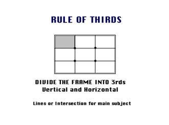
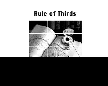
THE GOLDEN MEAN: Sometimes called The Rule Of Thirds. The artists
of old discovered it and good photographers always use it to improve their
photo-composition.
When you take a picture area and divide it into thirds Horizontally and
Vertically, where the lines cross in the picture area is a Golden Mean, or
the
best spot in which to place your Main Subject or Object of Interest as it is
the
Focal Point of your picture.
There are Four Spots where these lines cross:- the Upper Left the Lower
Left, the Upper Right and the Lower Left . You will note that all these Golden
Means spots are away from the center Bulls Eye position in the picture frame.
The two best Golden Mean spots are the Upper Right and the Lower Right
because the eye enters the picture frame at the lower left hand corner of the
picture frame, travels to the center of the picture area and then reaches the
right
hand Golden Mean position where it stops to look at the Center Of Interest.
The reason the eye enters a picture at the lower left side is because we are
taught to read from Left to Right. This is a psychological fact that has been
proven over the years.
Next time you are in an art gallery or art museum that shows the Old
Masters paintings, notice how many have the Center Of Interest, a figure, a
haystack, a house, an animal, etc. in one of these Golden Mean positions.
Be very careful that you do not place to centers of interest in two Golden
Mean positions, especially on opposite sides of the picture frame. This will
cause
the eye a lot of trouble as it will keep going back and forth from one Center
of
Interest to the other and will get confused and tired and want to leave the
picture
area.
Get use to visualizing the view finder in your camera as having the cross
lines of the Rule Of Thirds (Golden Means) and try to place your main subject
at a Golden Mean position. You will find your photographs have more style,
interest and impact because of it.
IMPLIED LINES HOLD THE PICTURE TOGETHER
Implied line are not actual lines that you can see in the picture area, they
are
implied and are made up by the way objects are placed in the picture area.
Sometimes actual items or objects do make lines such as, railroad tracks,
telephone wires, etc.
These implied lines can actually create a response in various ways:
THE VERTICAL LINE:- It denotes Dignity, Height, Strength, and Grandeur.
We find vertical lines in trees, tall buildings, fences, people standing up,
mountains, etc. A tall building shows height, strength, dignity and grandeur.
Trees show height and strength.
THE HORIZONTAL LINE:- Denotes Repose, Calm, Tranquillity and
peacefulness, such as a person lying in the grass sleeping, flowers in a field,
the
flatness of a desert scene or lake. You can make your photograph show these
feelings if your look for them in the picture area and use them in your
photographs.
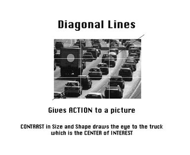
THE DIAGONAL LINE:- This like gives the sensation of Force, Energy
and Motion as seen in trees bent by the wind, a runner at the starting line or
the
slope of a mountain as it climbs into the sky. By knowing this you can create
Force, Energy and Motion with your camera easily by tilting the camera to make
objects appear to be in a diagonal line. A dignified church steeple when
photographed at a slant will change to a forceful arrow pointing towards the
sky
and show motion.
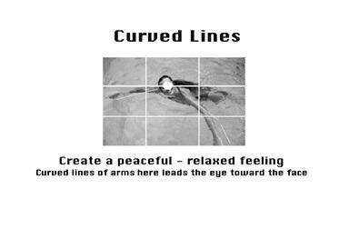
THE CURVE:- Here is a line of great beauty and charm and nothing gives a
better example than a beautiful female form with all its lines and curves. Of
course there are other examples: The curve in a river or a pathway through a
flower garden.
THE S CURVE:- This line goes further than just a plain curved line.
It is
called the Line Of Beauty. It is Elastic, Variable and combines Charm and
Strength. It has Perfect Grace and Perfect Balance. You have seen this S
Curve
hundreds of times in drawings and paintings and other works of art.
Examples: the double curve of a river makes an S curve. A path, row of
trees or bushes that curve one way and then the other way create the S curve.
Look for this type of design and use it in your photos to add interest and
beauty.
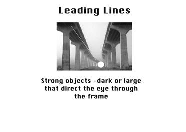
THE LEADING LINE:- The line that leads your eye in to the picture area
easily like a road or fence, a shoreline or river, a row of trees or a pathway.
A
successful Leading Line will lead your eye in to the picture and take it right
to
the Main Subject or Center of Interest
An UN-Successful Leading Line will take the eye in to the picture but will
ZOOM the eye right OUT of the picture if there is no Stopper to hold the eye in
the picture frame; such as a tree, house or other large object on the right
hand
side of the picture frame which will STOP the eye from going out of the
picture.
The Center of Interest or Main Subject will act as a Stopper and hold the eye
in
the picture frame.
The best Leading Lines will start at the Lower Left area of the picture frame
but not in the exact corner. Again, the eye likes to enter a picture frame at
this
point and the Leading Line will help it get in to the picture easily and
swiftly.
IMPLIED FORMS ALSO HOLD A PICTURE TOGETHER
Implied Forms are a combination of Implied Lines and they help to
hold a picture together. The eye enjoys these interesting forms and will stay
in
the picture area to examine each one of them, if they are present.
THE CIRCLE:- Is made up of a continuous Curve and its circular
movement keeps the eye in the picture frame. There are many circles in nature
and man made objects and if you find them in an image before you, be sure to
make good use of them in your photograph.
Circles can be made up of children playing ring around the roses or a small
pond or lake is usually in the form of a circle and of course many race tracks
are
a form of circle.
THE TRIANGLE OR PYRAMID:- This has a solid base and will show
Stability. It also has Height and Strength. The Pyramids of Egypt have survived
for thousands of years while other types of solid buildings have crumbled in to
dust in less time.
A Triangle can show up in your viewfinder as three points in the scene, such
as two trees on the grounds pointing to a cloud in the sky. Sometimes a fence
in
combination with a stream and a farm house can form the Triangle Composition.
THE RADII:- Is a connection of Lines meeting in the Center and it is
also
a expansion of Lines leaving the Center. The Radii is usually found in Nature
Subjects. The best example of the man made Radii is the spokes of a wheel.
The eye has two ways to go when it comes upon the Radii. It can either be
drawn in to the picture area or it can be led out of the picture area. You must
be
careful how you used the Radii and try to have the eye led into the picture.
THE CROSS:- A showing of Opposing Force that will give the picture a
feeling of Cohesion and Relationship. The horizontal bar of the Cross will act
as
a stopper while the vertical pole can act as a leading line. The windows in a
large skyscraper will form crosses and will keep your interest in the building.
The Cross also has religious meaning and the subtle use of the Cross can
give hidden meaning to a photograph.
THE L OR RECTANGLE:- This makes an attractive frame. It can be
used to accentuate important subjects. Many times it is a frame within a
frame. A tree with an overhanging branch at the right side of the picture
area
will form a Rectangle and help frame the Main Subject in the picture. By
doing
this you will make the Center of Interest stand out and be noticed clearly.
VALUE OF COLORS
Color can also help in Photo-Composition by drawing attention to the
subjects and objects. The eye will ALWAYS go to the Brightest and Lightest
coloris in a photograph. You must watch the play of Colors at all times and
make
sure they are doing what you desire in your image.
VALUE:- The Value of colors are Intensity, Brightness and Luminance
Factor. Thus colors are said to have Strong or Weak Values. They can be Warm
or Cold, Advancing or Receding. The longer wavelengths from Red to Yellow
are usually described as Strong, Warm, Advancing colors while the shorter
wavelengths, the Greens and Blues may be described as Weak, Cold and
Receding colors.
Pastel colors are Quiet and Moody while Bright colors are Strong and
Active. However, certain colors react very strongly with each other to give
Strong Contrasts and to many people these will become Discords rather than
Harmonies.
HUE:- Is the scientific counterpart for the more popular word Color.
Red,
Yellow, Green and Blue are the Primary HUES, while Orange, Blue-Green, and
Violet are Secondary HUES.
COMPLIMENTARY COLORS:- Colors that go with each other will
Compliment each other and are desirable in any painting or photograph. If you
place the Primary and Secondary colors on a Color Wheel you will find that
Red will be opposite Green; Orange will be opposite Blue and Yellow will be
opposite Violet. These Opposites are Complimentary Colors and can be used
together to create the best Color Harmony.
For example, a Red barn in a Green field of grass has harmony. The Blue
and Orange sky of a sunset has color harmony. Always look for Complimentary
Colors in the visual image you plan to photograph and use them to create better
photographs.
END
|
|
|||
|
The Golden rule |
|||
|
Let's start with an introduction of a technique that is well known for many centuries now: The 'Golden Mean' (sometimes called 'Golden Section') is a geometric formula by the ancient Greeks. A composition following this rule is thought to be 'harmonious'. The principal idea behind it is to provide geometric lines which can be traversed when viewing a composition. The Golden Mean was a major guideline for many artists/painters so it is certainly worth to have in mind for modern day photographers as well. |
|||
|
|
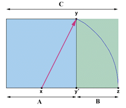
Well, let's begin with some words about the theory. The formula starts with a perfect square (marked blue in illustration A). Now we devide the base of the square into two equal parts. We take point x as the middle of a circle with a radius of the distance between point x and y. Thereafter we expand the base of the square till it hits the circle at point z. Now the square can be transformed to a rectangle with a proportion ratio of 5:8. The ratio of A to C is the same as the one from A to B. Luckily the 5:8 ration fits pretty close to the ratio of the 35mm format (24x36mm = 5:7.5). |
||
|
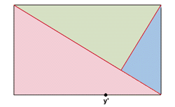
So now we've something which is thought to be a 'perfect' rectangle. What's next ? We draw a line from the upper left to the lower right edge of the rectangle (see illustration B) and another line from the upper right directed towards point y' (taken from illustration A) till it hits the first cross line. Obviously this divides the rectangle into three different sections. In principal we're finished with the 'Golden Mean' now. Just try to find objects/parts in your scene that fit roughly into these three sections and you have a 'harmonious' composition. You can vary the formula by flipping and/or mirroring the scematic rectangle from illustration B.
|
|||
|
Rule of the thirds |
|||
|
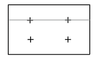
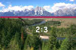
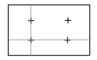
The 'Rule of the Thirds' is actually nothing else than a simplification of the 'Golden Mean'. The basic philosophy behind it is to avoid a symmetric compositon which is usually pretty boring because the view is centered. The connection to the 'Golden Mean' are the 4 possible crossings of the dividing lines (see the examples in illustration C1 and C2). To counteract symmetry the 'Rule of the Thirds' can follow two concepts: First we can divide the image into two distinctive areas which cover 1:3 and 2:3 of the size of the picture. |
|||
|
|
|
||
|
The second possible application is directly based on the crossing points of the Golden Mean. e.g Let's assume that we a landscape that is pretty charming but lacks a major feature or interesting geometric structure. The resulting image is a boring picture of an empty landscape. So what can we do here. Try to find an object which provides a contrast to the otherwise 'monotonious' surrounding and place it at one of these crossing points. This object is an anchor for the first look and invites to a further observation of the scene. |
|||
|
|
|
||
|
Moody light |
|||
|
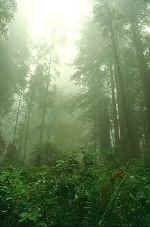
This section is actually no description of a photographic technique but the key issue of a great nature photo is often just 'being there'. Many photos cannot be planned. So feel the moods and exploit unusual light situations. One main problem here is that these light moods disappear as fast as they come. Overall it's a good idea to shoot first and ask later - waiting for the perfect moment often results in missing the moment. A few pictures for the trash bin surely doesn't hurt as much as no picture at all so experiment and SHOOT, SHOOT, SHOOT! |
|||
|
|
|
||
|
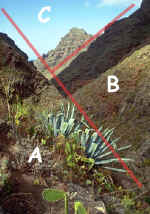
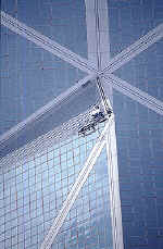
Cross lines |
|||
|
Crossing Lines/diagonals are actually again another simplyfication of the golden mean. The basic idea is to provide a sort of 'guideline' for the eyes to follow. It is a good idea to place the start or end of such a line to one of the extreme edges. The classical approach states that the upper left edge is the best starting point because most humans start to traverse a picture from here on. However, it cannot hurt to break this rule (see 2nd picture). Just a straight line would be pretty boring thouhg so there should be some sort of disturbance in the picture. The following picture shows a focus point where many lines find together so there are enough of directions for the eyes to follow making the picture interesting. |
|||
|
|
|
||
|
Skyline |
|||
|
|
|||
|
Color, color |
|||
|
Image composition is about light and light is about contrast/brightness and colors. It is either a good idea to surpress as many different colors as possible (resulting in monochromatic pictures when going to the extremes) or to make use of color contrasts by looking for complimentary colors - red, green & blue. The more pure the base color the more extreme is the difference (color contrast) making an image interesting. There're various possibilties to increase color saturation and therefore contrast. Polarizers are the most popular option. These filters work pretty good to enhance the blue sky or shiny objects like the sea or other non-metallic object. The effect is maximized at a position 90 degrees of the sun. Often it is a good idea not to go for the max here. Graduated color filters can help as well here and there. There're also various sorts of direct color enhancers like 'Redhancer' filter etc. pp. Just make sure that you know what you're doing |
|||
|
|
|
||
|
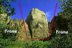
Framing |
|||
|
Sometimes you've a object of huge dominace within a scene. While breathtaking on-location the final picture looks often much less impressive due to uninteresting space around the object. Try to find a frame which can eliminate the unimportand surrounding and focus the view. The right picture uses the surrounding trees as a sort of portal to frame the mountain in the center. |
|||
|
|
|
||
|
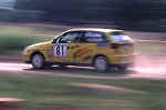
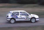
Panning |
|||
|
|
|||
|
|
|||
|
|
|||
|
|||||||||||||||||||||||||||||||||||||||||||||||||||||||||||||||||||||||||||||||||||||||||||||||||||||||||||||||||||||||||||||||||||||||||||||||||||||||||||||||
|
|
|
|
|
Prize Winning Photography - video notes Notes taken from a video watched in class. These are key points of the show and make good points for our internet visitors as well as students. Blur creates a feeling of speed - panning or moving the camera along so that it follows a moving object takes practice but makes a photo more interesting Posterization is darkroom technique that converts the photo into simple tones of black and white or simple blocks of color SIMPLICITY is the key to good pictures that win awards Everybody looks but not everybody sees. Imaginative seeing the potential of a photo is the skill to develop - look for pictures in the things you see Little extra touches in a photo such as a moon in the sky for comparison of shape or for a distant focal point is good. Take the time to examine the objects in your photo and look for the best viewpoint to show them Lighting plays a part in a prize winner. A silhouette or sunset can do a lot to make a photo simple and interesting. To make the exposure aim the meter away from the sun to the bright part of the sky and adjust exposure then hold it and recompose the photo for a dark sky and a silhouette of your subject. A silhouette simplifies the photo Time of day - the proper lens and vantage point as well as care in focus and exposure is what makes a prize winner. The telephoto lens makes things look closer together - it can be used to select the portion of the photo you like best Prize winners are EASY TO LOOK AT with the eye following the action - the subject is obvious and has impact - LESS IS MORE concept of getting in close and checking the frame for a photo that tells a story or sets a mood. People pictures are popular subjects. Look at the camera angles or vantage point to find one that gives a simple background with colors and objects that do not compete with the subject. Good expression is key to people shots -- look for how the mood is expressed -- be alert and have camera r
eady and semi-adjusted in advance for speed in response.
|
Top Ten Tips
|
Welcome to the top ten tips section. |
Know your subject:
Knowing your subject may seem obvious but lets say you were wanting to take a picture of a big brown moose. :) How would you go about getting the shot? It would probably be a good idea to know a little about when and where it eats and sleeps. How close can you get without disturbing the animal. Whether you know it or not a moose can seriously hurt or kill you. Hunters and photographers alike have been trampled by these large animals. Knowing these things in advance will help you get the shot and have the least amount of impact on the animals and the environment as possible. You can see where knowing your subject is a good idea. You don't want to wind up on the wrong end of an antler:)Top of Page
Keep that camera Ready:
You never know when that shot of a lifetime is going to happen. You could be out at the beach one day and some air force jet make a crash landing right there on the beach in front of you. How would you get the shot if your camera was in the car? 'Keep it ready'.Top of Page
Look for Good Light:
Always when composing a shot look for the best light. Near a window with the sun shining through. If outdoors, try to take your picture in the shade or where the light is not so harsh. Harsh bright light will flatten an image and make it stale. Look for the softest or warmest light when photographing people. It makes your photos more appealing and attractive.Top of Page
Try including Foreground:
Including foreground in your photo is another good technique. It shows more area and makes for better composition depending on what you are shooting. For example including a rock or small bush or tree will help balance out a photo and in turn make it more interesting.Top of Page
Get in Close:
Try something new. If you primarily shoot from a distance try getting in close to your subject. This can have a dramatic effect and make you photos stand out. Photographing flowers and insects is a good example. The idea here is to show everyday things not normally viewed in such a way as new and interesting. It produces a 'WOW I didn't notice that before' reaction in people and makes things way more fun.Top of Page
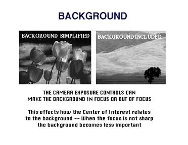
Keep Backgrounds Simple:
Simply don't include too many things in your background. It clutters things and makes your photo confusing to the eye. Keep it simple.Top of Page
Keep it Steady:
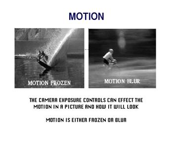
Whenever possible rest you camera on something sturdy or stationary. Or use a tripod. This helps your photographs come out much more sharp and clear. A human being can only hold a camera steady enough for a clear image with a shutter speed of 1/30 a second. Any slower and blurring will most likely occur. Some photographers suggest not hand holding you camera for speeds slower than 1/60. The point is your hand shakes much more than you realize it. Use a tripod whenever possible.Top of Page
Try it Sideways:
Huh?! 'What do you mean sideways?' :) Well it's simple. Most photos are taken with the camera right side up. Try it sideways. It lengthens perspective and will give your photos a new look. :)Top of Page
Use your flash:
When photographing people outdoors in daylight use your flash. It fills in ugly shadows and lessens the dark areas of the photo.Top of Page
Don't forget the bug spray?:
Anyone who has ever been outside knows that insects are abundant. Especially in the south. To make your outdoor experience more like fun and less like a slapping contest 'Don't forget the bug spray'Top of Page
'Composition'
Composition (noun) The arrangement of artistic parts so as to form a unified whole.
Subject:
This is anything you are taking a photograph of. To define it simply.
Knowing your subject:
Just going out a taking pictures is great. Knowing your subject is another matter. What kind of flower is that you are taking a picture of? What type of tree or frog or deer is it? Does that beautiful butterfly have a name?
Also if you are taking photos of wild or dangerous animals like a Grizzly bear I would imagine it's probably a good idea to know a little more about this animal than the fact that it's big and brown and furry and it's got lots of big teeth to bite you with. Know it's habitat, maybe what it eats and where it goes when it's sleepy would all be good things to know. This way you can be in the right place at the right time and can get a good shot or to know when to leave him be.
For safety sake these things can come in handy if you know them and prepare yourself in advance before going out into the field. So whether you are taking photos of a harmless little butterfly or a ferocious Grizzly, it's always a good idea to know your subject.
Positioning your subject:
Where is my subject located in the frame?
Is it obvious what I am taking a picture of?
Is it too 'busy'?
Is my subject lost in the scene?
These are some of the questions you need to ask yourself when composing a shot. Position your subject or yourself in the best place to show exactly what you are photographing. If you are taking sunset photos then position yourself where you can view as much of the area you can and where you can capture as much of the scene in your viewfinder as possible, but without making it too 'busy'.
For example. Let's say you are at the beach and your are trying to get a good sunset photo. There is a sailboat that looks gorgeous sitting out there among the waves and wind and birds flying around. Do you show that ugly buoy floating there in the water that's just sitting there taking up space or, do you try to frame the photo so that it doesn't include this eyesore? This is personal preference of course. Perhaps you want the buoy in the photo simply to give the picture more of a nautical feel.
Eye Catching:
Always make your photos eye catching. What would you like to look at? And don't forget to have fun doing it. Sometimes, you so caught up in trying to 'get the shot' that you miss the moment and the beauty of the scene. Try not to let this happen. Enjoy your surroundings.
Background:
Or what is behind your subject. Try to keep this simple and with as little distraction as possible. Your subject shouldn't be lost in the scene. Use a background that is clean and clear of clutter.
Foreground:
What is in front of your subject. If you are shooting landscapes try including more of your foreground in your photo. For example if you are taking a picture of a field with a big red barn maybe you could include a section of the fence or some such structure to give it more appeal and interest. Keep it simple.
Angle:
Angle is the direction from which you are taking the photo. This angle could be anywhere around the subject providing it is physically possible to position yourself and your camera in this area.
Simply clicking away at your subject without thinking of the angle you are shooting from and what you subject is can be very frustrating when you get your photos back from the lab. Not to mention it could be very costly. Instead, try thinking of what your subject is.
For example, if you are photographing children playing, try shooting from a lower angle to make it more interesting. Eye level is good. If you can get at eye level with what you are shooting (providing it has eyes) then this is a good practice. Tilting your camera slightly in either direction in relation to your subject has an abstract effect. It causes your eye to look at a familiar image from an unfamiliar angle.
Many great photos of animals look good because you are looking into their eyes and it produces an instinctive primal reaction. To cause reaction, is an important thing to remember whether positive or negative, like a beautiful bride at a wedding or like a starving child in a third world country. A creative angle has the ability to instill dramatic and emotional response. Like when a dog tilts his head when he is curious, this tilt makes us smile and laugh. It invokes a response, and this is what makes a photo interesting.
Focus:
To focus properly requires a combination of things. First and perhaps most importantly is to keep your camera steady. This may seem obvious but you would be surprised to know how little movement it takes to blur and ruin an otherwise perfect shot. Most new cameras have auto focus. This in combination with the shutter speed being preset at a higher speed allows for most point and shoot cameras to take very sharp images even when there is alot of movement. This is why these type cameras are called point and shoots because all you have to do is point it at what you want to take a photo of and press the shutter button. It's all automatic. If you want more control over focus then a manual or automatic SLR (Single Lens Reflex ) camera is the prefered choice.
Focal Distance:
This is the point at which your camera is focused during an exposure.
Depth of field:
This is the distance between which two objects in a picture remain in focus. Also called the zone of focus or depth of field zone. Depth of field is determined by your aperture settings (or the opening inside the lens that lets light in to expose the film). The size of the aperture is adjusted by setting your f-stop. These f-stop settings are marked on your lens and are usually in the order of 1.4, 2, 2.8, 5.6, 8, 11, 16, 22 and so on sometime. The smaller the number the larger the opening will be. The larger the number the smaller the opening. This effects depth of field and the amount of light that enters the camera. A smaller aperture increases the depth of field. A larger aperture decreases depth of field. About Aperture
An object that the camera is focused upon will be sharper than an object in front of or behind the point of focus. The farther you get from the focal point the more out of focus or blurry things get. For example, if you were taking a picture of three apples sitting on a table in a line directly in front of the camera (Let's say your cameras f-stop is set at 1.4 and you are focused on the second apple) then this apple would be in focus while the other two remain out of focus. If you wanted all the apples to be in focus then you would have to decrease the aperture which increases the depth of field. In other words just set the f-stop to 22 and all of your apples will be in focus. :) I didn't confuse you did I?
|
Politica de confidentialitate | Termeni si conditii de utilizare |

Vizualizari: 1793
Importanta: ![]()
Termeni si conditii de utilizare | Contact
© SCRIGROUP 2026 . All rights reserved