| CATEGORII DOCUMENTE |
| Asp | Autocad | C | Dot net | Excel | Fox pro | Html | Java |
| Linux | Mathcad | Photoshop | Php | Sql | Visual studio | Windows | Xml |
Formatting Results
![]()
Now that you've learned how to get results, both numerical and graphical, there are a few tips you should know for formatting your results in Mathcad. Suppose you define some function using the following steps:
Define the variables as constants
Type P:500 See on screen
![]()
Type r:.07 See on screen
![]()
Type n:365 See on screen
![]()
Define A as a function of t , i.e. A(t)
Type A(t):P*(1+r/n)^n*t See on screen
![]()
Get the results for different values of t
Type A(3)= See on screen
![]()
This is a compound-interest calculation. Notice that by default Mathcad displays the result (highlighted above) in exponential form if it's larger in absolute value than 1000, and the result is shown by default with three places after the decimal point. Suppose your calculation involved currency and you wanted to see the result in nonexponential form with two places after the decimal point. To change the format of the result:
Double-click on the result (A(3)=), or click on the result and choose Number from the Format menu.
Notice that the Number Format dialog box pops up.
Change Exponential Threshold from 3 to 6 (or another value > 3).
Change Displayed Precision from 3 to 2.
Click on OK.
![]() would now display as
would now display as
![]()
This changes the exponential threshold locally -- i.e., only for ![]() . If you want to change it for the entire
worksheet,
. If you want to change it for the entire
worksheet,
Click on a blank part of the worksheet.
Select Number from the Format menu.
Change Exponential Threshold to the desired number.
Change Displayed Precision to the desired number.
Click on OK.
Under Number Format, you can also control, among other characteristics:
Complex tolerance
Zero tolerance
The radix of the result (octal, hexadecimal, or decimal) for integer values.
Plots, too, are easy to format via a dialog box you can summon by double-clicking on a result (plot), or by choosing Graph from the Format menu.
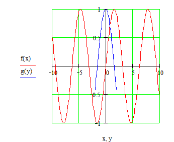
Suppose you want to change the traces on the following plot:
Type f(x):sin(x) See on screen
![]()
Type g(y):cos(y) See on screen
![]()
Type x:-10,-9.9;10 See on screen
![]()
Type y:-2,-1.9;2 See on screen


To create the plot above:
Type in some blank space.
In the placeholder on the horizontal axis, type x,y
In the placeholder on the vertical axis, type f(x),g(y)
Type [Enter] Notice that the traces are different colors. To reformat the plot,
Double-click near the center of the plot to see the X-Y Plot Format box. You can also access this dialog box in your main worksheet window by clicking on a plot and choosing Graph/X-Y Plot Format in the Format menu.
Click on the Traces tab.
Click on trace 1, and change the Color to green (for example).
Click on trace 2 and change the Line to dadot (for example).
Click on OK.
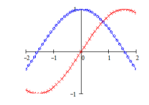
Experiment with the different options to see how you can alter the trace types and other graph characteristics. For example, you could end up with this plot . . .

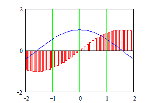
. . . or with . . .

You can also make your plot log scaled (if appropriate), put in grid lines, set markers for emphasizing certain areas of the graph, create legends and axis labels, even create a title for the plot. Be sure also to try clicking once on a plot when you are in the main worksheet window and then select Trace or Zoom from the Graph Palette. And, of course, you can stretch the plot to make it wider or longer by dragging the sizing handles you see at the right and bottom edges when you click on a plot in the main worksheet window.
![]()
|
Politica de confidentialitate | Termeni si conditii de utilizare |

Vizualizari: 1885
Importanta: ![]()
Termeni si conditii de utilizare | Contact
© SCRIGROUP 2025 . All rights reserved