| CATEGORII DOCUMENTE |
| Asp | Autocad | C | Dot net | Excel | Fox pro | Html | Java |
| Linux | Mathcad | Photoshop | Php | Sql | Visual studio | Windows | Xml |
Emphasizing Your Point with Charts with Excel 97
What you will learn from this lesson
With Excel 97 you will:
Create charts with worksheet data.
Modify standard graphs.
Create and insert WordArt into your worksheet.
Create do-it-yourself (DIY) charts.
Insert maps into your worksheets.
Use pie charts with your data.
What you should do before you start this lesson
Beginning the lesson on charts
Start Excel 97.
Open the Excel 97 file named Technology, which you created in an earlier lesson.
Exploring the lesson
Throughout this lesson you will be creating charts using the exceptionally quick and easy graphing capabilities of Excel 97. With the built-in Chart Wizard you can look at data and change the layout, type, and formats to fit your purpose.
Starting the Chart Wizard
The Chart Wizard shows each step along the path from entering raw data to completing a professional-looking graph. You can transform numbers into graphs, illustrating the power of visually oriented information to strengthen presentations.
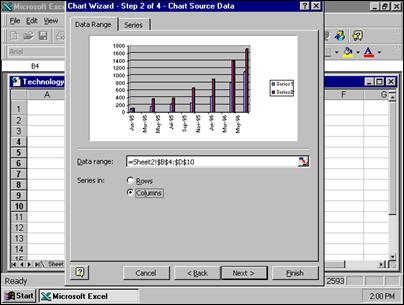
Using the Chart Wizard to get started
 Select all of the data in the Technology
worksheet, including the headings, but not the main title or totals.
Select all of the data in the Technology
worksheet, including the headings, but not the main title or totals.
On the Standard toolbar, click the Chart Wizard button.
On the Standard Types tab, in Chart type, click Column.
In Chart sub-type, click Clustered column with a 3-D visual effect.
Click the Press and hold to view sample button to see a sample of your data in the clustered column 3-D format.
Click Next twice.
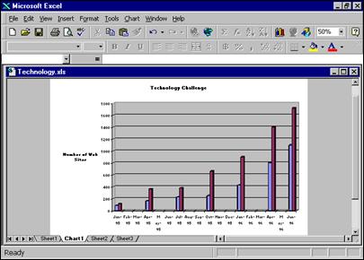
Adding titles
A graph title identifies what the graph presents and explains the data.
Adding titles
With the Technology workbook open, on the Title tab, in Chart title, type Technology Challenge.
In the Value (Z) axis, type Number of Web Sites. (The Z-axis title is available but not the Y-axis, because the Y-axis extends back into the chart.)
Click the Gridlines tab to select type of lines to show on your graph.
In Category (X) axis, check Major gridlines, and click again to remove.
To see how the graph could look, in Value (Z) axis, check Major gridlines.
To move the legend to the bottom, click Bottom on the Legend tab.
On the Data Labels tab, click Show value, Show label, and then None.
On the Data Table tab, click the Show data table option to see a table, and click again to remove the table.
Click Next for Chart Location.
Click As new sheet.
Click Finish to complete the chart process.
Attaching the graph as a new sheet makes it easier to print a chart. You now have a readable and easy-to-understand chart. Attaching the chart as an object has the advantage of providing an immediate view of changes to the chart as you change the data.
Rotating Z-axis titles and enlarging chart titles
The Z-axis title might look cleaner if it were rotated. The main graph title would be easier to read if it were a larger font size. You can change them both.
Rotating Z-axis titles and enlarging chart titles
In the chart from the previous lesson, click the chart title.
On the Formatting toolbar, change the font size to 18.
Click the title, and position the pointer on the bottom line of the title, and move the title to the top center of the chart.
Right-click Number of Web Sites.
Click the Format axis title dialog box.
On the Alignment tab, click the Red Diamond text line, and drag it up to the top of the semicircle.
Click the Font tab, and change the text to bold and 14-point.
Click OK.
Right-click the "Technology Challenge" chart title.
Click Format Chart.
Click the Font tab, and change the text to bold and 20-point.
Click OK.
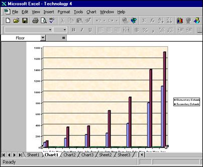
Adding texture to your background
The plain, gray background can be changed to a colorful texture. If you have a color printer, a textured background will emphasize your chart.
Adding texture to your background
In the chart from the previous lesson, on the graph background, right-click Walls.
Click Format Walls.
On the Patterns tab, click Fill Effects.
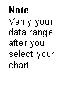
Note If the floor of the chart is too small to find, click the
Zoom button, and select 75%.
On the Texture tab,
click the Parchment color block in
the third column of the first row.
Click OK to close the Fill Effects window.
Click OK to close the Patterns tab.
On the graph background, right-click Floor.
Click Format Floor.
On the Patterns tab, click Fill Effects.
On the Texture tab, click the Green marble color block in the first column of the third row.
Click OK to close the Fill Effects window.
Click OK to close the Patterns tab.
On the File menu, click Save.
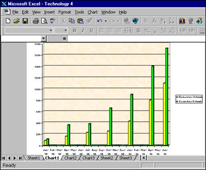
Changing colors of data bars
It is easy to change data bar colors to enhance your chart.
Adding colors to enhance data bars
Right-click the first data bar.
Click Format Data Series.
On the Patterns tab, click Bright yellow in the fourth row.
Click OK.
Right-click the second data bar.
Repeat steps 1 through 4, and click Bright green in the fourth row.
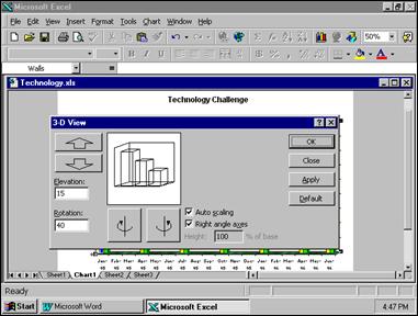
Rotating charts
Sometimes it is easier to understand a chart if it is viewed in 3-D. Using Excel 97 you can modify your chart to show it from any view-top, bottom, right, left-or you can create 3-D charts.
Rotating charts
Right-click Walls.
Note If your image gets blurry, return to the 3-D dialog box
and click Default. Excel 97 will
return the chart to the "normal" 3-D settings.
Click 3-D View.
In the Elevation dialog box, type 15.
In the Rotation dialog box, type 40.
Click the Auto scaling and the Right angle axes boxes.
Click Apply.
Click OK.
Adding depth to charts
The illusion of depth adds dimension to your chart. Using Excel 97 you can easily modify your charts to show depth.
Adding depth to your chart
Click the second bar on your chart.
Press ctrl+1 to open the Format Data Series window.
Click the Options tab.
In the Gap depth dialog box, type 170.
In the Gap width dialog box, type 90.
In the Chart depth dialog box, type 699.
Click OK.
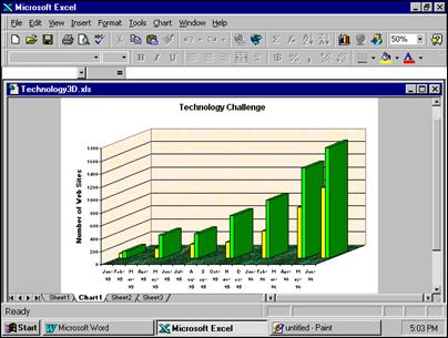
As you view your graph now, determine its effectiveness in illustrating your data. Look at the colors, elements, angles, and text. Consider how students will view the graph in terms of color or black-and-white. You can easily change any part of the graph to improve your presentation.
Adding charts to the workbook
Sometimes it is sufficient and appropriate to add graphics to your charts. Excel 97 has an extensive library of clip art for your use. If you have the installation CD-ROM available, you can use the clip art on it for this exercise.
Adding worksheet graphics from Clip Art
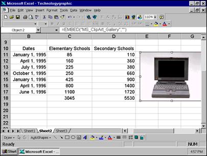
Click cell F4 in your Technology workbook.
Note To identify a chart by file name, click Magnify, and the image will enlarge
with the file name. Or click Properties
to see the file name.
On the Insert menu, click Picture, and then click Clip
Art.
On the Clip Art tab, click Science & Technology.
On the Images tab, click on an image of a laptop computer.
Click Insert.
Click the corner square and drag with the diagonal double arrow to enlarge the picture.
Click OK.
Save the chart with the file name Technology Graphic.
Creating do-it-yourself graphics
Now that you've tried your hand at preprogrammed Clip Art, you are ready to create and insert a do-it-yourself (DIY) graphic. The Drawing toolbar makes it easy to create original, one-of-a-kind graphics.
Attaching the Drawing toolbar
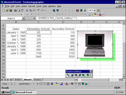
Using the Technology worksheet from the last exercise, click Clip Art.
Right-click a blank area (to the right of the Help button) on the menu bar, and then click Drawing.
Click the graphic you have just inserted, and then click Shadow on the Drawing toolbar.
Click Shadow Style 6 to place a shadow behind the graphic.
Click Shadow again, and click Shadow Settings.
On the Shadow Settings, click the arrow to the right of Shadow Color (Custom).
Click Bright Green.
Click OK.
Under Shadow Settings, click Nudge Shadow Down four times, and click Nudge Shadow Right four times.
Under Shadow Settings, click the arrow to the right of Shadow Color.
Click Semitransparent Shadow.
Save your chart.
If you print your worksheet in color, your chart and information may look and present better than in black-and-white. If you can print overheads directly from your printer, you have just created eye-catching materials for your next presentation.
Using WordArt
Excel has a button on the Drawing toolbar for you to create WordArt. WordArt bends, stretches, and twists words to create one-of-a-kind titles for your worksheets.
Applying WordArt techniques
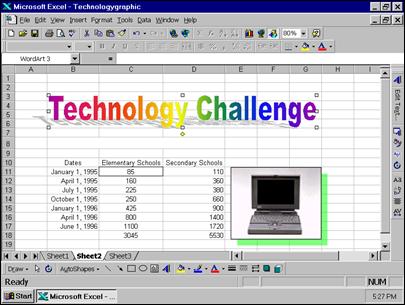
Using the Technology workbook, select the words Technology Challenge, and press delete.
Click the row 1 header, and select seven rows.
On the Insert menu, click Rows, and seven new rows will be inserted.
On the Insert menu, position the pointer on Picture, and click WordArt.
Click the Multicolor WordArt in the fourth column.
Type Technology Challenge.
Click OK.
Click the Size dialog box, and type 32.
Click OK.
On the View menu, click Zoom, and click 75%.
Click OK.
Click the words Technology Challenge, and center the title horizontally and vertically, from the top of the chart to row 7.
Save the worksheet.
How you can use what you learned
Everyone understands the power of pictures to explain data. When you add even one illustration, graphic, or chart to your document, it comes alive. Color draws attention to your worksheets or charts. You can use the power of the Chart Wizard, and have the fun of adding Clip Art.
Using Excel 97 you can add depth, interest, and clarity to charts, and with the Chart Wizard you can easily add color, pictures, and WordArt.
Extensions
Adding maps
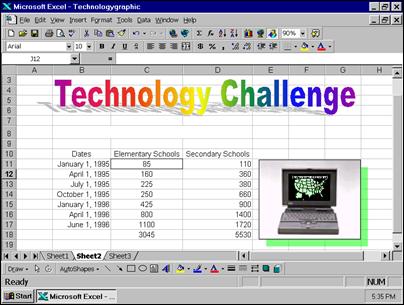
You have added and changed the view of your graph. Now it is time to modify your worksheets even more by adding a map to the Clip Art you already inserted.
Adding a map to your worksheet
Using the Technology worksheet from the previous lesson, on the Insert menu, click Map.
Position the pointer, and click and drag inside the picture of the computer screen as shown in the following illustration.
Click
Save your report.
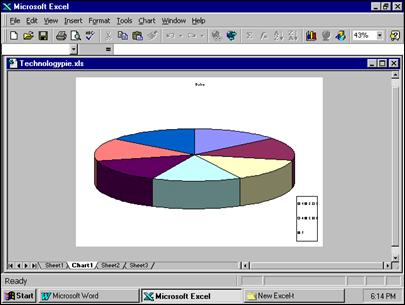
Viewing data with pie charts
Pie charts are easy to understand, and with Excel 97 and they are easy to make.
Creating pie charts
Visually presenting data with Excel 97 pie charts
With the Technology workbook open, click cell B3, and then press shift while you click B10.
Press ctrl while you click cell D3 and drag the pointer to select cells D3 through D10.
Click the Chart Wizard button.
Under Chart type, click Pie, and In Chart sub-type, click Pie with a 3-D visual effect (first row, second chart).
Click Next.
On the Series tab, click Next, and on the Title tab, click Next.
Click As new sheet.
Click Finish.
Note If your chart does not have a title, start with step 4,
or go back to the Chart Wizard and add a title.
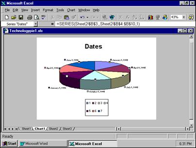
Modifying pie charts
Emphasizing data and text in your pie charts
Click Title.
Right-click (chart) Title to open the Format Chart Title dialog box.
On the Font tab, click Bold, change the point size to 36, and then click OK.
Right-click the Legend box to open the Format Legend dialog box.
On the Font tab, click Regular, and then change the point size to 16.
On the Placement tab, click Bottom, and click OK.
Click the Legend box.
Click the size handle at the bottom, and drag it down to increase the length of the Legend box.
Click the size handle at the side of the Legend box, and drag it left to increase the width of the box.
Right-click inside Pie to open the Format Data Series dialog box.
On the Data Labels tab, click Show value.
Click Show legend key next to label, and click OK.
Right-click one of the Data Labels to open the Format Data Labels dialog box.
On the Font tab, click Regular, click 14, and click OK.
Your chart should match the following example:
![]() Summarizing what you learned
Summarizing what you learned
In this chapter you have explored and practiced:
Creating graphs with worksheet data.
Modifying a standard graph.
Creating and inserting WordArt into your worksheet.
Creating do-it-yourself (DIY) graphics.
Inserting maps.
Using pie charts.
|
Politica de confidentialitate | Termeni si conditii de utilizare |

Vizualizari: 1661
Importanta: ![]()
Termeni si conditii de utilizare | Contact
© SCRIGROUP 2026 . All rights reserved