| CATEGORII DOCUMENTE |
| Asp | Autocad | C | Dot net | Excel | Fox pro | Html | Java |
| Linux | Mathcad | Photoshop | Php | Sql | Visual studio | Windows | Xml |
After creating a chart, you may realize that you selected the wrong data for it. Perhaps you left out one of the rows or columns you meant to include, or perhaps you selected too much.
To change the data range for the chart, do the following:
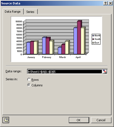
Figure 5-13: Change the data range if needed.
TIP
Some people find that it's less work to delete and
re-create a chart rather than to modify the data range; that's up to you.
As mentioned earlier, you can project a very different message with a chart by changing its plotting by rows versus columns. An easy way to do so is to click the By Rows or By Columns button on the Chart toolbar. You can also do it from the Source Data dialog box shown in Figure 5-13A data table is a minigrid that appears below a chart, showing the data that the chart is based on. Figure 5-14 shows an example of it. You can turn the data table on/off with the Data Table button on the Chart toolbar.
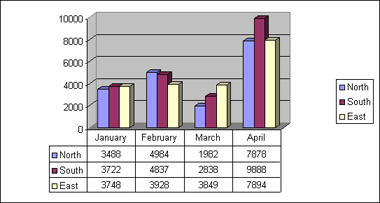
Figure 5-14: This data table provides background
data that the user might want when interpreting the chart.
Excel selects the data scale automatically depending on the data. It starts at zero (0) and goes up to the highest value represented in the chart, or slightly above it. For example, in Figure 5-14, the highest value is 9,888 and the scale on the vertical axis goes up to 10,000.
Most of the time, the default scale is appropriate, but you might want to change it to strategically emphasize a certain fact. For example, suppose you're plotting data where all the values were between 9,500 and 10,000. There would not be much of a difference between the heights of the bars. But if you change the scale so it starts at 9,000 and ended at 10,000, the differences appear much more dramatic. Is that what you want, to make the differences look dramatic, or do you want to minimize them? That's up to you and the specific situation you're in.
To change a chart's scale:
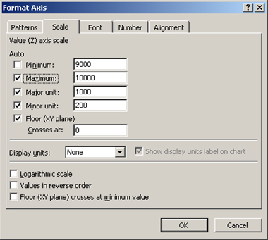
Figure 5-15: Change the scale to emphasize or
de-emphasize differences in the values.
|
Politica de confidentialitate | Termeni si conditii de utilizare |

Vizualizari: 1151
Importanta: ![]()
Termeni si conditii de utilizare | Contact
© SCRIGROUP 2025 . All rights reserved