| CATEGORII DOCUMENTE |
| Asp | Autocad | C | Dot net | Excel | Fox pro | Html | Java |
| Linux | Mathcad | Photoshop | Php | Sql | Visual studio | Windows | Xml |
Charts (also called graphs) summarize and present data in a graphical way. Take a look at Figures 5-1 and 5-2; which would you rather look at?
Excel uses the terms graph and chart interchangeably. Throughout the main part of Excel, chart is used, but the official name of the portion of the program that creates the charts is Microsoft Graph. In this lesson, we use chart.
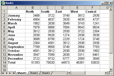
Figure 5-1: A typical worksheet full of numbers.
Boring!
Probably Figure 5-2, right? The chart makes the meaning of the data immediately obvious -- one region (or division) had much better sales than any of the others -- without having to wade through the actual numbers.
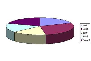
Figure 5-2: When data is made into a chart, its
meaning becomes more readily apparent.
Providing a chart to the audience is not only a service to them, but it also gives you an extra edge in manipulating your audience's perception of the data. For example, take a look at Figures 5-3 and 5-4. Both present the same data, but in Figure 5-3, the audience is being invited to compare the regions to one another.
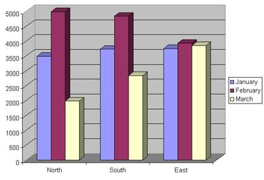
Figure 5-3: This chart compares one region to
another.
In Figure 5-4 the audience is being invited to compare performance over time.
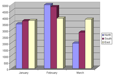
Figure 5-4: This chart compares performance over a
period of months.
The charts shown in Figures 5-3 and 5-4 are all about comparisons, but what if the important thing you want the audience to see is the overall company-wide effort? You could emphasize that by structuring the chart as shown in Figure 5-5.
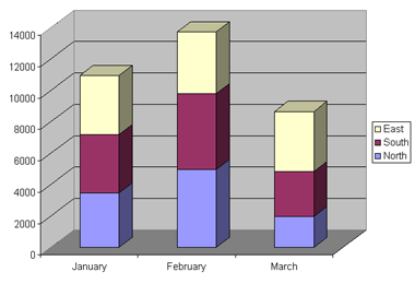
Figure 5-5: Here's a version that invites the
audience to look at the big-picture results of all regions combined.
And that's just one chart type. Excel offers more than a dozen chart types, and many subtypes for each type, so you can construct almost any chart you can imagine.
Selecting the right chart type may take some trial and error, so this lesson explains how you can switch freely between the types. Lines, bars, columns, areas, and other chart types are all appropriate for different situations.
The only hard-and-fast rule when choosing a chart type is that a pie chart can be used only for data containing a single series. A pie chart shows how various pieces contribute to a whole -- for example, how various region revenues contribute to a corporate total revenue amount, or how various products contribute to total sales. By definition, this means a single data series. You can't use a pie chart to show several products' sales over several years, for example, but you could use a pie to show a single product over several years, or multiple products in a single year.
|
Politica de confidentialitate | Termeni si conditii de utilizare |

Vizualizari: 1024
Importanta: ![]()
Termeni si conditii de utilizare | Contact
© SCRIGROUP 2025 . All rights reserved