| CATEGORII DOCUMENTE |
| Asp | Autocad | C | Dot net | Excel | Fox pro | Html | Java |
| Linux | Mathcad | Photoshop | Php | Sql | Visual studio | Windows | Xml |
Native Visual FoxPro Controls
A form by itself doesn't do much. You've got to put stuff on it, and most often, that stuff is one or more controls. Visual FoxPro comes with a set of controls that you may well find meets the majority, if not all, of your needs. In this chapter, I'll discuss how to use each of VFP's native controls.
There are 21 controls native to Visual FoxPro, and among them they have 839 properties, events, and methods. Well, maybe 841 by now. Trying to examine each one of these controls and their PEMs in this chapter would be as unreasonable an exercise as including a 50,000-word dictionary in the third lesson of an English grammar text. Instead, I'm going to cover the key properties, events, and methods for each control, and show you how to use them in a simple form.
I'll cover more practical, real-world use in Chapters 12 through 15, and you can explore each PEM in depth in the Hackers' Guide to Visual FoxPro 6. 0 by Tamar Granor and Ted Roche.
The proper care and feeding of controls
Controls can be divided into three groups according to their function: those that perform visual delineations, those that initiate actions, and those that allow you to manipulate data.
The visual delineators include the Label control, the Line and Shape controls, the Image control, and the Page Frame. These don't actually do anything, but they provide a means to provide visual feedback to the user.
The action controls include the Command Button and Command Button Group, and the Timer. You'll often see Windows applications that use other controls, such as check boxes, to initiate actions. In the discussion following this section, I'll explain why I believe this is a bad choice.
The data-manipulation controls include the Text Box, the Edit Box, the Option Group, the Check Box, the Combo Box, the List Box, the Spinner, and the Grid. These are used to accept input from the user, either to control the application or as a means to enter data into the application's tables. Many of these controls can be used for the same purpose-for example, you can use a text box or an edit box to enter a string of text into a field, and you can use a check box or a two-button option group to select between two choices. However, there are advantages to using certain controls for specific data-entry mechanisms, and I'll cover these in the section for each individual control.
The ActiveX and ActiveX bound controls are simply placeholders for third-party controls, and those could belong to any of the three groups.
Focus and containers
The concept of "focus" is core, both to a form and to the controls placed on it. Focus is the GUI equivalent of a cursor in a character-based system. Focus is where the action is occurring on the form; it might be a command button, an option group, or a text box. In much the same way as you can manipulate the cursor in a character-based system with the arrow and tab keys to move the cursor from field to field, you can manipulate the focus on a form by using either the keyboard (the arrow and tab keys) or the mouse (clicking on a control). A control changes its appearance when it has focus. Typically, you'll see the cursor blinking in a text box or edit box and you'll see a dotted line around the caption in controls like option groups, check boxes, or command buttons.
It's important to remember that, unlike many character-based systems, the Enter key does not usually change focus. Instead, if there is a default control on the form, pressing Enter executes that default control. Many times this is not what the user expects, so you'll need to account for this tendency.
One key point to remember about working with controls is that you must remember which level of the hierarchy you are in when editing. Some controls are simply containers for additional controls, such as the page frame, grid, option group, and command button group. It can be frustrating at first to try to manipulate the control inside a container and have Visual FoxPro prevent you from doing so. It is doubly frustrating to create a series of controls on a page of a page frame, only to find that you've actually placed all of the controls on top of the page frame itself-not in one of the pages.
Here's the trick. When you want to work within a container control, such as a page frame, place it on a form and then select the container. You'll see eight drag boxes-in the four corners and in the middle of each side. Then, right-click the container control to bring up the shortcut menu and select the Edit menu option. The container control will be highlighted with a thick green border, and you can now select individual controls in the container, such as an individual page.
An alternative method that works for all controls is to use the Object drop-down list box in the Properties window. You'll notice that the controls in the form are arranged in a hierarchical order with an outline format. You can scroll through the list box and select the desired object.
Some container controls have a predefined number of child objects but others do not. For example, when you drop a page frame on a form, it comes with two pages by default. Similarly, an option group comes with two option buttons. However, a grid does not come with any columns defined by default. You will have to set a property to define how many child objects you want-in the case of a grid, this property would be ColumnCount. Many controls have a number of properties and events in common, including Name, Caption, and BackColor, and events such as Click, Init, and Error. Instead of repeating the same information in each section, it makes sense to discuss handling these items just once.
Common properties
Colors
Controls have two color-related properties: ForeColor and BackColor. The former is the foreground color used to display text and graphics in an object, while the latter specifies the background color. For example, in a label, the ForeColor of the Visual FoxPro base class is black (the color of the text in the label) and the BackColor is gray.
The default BackColor property defaults to white for some controls, such as text boxes and edit boxes, and to gray for other controls, such as labels and check boxes. If your form has a different BackColor, such as tan, the control will look out of place because there will be an invisible boundary with a white color. You'll likely want to change the color to match the form's BackColor. Note that this process can be made automatic by subclassing the controls and setting the BackColor property in the parent class. This is discussed in Chapter 10.
When you disable a control, such as a command button, the object automatically changes color so the caption uses the DisabledForeColor. You might want to be able to change the color of the command button's caption at other times as well, and you can do so with the ForeColor property. Be careful when doing so, because not all users have sensitivity to certain colors or schemes, and because it's easy to mistakenly turn the color of the button background and caption to the same color, making the button unreadable.
You can use the RGB() function to explicitly specify a color. The RGB() function takes three parameters, each a numeric value between 0 and 255, specifying the intensity of the Red, Green, and Blue color components. Experiment with the Color Picker to see the parameters needed for various colors. The following schemes can help get you started:
0,0,0 black 64,64,64 mottled red/pink 128,128,128 dark grey 192,192,192 light grey 255,255,255 white 128,0,0 magenta0,128,0 light green 0,0,128 light blue 128,128,0 yellow128,0,128 purple0,128,128 light blue255,0,0 bright red 0,255,0 bright green 0,0,255 bright blue 255,255,0 bright yellow 255,0,255 bright magenta 0,255,255 aqua
Names and captions
The Name and Caption properties typically cause some confusion, because they seem to refer to the same property. The caption of a control is the actual text that shows up with the control on the form. Thus, some controls don't have a Caption property. For example, a check box's caption is the text that appears next to the check box itself. A text box, however, doesn't have a caption. The Name of the control, on the other hand, is the physical name of the control used by the developer to refer to the object within the program in order to manipulate it. For example, in order to determine whether a check box is checked, you'd need to evaluate the value of the check box, and you'd use the name of the check box to do so:
chkIsAlive. value.
chkIsAlive. name = 'chkIsAlive chkIsAlive. caption = 'Is Alive'
All controls must have a name in order to reference them, but some controls do not have captions that are displayed. For example, a command button group would have a name, but wouldn't need a caption because there is no visible object on the form for the group. Each command button, however, would have a caption in addition to a name.
It is easy to develop a set of names for controls that are difficult or impossible to remember, which makes development time-consuming, frustrating, and error-prone. The following conventions are suggested to help avoid these problems. (They can also be found in Help under the topic Reference, Language Overview, Language Categories, Naming Conventions, Objects. ) First, use the following list of prefixes as the first three characters of an object's name:
acd ActiveDoc chk CheckBox cbo ComboBox cmd CommandButton cmg CommandGroupcnt Container ctl Control edt EditBox frm Form frs FormSet grd Grid grc Column (within a Grid)grh Header (within a Grid)hpl Hyperlinkimg Imagelbl Label lin Line lst List olb OLE Bound Control ole OLE Control opt OptionButtonopg OptionGrouppag Page (within a PageFrame)pgf PageFrameprj ProjectHooksep Separator (within a ToolBar)shp Shapespn Spinnertxt TextBox tmr Timer tbr ToolBar
The rest of the name of the control follows the prefix. In the case of a single control, such as a command button, the name might consist of the "cmd" prefix and the caption or the first word of the caption on the command button. In the case of a container, such as an option group, the name might consist of the "opg" prefix and a word that describes all of the option buttons together, such as Color or Season. It is customary to capitalize the first letter after the prefix, like so: cmdDone, opgSeason, tmrBegin.
If a control is bound to a field in a table, I'll use the name of the field as the name, like this text box that is bound to the last name of a person:
txtNameLast
Because Visual FoxPro will handle variable names and user-defined PEM names that are longer than 10 characters, I usually use the name of an accompanying descriptor for a container such as an option group. For example, I usually place a label near the option group to describe what the control represents, just as you would do in front of a text box. I'll use the label as the suffix for the name of the option group, like so:
opgRentalSeason
AutoSize
AutoSize is another property that I set for many controls. This property automatically causes the control to be resized to the width of its caption at design time. Labels, option buttons, and check boxes are all likely candidates to have AutoSize set to . T. Many developers prefer to keep AutoSize set to . F. for command buttons-a form with several vertically aligned buttons that are all different sizes would look bad.
Common events
All Visual FoxPro controls have Init, Destroy, and Error events. Most also share a number of other events, including Click, GotFocus, and LostFocus.
The Click event is fired when the user clicks the mouse while the mouse pointer is positioned over the control. All controls have a Click event associated with them, including those you wouldn't normally click on, such as labels and shapes. Think of the Click event of these types of controls as allowing the control to act as an invisible button. You can temper the allure of creating fancy and complex forms containing dozens of hidden Click events with the knowledge of the drudgery of educating users and maintaining a complex and less-than-perfectly-documented application.
The Init event is fired when the control is created. Note that a control's Init event is fired before the Init event of the corresponding container object (including the form itself!). In other words, you can think of Inits firing from the inside of a container to the outside. This is so that you can reference the control while creating the container.
The Error event of an object is fired when a runtime error is encountered in a method of that object. Suppose you have a form with a command button that has code in the button's Click event, and that code contains an error, such as trying to open a table that does not exist. To handle the error, place code in the command button's Error event. If you place code to handle that error in the form's Error event (as opposed to the command button's Error event), it will be ignored.
The GotFocus and LostFocus events are fired when the object receives or loses focus. The user can initiate the events by performing an action such as tabbing into or clicking on the control. The developer can also control the events with the SetFocus method. You might want to move the focus from one control to another after an action has been performed. (Fox 2. x users have been using _curobj to do this. ) For example, after clicking the Add button you would move the focus to the first text box in the form, so the user can begin entering data immediately. This is done with the SetFocus method. This is tricky, in that the call to the SetFocus method (remember, a method is simply a subroutine) is made in the event of the control you are leaving-not the one you are setting focus to. So in the Add button's Click event, you'd add the following code to move the focus to the Customer Name text box:
frmThisForm. txtCustName. SetFocus()
Event firing
As you've seen, each control has a number of events associated with it. Much as it may seem to the contrary to a developer (particularly early in the morning with bleary eyes and tired fingers), these events do not fire at random occasions. Rather, they are executed in a specific order and in response to specific situations. To take advantage of an event's usefulness, it is best to be comfortable with the environment surrounding the firing of events.
This is one of those
situations, much like riding a bike, where you can listen to someone
else talk about it at length, but eventually you have to try it for yourself.
Many programmers
find it useful to create a sample form with code attached to each event of
certain controls.
The form FIRE, shown in Figure 9. 1 and included in this chapter's source code files at
 www. hentzenwerke. com, contains several
controls with commands that output a
www. hentzenwerke. com, contains several
controls with commands that output a
message. The message contains the name of the event to the Debug Output window in many of the methods. Run the form and see for yourself when each of the events is fired.
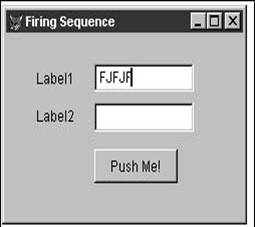
Running this form, entering a five-character string in the first text box, and then tabbing through to the Push Me! button generates the output shown here:
Form. load()label1. init()text1. init()label2. init()PushMe. init()text2. init()
Form. Init()Form. show()Form. activate()text1. when()Form. gotfocus()text1. gotfocus()text1. interactivechange()text1. interactivechange()text1. interactivechange()text1. interactivechange()text1. interactivechange()text1. interactivechange()text1. valid()text1. lostfocus()text2. when()text2. gotfocus()text2. valid()text2. lostfocus()PushMe. when()PushMe. gotfocus()Form. release()PushMe. valid()PushMe. when()Form. destroy()text2. destroy()PushMe. destroy()label2. destroy()text1. destroy()label1. destroy()Form. unload()
You'll see that the form loads, but before anything else happens to the form itself, the controls are all instantiated (created). Then the form's Init, Show, and Activate events are fired. Third, the first control, text1, has its When event fired, and then the form and the text box both receive focus. At this point, the cursor is blinking in the text box, waiting for the user to do something.
Each time the user types something, the InteractiveChange event fires. When the user presses the Tab key (that's the sixth InteractiveChange event, by the way), the Valid event fires, and because there is no code in the Valid event to prohibit the user from leaving the control, the first text box loses focus and the second one gets focus.
When the Push Me! button (with a "thisform. release" command in its Click event) is clicked, a number of interesting things happen. First, the button's When event fires, the button gets focus, and the code in the Click event is executed ("thisform. release"). Then the button's Valid event fires, and, interestingly enough, the button's When event fires again! Notice that the Push Me! button's LostFocus event is never triggered.
Finally, the form and then each of the controls is destroyed, the form is unloaded (from memory) and the process is complete. Not exactly what you were expecting, I'll bet. Obviously, it will be well worth your while to spend some time examining and working with the various events until you get comfortable with what fires when, and why.
Now it's time to look at the controls themselves. I'm going to look at each group of controls first, and then examine the specifics of each individual control after that.
Visual delineators
Visual delineators are used to display static information, divide the form, or otherwise provide visual indicators of how the form is organized.
Label control
Use the Label control to place text legends next to text boxes and edit boxes, provide prompts for controls where they can't include the prompt themselves, and provide other textual information such as instructions or reminders. You can change the text of a label and its visible state programmatically while running the form.
The label, although seemingly dumb, has many properties and can react to a number of events. For example, you can click on a label and execute a method, much like an invisible button. You need to be careful with this because good interfaces need to be keyboard-friendly as well, and you can't tab to a label; as a result, there is no "keypress" event associated with a label.
Image control
Use the Image control to place static images on a form. Formats supported include . BMP (bitmaps), . CUR (cursors), . DIB (bitmap), . GIF (Graphic Interchange Format), . ICO (icons), and . JPG (JPEG files).
You can change the image and its attributes programmatically while running the form, and you can control how the image is placed on the form according to the space allotted for it. By setting the Stretch property to 0-Clip, the part of the image that extends past the size of the control will be cut off. By setting the Stretch property to 1-Isometric, the image will be resized so that at least one dimension fits into the control completely. The other dimension will be cut off. In other words, the aspect ratio will be maintained at the expense of part of the image. By setting the Stretch property to 3-Stretch, the image's aspect ratio will be modified so that the picture fits exactly in the space allotted for the control.
Line control
Use the Line control to place lines on a form. Lines are often used to group or divide sets of controls on a form. Dividing a complex form into several areas makes it easier for the user to comprehend the use of the form.
Shape control
Use the Shape control to place boxes and ellipses on a form. Like the Line control, these shapes are often used to group or divide sets of controls on a form. Line and shape controls also can be used to create simple drawings that contain colors, shading, and so on.
Page Frame control
Use the Page Frame control to place multiple sets of controls on a single form instead of creating multiple forms. Each set of controls is placed on a separate page and the pages are placed on top of one another much like a deck of cards. Each page can have a tab that "sticks out" from the deck in a separate location; clicking a tab brings that page to the top of the deck.
Using a page frame is straightforward. After placing a Page Frame control on a form, you'll set the PageCount property to control how many pages are in the page frame. Because much of the allure of a Page Frame control is the nifty set of tabs that display on the top of the control, you'll probably want to keep the Tabs property set to . T. , but you can turn the tabs off if you have another mechanism for switching between pages. For example, you can create a wizard interface by placing each step on a separate page of a page frame, setting the Tabs property to . F. , and then providing Next and Back buttons for the user to navigate between pages.
Other useful properties include TabStop, which determines whether the user can use the Tab key to move between pages, and ActivePage, which is the number of the topmost page. You can interrogate ActivePage to determine which page is on top, or change its value to programmatically change which page is showing on top.
You can have dozens of pages in a page frame, but you'll see that by default, the tabs are each compressed and the caption on each tab is chopped off. If you need more tabs than can comfortably fit on one line, you can create multiple rows by changing the TabStretch property from 1-Clip to 0-Stack. The Page Frame control will automatically determine the number of rows of tabs necessary so the captions on each page are completely visible. Note that Visual FoxPro automatically creates the rows, so if your tab captions aren't long enough, you can't force multiple rows of tabs.
If you scan through the PEMs of the page frame, you'll see that you can't change the color of the text on each page. However, that's mainly because you're looking in the wrong place. Not only can you change the color of the text, but you can use a different color for each page by manipulating the ForeColor property of a specific page.
It's tempting to create a complex page frame, adding dozens of controls to each page- perhaps even additional page frames on individual pages of the master page frame-but be aware that this won't come cheap. The more complex a page frame is, the longer it will take to load. Be sure to test a form with a page frame against a live data set on a machine typically used by a user of your application. The two-dozen-tab page frame might be snappy on your brand new development machine, but the story might be different for the user.
Probably the most requested feature that hasn't been implemented (as of this writing) is the ability to move the tabs to the side or bottom of the form. But that's why God created ". 1" releases.
Separator control
Use the Separator control to place spaces between buttons on a toolbar. Separators can be used to group buttons so the user can more easily identify buttons by noting the group they're in and their relative position within the group. For example, all Edit buttons on the Standard toolbar are grouped together so it's easier to find and use the Cut, Copy, and Paste buttons. Many users don't actually look at the pictures on the buttons, but just click on the "middle button" in order to copy something.
The Separator control will be discussed in more detail in Chapter 14.
Controls to initiate action
These controls are used to provide the user with a mechanism to initiate an action or to allow Visual FoxPro to initiate an action at a given time. The most-used controls are the Command Button and Command Button Group. Selecting a command button-clicking it or pressing Enter when the button has focus-will cause an event to happen. Examples are bringing forward another form, moving the record pointer, or causing interaction with the database, such as saving data. As with menus, it is good practice to use an ellipsis (a set of three dots) in the caption of a command button when clicking it opens another form.
In stark opposition to Microsoft and other Windows adherents, I believe certain controls should be used only for specific purposes. While it is possible for any control to initiate an action (they all have Click events, for example), I believe it is bad interface design to do so. For example, you often run across applications where a check box opens up a second form. I don't agree with this use. When you click a button, you expect something to happen. When you click a check box, however, you simply expect to have the state of the check box change from checked to unchecked (or vice versa). You don't expect a dialog to display or the form to disappear-well, at least I don't. Others justify this interface, believing that the status of the check box (checked or unchecked) provides a visual clue about whether or not the form opened by that check box contains data.
I prefer to use a command button to open the second dialog, and then modify the caption of the command button to indicate whether or not there is data in the second dialog. For example, with a dialog that has a "Comments" field, I would use a command button titled "Add Comments" when the Comments field is empty. Once the user has entered comments, I'd change the caption to "Edit Comments. "
If you choose to use controls for purposes that they aren't intended, be sure to provide plenty of explanation, an escape route should users wander down a path they hadn't meant to explore, and, above all, consistency, so that the same control does the same thing everywhere throughout the application.
Command Button control
The Command Button control allows the user to initiate an action. It has a full set of properties (such as Enabled, Color, and Caption), and events (including Click and MouseDown).
Most commonly you'll want to attach a code to a command button that is executed when either the control is clicked or the Enter key is pressed when the focus is on the button. This code is placed in the Click event of the button, and it might be as simple as "do FORM XXX" or it might contain a complex procedure or routine, such as posting data to accounts or importing data from another system.
In the scope of the form, there are many other actions you'll want to do with a command button. You might want to change its caption. For instance, you might have two or more mutually exclusive actions to be performed, such as steps in a posting routine. The first step might be to Import new transactions, the second would be to Post, and the third to Archive. Instead of having three command buttons, two of which would be disabled at any given time, you could use one button and simply change the caption (using the Caption property) according to a flag in the table. After reading a record, the following code would change the caption of the command button according to the contents of that flag:
do case case cFlagTrans = '1'
frmThisForm. cmdTransactions. Caption = 'Import'case cFlagTrans = '2'
frmThisForm. cmdTransactions. Caption = 'Post'case cFlagTrans = '3'
frmThisForm. cmdTransactions. Caption = 'Archive'endcase
In this case, the button acts as a mini-wizard, seemingly changing state as the process progresses.
In other cases, you might just want to disable a command button, but leave it visible in order to provide a visual clue to the user that the action isn't available or appropriate at a given time. For instance, when moving to a new record, you might want to disable the Save button (using the Enabled property) until the user has made a change. The following code would enable and disable the Save button:
if (change has been made)
frmThisForm. cmdSave. Enabled = . t. else
frmThisForm. cmdSave. Enabled = . f. endif
Instead of disabling a command button, you might want to hide it completely using the Visible property. Note that an object can still be manipulated in code when it's not visible.
In keyboard-intensive applications, you might want to provide keyboard hotkeys for command buttons so the users don't have to tab through many controls or move their hands from the keyboard to the mouse in order to execute the button. Preceding one of the characters in the caption with "<" will make the caption appear with that character underlined. That command button can then be executed by holding down the Alt key and pressing the underlined character.
FoxPro 2. x users should note that the other keyboard hotkeys to mimic Escape and Default behavior (the ! and ? combinations) do not work in Visual FoxPro. Users who are coming from character-based applications are often used to pressing the Escape key to get out of the form. Similarly, they might be used to having a "default" button that is executed upon pressing Enter. The Cancel and Default properties can be set to . T. for a command button. This is handy in order to force the methods associated with that button to be executed at the time the Escape or Enter keys are pressed. For example, you might have code that must be executed upon leaving the form in the method attached to the Done button. By setting the Cancel property of the Done button to . T. , that code will be executed whenever the user presses the Escape key to leave the form.
You might also want to place a picture on a command button and possibly change the picture depending on whether the button is depressed or not. The Picture, DownPicture, and DisabledPicture properties enable you to attach an image to a command button to do all this. Note that the image must be appropriately sized for the button.
Command Button Group control
The Command Button Group control also allows the user to initiate actions, but the buttons are placed in a group as a convenience for the developer. You can manipulate command buttons in a group as a single object, and also tie methods to the entire group instead of to a single command button.
You might want to have a single method called from all of the buttons, and then execute part of that method depending on which button was selected. Attaching the method to the Click event of the command button group will make this happen. You need to interrogate the Value property of the command button group to determine which button was selected. The following code in the Click event of a command button group will execute some common code, then button-specific code, and finally more common code:
* button-nonspecific code<code that is executed regardless of which button was clicked>
* button-specific codedo case case This. Value = 1
<code is executed only for button 1>case This. Value = 2 <code is executed only for button 2>caseThis. Value = 3 <code is executed only for button 3>endcase
* more button-nonspecific code<code that is executed regardless of which button was clicked>
The command button group is a container, and it is important to note that methods might be attached to similar events in both the command button group and in individual command buttons. The Click method of a single button will execute instead of the Click method of the group if there is code in both.
Timer control
Use the Timer control to force Visual FoxPro to initiate actions at set intervals. These actions can include proactive actions, such as events that you, the developer, want to initiate, or reactive actions, such as checking the state of something (like the value of a property) at specific times.
The initial use of a timer can be confusing. Placing a Timer control on a form does nothing by itself. You must set at least one timer property and attach code to one event for the Timer control to do something. The key property is the Interval, which is the time span at which the Timer control fires the timer event. Note that the Interval property is set in milliseconds, so a value of 500 will fire the timer event every half second.
The timer event contains code that is executed each time the interval is reached. Note that the interval doesn't have any direct relation to the system clock. Just because you set the interval to 1000 (one second) doesn't mean that the timer event will be fired at 12:01:00, 12:02:00, 12:03:00. Rather, it will be fired every second, although perhaps in the middle of the second: 12:01:23, 12:02:23, 12:03:23.
Before you get all excited about the capabilities this seems to promise, you should be aware that there are a number of caveats to the timer's functionality. Instead of thinking of a timer as a cure-all to all sorts of problems you've encountered, think of it as providing extensions that didn't used to exist. For example:
The timer does not process when a menu bar, pull-down menu, or pop-up menu is open. For example, you can cause something to happen when the timer event is fired, such as a WAIT WINDOW command or a message dialog, and the Timer control keeps on ticking. The ATIMER sample in the source code files sets an integer property to 1 and increments it every 100 milliseconds. See Figure 9. 2. The timer also has a message box that fires when the seconds portion of the current time equals 00, 20, or
40. The following code is in the timer event of the Timer control:
thisform. iCounter = thisform. iCounter + 1 thisform. text1. Value = thisform. iCounter if sec(datetime()) = 0 or sec(datetime()) = 20 or sec(datetime()) = 40messagebox('The seconds are divisible by 20. ' ;
+ chr(13) ;
+ 'Wait a few seconds and press OK. ' ;
+ chr(13) ;
+ ) 'You'll see the timer has kept going. ' ;
endif
thisform. Refresh()
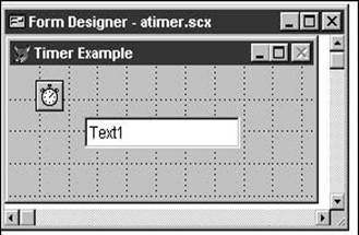
When this fires, the timer stops processing while the message box is displayed. You'll see that when you eventually get around to clicking OK to get rid of the message box, the counter will continue to be updated with the next value-it hasn't been incremented every tenth of a second while you were waiting.
The timer has a maximum interval of approximately 3. 5 weeks (2,147,483,647 milliseconds). You'll have to perform some tricks behind the scenes to fire an event
once a month. This could be done by setting an interval of two weeks, and then throwing every other timer event away.
The maximum resolution of a timer interval is constrained by the system clock- approximately 18 ticks per second. So while you can specify an interval of 3 (3/1000 of a second), the interval will actually be 1/18 second-about 0. 0555 seconds.
The interval is not guaranteed to elapse exactly on time. Thus, if you specified an interval of one minute, the timer event might actually fire at 12:01:23, 12:02:24,
12:03:22. (This isn't the fault of VFP; rather, it's because the computer might be doing something else at that specific moment. ) Use the system clock in combination with the timer in order to manage preciseness.
An application demanding heavy processor resources can cause timer events to be processed late-or not at all. Consider this when deciding how short an interval to rely on.
Hyperlink control
The Hyperlink control allows you to let a user jump to a specified URL. Its navigational capabilities also include moving back and forth through a container's history, much like a browser's Back button allows you to move to the previous Web page.
The Hyperlink control is somewhat of a disappointment when compared to the other native controls in Visual FoxPro, for two reasons. First, you can't really use it "out of the box" like you can the other 20 controls. It has no user interface and requires a fair amount of work to implement robustly-much more than, say, dropping a check box on a form and then being able to click on it. Second, the Hyperlink object works only with Microsoft Internet Explorer. This is corporate arrogance at its worst. Imagine if the Text Box control worked only on computers that were attached to a Windows NT network-if your application was running on Novell or LANtastic, you'd have to use a different, more complex mechanism!
Controls to manipulate data
Data-manipulation controls can be divided into two primary groups: those used when the data to be entered can't be predetermined, such as a company name or a phone number; and those used when the user will make a selection from a predetermined list of choices, such as the name of a department, the sex of an individual, or the status of a payment. Text Box, Edit Box, and Combo Box controls allow the user to enter information that can't be predetermined, while the Option Group, Check Box, Combo Box, List Box, and Spinner controls can restrict the choices available to a user. The Grid control is a spreadsheet-like object that can contain both types of data controls.
Text Box control
Use the Text Box control to display and edit data of a fixed length. This control is usually tied to a non-memo field in a table but can also be used to enter data that the application can use elsewhere, such as the heading of a report or the name of a file being created. Use a text box when the value that a user will enter can't be predetermined but the length of the data will fit in a non-memo field.
To create a Text Box control that will not be bound to a table, select the Text Box control from the Form Controls toolbar and drag it to the form. Resize the control as desired, give it a name, and you're ready to use it. Once you have a Text Box control on a form, you're likely to want to type data in the text box and then determine what data has been typed there. Typing data into the text box is simply a matter of moving to the control and typing. Once done, you can move out of the text box. The data that has been typed in the text box can be determined by interrogating the Value property of the control.
To bind a Text Box control to a table, set up a data environment that contains the table or tables desired, and then drag the specific fields to the form. (If you attempt to drag an entire table to a form, you'll automatically create a Grid control, which is addressed later in this chapter. )
If you created a Text Box control by dragging a field from a data environment onto the form, you'll see that the ControlSource property for the text box has automatically been assigned the value of the table and field name. This makes life very easy. To create a simple navigation screen, place the usual Next and Previous command buttons on the form. Then, when running the form, selecting the navigation buttons will automatically cause the text boxes to display data from the table. The ControlSource property causes the appropriate table(s) to be opened and data displayed when the form is run.
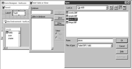
If you need to bind a Text Box control to a table but, for whatever reason, don't have the ability to drag fields from the data environment, you can still avoid typing the data source manually. First, add the table to the data environment. You can do this by right-clicking on the form, selecting the Data Environment menu command, and when the Open dialog appears, select the table of interest. After clicking OK in the Open dialog, the table will be added to the data environment. (You'll have a chance to add more tables to the data environment by using the Add Table or View dialog, as shown in Figure 9. 3. )
Once the table in question is part of the data environment, select the ControlSource property of the Text Box control in the Properties window. A combo box appears, which enables you to either type a data source or select a field from any open table. Scroll through the list of fields and select the desired field.
Because the text box is often the primary, if not only, tool for data entry into many applications, you're typically going to require many demands of the Text Box control. First, you're probably going to want to format or mask the input of the data entered into a text box. For example, when entering a Social Security number, you might want to store only the numbers, but display the number with the hyphens. You can do this by using a format of R and an input mask of 999-99-9999. The Help topic "Template Codes" has a complete list of format codes for text boxes. You'll often want to validate the data entered by the user. This is most commonly done by using a method in the Valid event of the control. This method must return . T. or . F. depending on whether or not the value is allowed. For example, if you were validating a birth date, you'd place the following code in the Valid event:
txtDOB TextBox: if This. Value > date()
return . f. endif
Note that you'd probably want to include some mechanism-perhaps a Wait Window message or a Message Box-that explains to the user why the entry was not valid. This will get you started, but I'll show you a better way to handle data validation in text boxes as well as other controls in Chapter 10.
It is often handy to disable a text box when you don't want the user to edit the contents, and you might want to provide a visual clue to the user when you do so. Use the DisabledBackColor and DisabledForeColor properties. Be sure to select color choices that are visible to the user; it's easy to mistakenly select two colors without enough contrast.
As another visual aid, you might want to mark the data in a text box as read-only. You can do this by disabling the field, of course, but that could confuse the user into thinking that there is some situation where the data will not be read-only. Better to use a different visual indication that the data will never be able to be edited. You can do this by setting the ReadOnly property to . T.
Depending on the type of data entry being done in the form, you might want to automatically select the contents of the entire field when the text box receives focus. Setting the SelectOnEntry property to . T. will cause the contents of the field to be selected when the user tabs into it.
Alternatively, you might want to automatically move the cursor to the beginning of the field when the text box receives focus. Placing the following code in the GotFocus event of a text box will do so:
keyboard ''
You might often find that you want the user to be able to decide whether these capabilities should be implemented in specific locations. Instead of hard-coding the code in each method, consider the following method:
if m. lUserGoHome
keyboard ''endif
In another part of the application, you would allow the user to set a flag that assigns a . T. or . F. to the memory variable m. lUserGoHome so they can choose whether or not the option would be implemented.
One of the most frequently asked questions is how to inhibit the display of passwords or other sensitive data. In previous versions of FoxPro, developers had to resort to any number of tricks, including changing the font of the password field or using a third-party utility that would trap the keystrokes and return a "dummy" character to the screen while actually processing the character that was typed. The PasswordChar property allows you to specify a character that will be displayed in the text box in lieu of the actual entry. Note that the data typed by the user will still be treated as normal-it's simply the display of the data that is modified.
Edit Box control
Use the Edit Box control to display and edit data of an unlimited length. This control is usually tied to a memo field in a table. It essentially functions the same as a text box but has some additional properties. The ScrollBars property can be set to 0-None or 2-Vertical. The AllowTabs property can be set to . T. or . F. depending on whether you want the user to be able to use the Tab key inside the memo field. You can also set the ReadOnly property to allow users to scroll through the memo field without being able to edit the contents of the field.
Check Box control
The Check Box control is used for two disparate purposes. The first is just like the other data controls where you're moving data in and out of the tables: The field can contain one of two elements, such as Male/Female, or Is Alive/Is Not Alive. Instead of making the user enter a "M" or an "F", you could use a single check box. However, you need to be careful when you use controls for this. For example, you might be thinking Male/Female is exclusive, but you also might need to store a third choice: Unknown.
The other choice is simply to control the form. Say you're going to send something to the printer but first you want to preview it on the screen. You can do this by using a check box called Preview. This way it has nothing to do with the table or data.
You can control the status of the check box by initializing it to true; otherwise the default will be false-empty or blank. And, like other controls, you can change the value of the check box by changing its Value property.
You can change the caption of a check box by modifying its Caption property.
You can read and modify the value of a check box in one of two ways. First, a check box can have a numeric value. 0 means the check box is unchecked, 1 means it's checked, and 2 means it's grayed out. This does not mean it is disabled-it means we don't know what the value is. Typically, you'd use a value of 2 when the field is a null. (Remember, null doesn't mean empty; it means "I don't have a value for this. ") If you used a field to record whether an individual has seen Elvis, a gray box would mean you don't know if that person has seen Elvis.
The second type of value a check box can have is . T. , . F. , or . null. These represent a checked box, unchecked box, or grayed-out box, respectively.
You can also disable a check box, just as with other controls, by setting the Enabled property to . F. Note that a check box has a DisabledForeColor that by default is dark gray-if your form's background color is light gray, the white will stand out like a sore thumb. Be careful with the color you use so that you don't make a disabled check box unreadable.
Option Group control
Use the Option Group control to present a fixed number of choices to the user, only one of which can be selected at a time. These used to be called Radio Buttons, modeled after the buttons on a car radio, which had the characteristic that only one button could be selected at any one time. Technically, you can also leave all of the option buttons in a group unselected, much like when you hadn't selected any station on the radio. I prefer to include a choice in the option group to indicate that none of the other choices were acceptable. For example, instead of having two choices for gender-Male and Female-and then leaving both option buttons unselected if the gender was unknown, I'd include a third for Unknown. The reason is that it's impossible to physically uncheck all of the option buttons. (On a car radio, you could unselect all of the buttons by pressing two in at the same time. You'd need a pretty big mouse to do that on your computer screen. Seriously, you can. ) If you accidentally selected one of the option buttons and later wanted to reverse that decision, there is no way to do so if you didn't give yourself an out.
You can use an Option Group control to let the user control additional choices on the form, and you can use it to move data in and out of a table. Some properties vary according to the way you use an option group.
An option group is actually a container for another control: the Option Button. When you address all of the option buttons as a group, you need only address the option group container object. When you address a single option button, you need to address both the container and the option button.
Much like the Command Button control, you can determine (and change) the caption of a specific option button by using the Caption property. Note that you need to know the name of the specific option button. You can determine which one is selected with the option group's Value property. Notice that this is a property of the option group-not a specific option button. You can then determine (and change) the caption of the currently selected option button in a group by using the opg. Buttons(opg. Value). Caption property.
Often you'll want to use an option group to move data between the form and the table. Because these values are like "lookup" values, you might think you'd use a lookup table with codes, and store the code of the option button in the actual data table. However, because an option group indicates that the given choices are expected to be fairly (or, actually, extremely) stable, it is probably a safe bet to store the chosen option button's caption directly in the table. You might want to alter this strategy if you expect to change the captions based on other conditions in the form.
You might also want to store the number instead of the caption if you are constrained by size (the caption will require a longer field than the number) or if you will be translating the caption to a different language for international use.
To bind the option group to a table, create the form, create a data environment, create the option group, and select as the ControlSource the name of the field in the table that matches up with the option group. Note that the ControlSource property belongs to the option group-not to a single option button-because the option buttons are simply various choices that might be placed in the field. The option group is tied to the field in the table. Just be sure that the values in the table match the captions on the buttons exactly. This is actually only an issue if the Field and Value of the option group are both of Character data type. The values in the table should range from 1 to the value of the option group's opgButtonCount property if the value is numeric.
List Box and Combo Box controls
Use the List Box control to present a predetermined set of choices to the user. Use the Combo Box control to display a list of predetermined choices but also allow the user to add choices not already provided. This "combination" of functionality gives the control its name. List boxes and combo boxes have much in common, so I'll cover those features just once for both, and then I'll discuss unique features of each control.
There are three variations on the list box and combo box type of control: one of each and a third that is sort of half-list and half-combo. The regular list box displays a number of choices in a rectangular box and has a scroll bar on the right that you can use to view additional choices that don't fit in the available space. The combo box allows users to either pick from a list of existing choices by clicking the down arrow button or to enter a new choice as they would in a text box.
The third type-a drop-down list box-provides the same capability as a list box (selecting from a set of predetermined choices), but it takes up less screen real estate because it is presented to the user as a combo box control-a single pop-up control in addition to a down-arrow button that is used to expand the box.
I'll treat both the regular and drop-down list boxes the same because the combo box has additional functionality not found in either list box.
Uses of lists and combos
First of all, I should discuss the proper uses of list and combo boxes, because there's more to these controls than meets the eye.
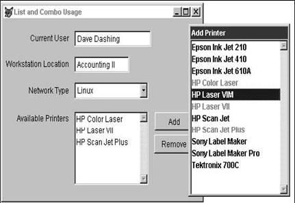
You can use a list box or a combo box to allow the user to select one item from a predetermined list. One common example is a pick list, where a list box displays the choices from which the user can select an item. See Figure 9. 4, where the Add Printer dialog uses a list to display all the printers. Note that the printers that have already been selected have been disabled so they can't be selected again.
Another example is the ubiquitous Open File dialog, where a list box presents a list of folders through which the user can navigate.
A combo box, on the other hand, not only can allow a user to choose from a list of predetermined choices, but also can easily show which choice from that list has been selected.
You can also use a list box to display multiple values that are related to another entity, particularly when the number of values will vary. For example, you might have a form that displays all the information for a family, and you would use a list box to display the names and ages of all of the kids. Normally, you'll need to provide a mechanism for allowing the user to add items to the list, remove items from the list, and edit items that were already in the list. In Figure 9. 4, I've used a pair of buttons, Add and Remove, to provide this functionality. If the user needed to edit an item, double-clicking it would open a dialog that would allow the user to do this.
Note that you can also use a combo box for this purpose. You could populate the combo box with all of the values, and display only one of them. However, you'd only want to do so if screen real estate was extremely limited-and even then, you'd want to provide some sort of visual clue that there was more than one item in the combo box.
Populating a list or combo box
The very first thing you need to do when using a list box or combo box is to populate it. You can fill a list box in one of 10 ways, and each method is fraught with its own peculiarities. In each case, you set the RowSourceType of the control to a specific option and then set additional properties according to which RowSourceType you selected. In general, the trick is that the data that will populate the control must be visible outside the scope of the control itself. In other words, if you use an array to populate the control, you can't create the array inside a method that belongs to the control because the array won't be visible outside that method. The following sections describe the available methods of populating a list box or combo box.
Programmatically
The first method is to not populate the list box at all. In this case, you would leave the list box empty and then programmatically fill it later. You set the RowSourceType property to 0-None, and then, when needed, use the AddItem method to add items to the list box. Here's the code that populated the list of networks in the combo box in Figure 9. 4:
thisform. combo1. AddItem('Novell')thisform. combo1. AddItem('Windows NT')thisform. combo1. AddItem('Linux')
Precede the value you are adding with a backslash if you want to disable that value. For example, here's the code that populated the Add Printer list box:
thisform. list1. AddItem('Epson Ink Jet 210')thisform. list1. AddItem('Epson Ink Jet 410')thisform. list1. AddItem('Epson Ink Jet 610A')thisform. list1. AddItem('HP Color Laser')thisform. list1. AddItem('HP Laser VIM')thisform. list1. AddItem('HP Laser VII')thisform. list1. AddItem('HP Scan Jet')thisform. list1. AddItem('HP Scan Jet Plus')thisform. list1. AddItem('Sony Label Maker')thisform. list1. AddItem('Sony Label Maker Pro')thisform. list1. AddItem('Tektronix 700C')thisform. list1. DisplayValue = 'HP Laser VIM'
Hard-coded values
The second method is to hard-code values for the list box. While this method is easier than other methods that require setting up arrays, filling cursors, or attaching tables, it obviously has the huge downside of increased maintenance. You set the RowSourceType property to 1-Value, and then type the actual data items in the RowSource property-yes, directly into the Property window. One small trick: Many of us are used to leaving a space between items in a comma-delimited list. Visual FoxPro interprets all of the characters between the commas as part of the item, so a space between a comma and the next item will cause the next item in the list to be indented.
First N field values from a table
The third method is to display fields directly from a table. Note that you can choose to select the first N fields, where N is any number you wish, but multiple fields will appear in the order that they appear in the table. If you create your tables like I do, using a surrogate primary key as the first field, this choice won't be terribly useful. If you want to control the order in which the fields display, or if you want to display fields from multiple tables, use the SQL Statement method, discussed next.
You set the RowSourceType property to 2-Alias, set the RowSource property to the name of the table that will populate the list box, and then set the ColumnCount property to the number of columns to be displayed. It's important to note that as you move through the list box, you are actually moving the record pointer through the table.
SQL Select
The fourth method is to create a custom set of fields via an SQL Select statement. You can choose the order of the columns, the order of the items (via the ORDER BY clause in the SQL statement), and even pull data from more than one table if you like.
Set the RowSourceType property to 3-SQL Statement and type the SQL statement (yes, the whole thing!) into the RowSource property. Note that you have to be careful about the syntax of the SQL Select command. For instance, you have to make sure that variables you reference in WHERE clauses are visible to this control. You can't initialize the variable in a method elsewhere attached to this control. Also, be sure you explicitly send the results of the SQL Select statement to a cursor or a table-if you don't, you might see an unintended Browse window displaying the results of the query.
Don't forget to consider multi-user requirements at this stage. It's easy to send the results of one of these SQL Select statements to a hard-coded name for a table, and then run into problems with multiple users. Consider using SYS(3) or another mechanism to create unique file names or use a cursor. You'll need to prepend a character to a table name created by SYS(3).
Because the SQL statement is a character string, you'll need to surround it in quotes if you want to create or modify it programmatically:
thisform. list1. RowSource = 'select Name, City from FRIENDS into table 'Z' + sys(3)'
You'll want to make sure you close the cursor or table manually in the Destroy method of the control.
Query
The fifth method is to populate the list box with the results of a query file (MYQUERY. QPR) designed and saved in the Query Designer. This will produce similar results to the previous method except that you don't have to type the entire statement in the RowSource property.
Set the RowSourceType property to 4-Query and then enter the name of the query file into the RowSource property. Visual FoxPro will assume an extension of . QPR if you don't include one.
Array
The sixth method is to populate the list box with the contents of an array. This is powerful because you can use a two-dimensional array to create a multicolumn list box, and it's extremely fast because you're working only with memory. Note that if you create an array by selecting items from data tables, you can potentially create very large arrays that might exceed the available resources on the computer.
There are two other issues you might want to consider. First of all, you might encounter performance degradation as the size of the array increases significantly. A rule of thumb is to keep the number of elements in an array under 500, but the number will depend specifically on the performance of the machine and resources available. The second issue is that a list or combo with hundreds or thousands of items might be difficult for a user to navigate. If you've got several thousand items from which the user can select, it's possible that the user might have a difficult time distinguishing between similar items. You can circumvent this by including enough information to make each item unique, or by including multiple columns in the list.
You can use an array created elsewhere in your application or address a custom array property of the form or formset. You have to be sure that the array is scoped properly in relation to the control. In other words, trying to declare an array in a method that's on the same level as the List Box control will cause the array to disappear when leaving the method. Note that you can still populate and repopulate the array from within any method as long as the array has been declared and initialized properly. The following code, run outside of a form, will declare and initialize an array that can then be populated via an SQL statement inside the form:
declare aSomething[1]aSomething = ''
The optimal method is to create an array property of the list box or combo box itself, and I'll show you how to do that in Chapter 10.
In both cases, you can display multiple columns in the list box from the array by setting the list box's ColumnCount property to the desired number of columns. Note that you might have to set the Column Width property of the list box in order to make its columns appear as you need, because, unlike fields, Visual FoxPro has no way of telling how wide the contents will be.
All in all, however, arrays are very powerful. You'll see in Chapter 10 that they are my row source of choice.
Delimited field list values from a table
The seventh method is to populate the list box with a comma-delimited list of fields. This provides the same functionality as RowSourceType = 2-Table with the additional benefit of being able to specify which fields and in which order. RowSourceType = 2-Table only allowed the first "N" fields. You are, however, still limited to fields from one table. Be sure to specify the alias in the expression for only the first field-not every field-like so: customer. company, city, state, postalcode, as opposed to customer. company, customer. city, customer. state, customer. postalcode.
File list
The eighth method is to populate the list box with the names of files. The list box is by default populated with all files in the current directory, but you can specify a file skeleton to show only certain file names. You can also change the drive and directory. Set the RowSourceType to 7Files and the RowSource to the file-name skeleton (for example, *. txt).
Field list
The ninth method is to populate the list box with the names of fields from a table. Set the RowSourceType property to 9-Structure and specify the name of the table in the RowSource property.
Pop-up menu
The tenth method is to populate the list box with the contents of a previously defined pop-up menu. This option is included for backward compatibility where you would be transporting existing code into the Visual FoxPro environment and have pop-up menus already defined. This choice displays actual field names, not user-friendly captions, so it's probably not going to be suitable for your users.
List Box functionality
The List Box control has a wide range of features that make it the control of choice in many situations. A list box by nature has incremental search capability-when the control has focus, typing the first few characters will move the focus highlight down the list to the choice that most nearly matches the typed characters. You can't tab over to other columns in the list and do incremental search on those columns. They are there just for additional description-for example, a customer name and account number, a person's last name and first name, or a company name and the name of the city. If you like, you can turn off this incremental search functionality. Set the IncrementalSearch property to . T. or . F. as desired.
A nice feature of Visual FoxPro's List Box control, as opposed to earlier versions, is that it can include multiple columns, use a proportional font for the display, and still have the items appear in neat columns. In earlier versions, we were required to use an ugly nonproportional font in order to make additional columns line up. You'll need to set the ColumnWidths property in order to show the right amount of data in each column.
Additionally, you can include mover bars in a list box so that the user can rearrange the order of the items in the list (set the MoverBars property to . T. ), and allow the user to make multiple selections in the list (set the MultiSelect property to . T. ). One frustrating aspect of mover bars, unfortunately, is that they are available only when the RowSourceType is 0 or 1.
Combo box functionality
The combo box has an additional property that allows you to add a value that the user types into the items in the list. The DisplayValue property returns the value of the item the user has typed. Use it in combination with the AddItem method to add the value to the list. You'll probably want to institute a check to make sure you're not adding duplicate items. The following code in the Valid event will perform both of these functions:
if not This. Value == This. DisplayValue
This. AddItem(This. DisplayValue)endif
Defining and returning values from a list box
You can determine which item has the highlight by the DisplayValue property. For example, in Figure 9. 4, the Laser VIM printer was highlighted by using the following line of code (note that the value "HP Laser VIM" had already been added to the list):
thisform. list1. DisplayValue = 'HP Laser VIM'
You can determine which item in a list box is currently selected with the Value property. For example, the command:
thisform. txtCurListItem. Value = thisform. lstDest. Value
will place a copy of the current list box selection (lstDest. value) into the text box named txtCurListItem.
If you've set the MultiSelect property to . T. , you'll need to process those selected. The basic strategy is to loop through the items in the list and determine whether or not a specific item has been selected by interrogating the Selected property. Once you've made that determination, you can use the List property to identify the value of the selected item (the Value property will identify only the last selected item in the list) and do with it what you will.
One mechanism that takes advantage of the MultiSelect property is a "mover" control, in which you display two lists of objects and allow the user to move more than one object to the other list at one time.
Spinner control
A Spinner control consists of a text box and two arrows. It is used to allow the user to enter a value or increment the value visually by clicking the arrows. Clicking the arrows will force the displayed value to "spin" through values like the numbers on a gas pump display.
You can bind the control to a field in a table by using the ControlSource property, just as with other controls.
The Spinner control has several special properties, including the ability to set the value of the increment as well as the maximum and minimum values allowed by spinner and keyboard entry. In other words, you can force the value to increment by 5 or -5 when one of the arrows is clicked, and to stop incrementing when a value such as 100 or 2048 is reached.
You can use a spinner to increment non-numeric values, including dates and character fields. First, narrow the width of the spinner so that only the up and down arrows appear. Next, create a text box, named txtDate, and initialize the value as today's date with the following code in the Init event:
this. Value = date()
Finally, update the value in the txtDate text box when the up and down arrows are clicked by including the following code in the UpClick and DownClick events, respectively:
UpClick: thisform. txtDate. Value = thisform. txtDate. Value + 1DownClick: thisform. txtDate. Value = thisform. txtDate. Value - 1
It's just slightly more involved to make a character string increase or decrease incrementally with a spinner. The trick is based on how you want to define the increment of a character. Suppose you want to just roll through the alphabet, A to B to C, and stop at the letter Z. Following the same process as with the date spinner above, create a spinner where only the arrows show and a text box, txtAlpha, that is initialized to the letter "A". The following algorithm will return the next character in the alphabet:
char(asc( txtAlpha )+1)
You can place a version of this algorithm in the UpClick and DownClick events of the spinner. Note that you might want to do some bounds checking so you don't end up trying to increment past the range of ASCII characters.
* UpClick()
if thisform. txtAlpha. Value = 'Z'
m. nX = messagebox(You can't increment past 'Z'', 32, 'Help me')else
thisform. txtAlpha. Value = chr(asc( thisform. txtAlpha. Value )+1)endif
* DownClick()
if thisform. txtAlpha. Value = 'A'
m. nX = messagebox(You can't decrement below 'A'', 32, 'Help me')else
thisform. txtAlpha. Value = chr(asc( thisform. txtAlpha. Value )-1)endif
A common mistake with spinners is accidentally setting the increment value to 0. The spinner will appear to be broken when the problem is that the value is incremented by zero each time it is clicked.
There is a caveat to using increment values other than 1 or maximum and minimum values. If the increment value doesn't divide equally into the maximum and minimum values, the increment will be ignored when you hit the limit value. For example, suppose you've set an increment of 5 and a maximum value of 23. Clicking the up arrow will change the spinner value to 5, 10, 15, 20, and then, finally, 23, which might not be what you want.
Grid control
The Grid control is a spreadsheet-like control that can be used to present tabular data. The grid, like the command button group, option group and page frame, is a container control. Like the option group, a grid by itself contains no data. Instead, it holds one or more columns, each of which is also a container. A column holds a header (the title for the column) and one or more controls. This control defaults to a text box, but you can replace the text box with a different type of control, such as a spinner or an edit box, or you can even place multiple controls in a column, any one of which is displayed at a given time.
The grid can be viewed as an alternative to a list box, and, indeed, is a much more flexible control. You'll immediately gravitate to the grid in three specific instances. The first is to display the "many" side of a parent-child relationship or a master-detail relation. Examples include all of the invoices for a customer, and all of the line items for a purchase order. The second instance is to take over for a list box when the list can't handle the number of rows, due to memory or other resource constraints. You might also want to use a grid when the values you want to display have so many attributes (columns) that you need the ability of a grid to be able to scroll left and right. (The list box is still the preferred choice when you need to populate the control from an array or when you need to provide multi-select capability-neither of which can be done with a grid except with a lot of work. )
Each component of the grid has a number of properties, and, like other container controls, is addressed through the control hierarchy. For example, the grid and each column all have width properties. They are addressed like so:
form1. grid1. Width = 250form1. grid1. column1. Width = 75form1. grid1. column2. Width = 125
It would take the better part of this book to explore all of the properties and methods of each component of a grid, but it's worth a few moments to mention some of the more useful ones. You can control the position, size, and colors of all components as well as font attributes like FontName, FontSize, FontBold, and so on. You can control the way the entire grid looks by manipulating the DeleteMark, RecordMark, ScrollBars, and GridLines properties, and whether the user can move or resize columns or edit the contents with the Movable, Resizable, and ReadOnly properties. The ColumnCount property determines how many columns appear in the grid.
Besides addressing the property of a single control, you can use the SetAll property to manipulate the same property for multiple objects. For example, instead of typing:
form1. grid1. column1. header1. FontSize = 12form1. grid1. column2. header1. FontSize = 12form1. grid1. column3. header1. FontSize = 12
you could use the single command:
form1. grid1. SetAll('FontSize', 12, 'header')
You can bind data to a grid in one of two ways. You can drag a table from the data environment (use the title bar of the table window in the data environment) to the form and the grid will be created automatically. The downside is that you don't have explicit control over the controls inside the grid, because it is populated with the columns from the table starting with the first field.
The second way is to create an empty grid and manually add columns. First, set the ColumnCount property of the grid to the number of columns you want. Then, set the ControlSource property for each column. If you have a table in the data environment, the drop-down list box in the Properties window for the ControlSource property will be populated with the fields from the table.
If you have a parent-child relation set up in the data environment, dragging fields from the parent table and then creating a grid from the child table will automatically set up a one-to-many relationship in the form. Be sure to set the InitialSelectedAlias of the Data Environment to the parent table.
You are not limited to using a text box as the control in a column. However, adding a different control is a bit tricky. Here's how to do it.
Create a grid on a form.
Select the column to which you want to add the control (let's say it's an edit box and we're adding it to a column that maps to a memo field in the table). Remember that you can use the Object drop-down list box in the Properties window to select the column of interest.
Select the Edit Box control from the Form Controls toolbar by clicking the Edit Box icon. Select the Form Designer again-by clicking the title bar of the window-and then click in the desired column. You'll see the form flash for a second and then return to normal. Look at the Object drop-down list box, and you'll see that a second control, Edit1, has been added to the column container below Text1.
Here's the tricky part. If you simply run the form at this point, you'll see the memo field appear as a regular memo field with the word "memo" in that column, just as it does in a regular Browse window. This isn't exactly what we had in mind. We need to specify that we want to use the edit box as the control for this column.
Go back to the column container and change the CurrentControl property for the column that contains the additional control. You'll see that you can use the drop-down list box immediately above the page frame in the Properties window to choose between the original Text1 control and the new Edit1 control. If you like, you can select the original Text1 control and delete it from the grid.
Run the form. When you move into the column containing the memo field, you'll see that the control changes to an edit box, complete with a scroll bar if necessary. When you move out of the field, the control changes back to a regular text box. If you want to see all memo fields, you can change the Sparse property of the column to . F. Generally, you'll want to keep Sparse set to . T. for better performance.
Other controls
Container
After you've worked with some of the native containers in Visual FoxPro, such as forms, option groups, and page frames, you might be thinking that it would be nice to be able to create your own containers, and fill them with a set of controls that you'd like to use over and over again. This functionality, in essence, is what object-oriented programming is all about- creating your own objects and then reusing them.
The Container control is often used as part of this process of creating your own objects, but it doesn't have a lot of use on its own. For this reason, I'll defer in-depth discussion until Chapter 10.
ActiveX control and ActiveX bound control
These don't fit into one category because, by definition, they could be anything. I'll cover ActiveX controls in depth in Chapter 23.
Custom class
Not all classes in Visual FoxPro are used to create visible controls. The Timer is one example of a control that doesn't ever appear to the user. Another class, the Custom class, is similar to the Container class in that it allows you to create your own class with properties, events and methods, but it's different because it has no visual representation. Thus, it's useful for creating class libraries that handle behavior or functionality that you would have used a procedure file for in the past.
Session class
Another non-visual class, the Session class is new to Visual FoxPro Service Pack 3. It allows you to create a custom, user-defined object that manages its own data session. Before the Session class was available, if you needed to work with tables or views that required a data environment, you had to create a form, add a data environment to the form, and do your work there. But you also had to set the form's Visible property to . F. This by itself wasn't a huge hurdle, but you also had to deal with the fact that a form class had a lot of overhead associated with it-a lot of properties, events, and methods that had to do with its visibility, and, thus, were useful in terms of a non-visual class.
You won't find information on the Session class in the regular Visual Studio MSDN Library help. However, there is a help file in the Microsoft Visual StudioVFP98 directory called VFPSP3. CHM that lists some additional information such as PEMs to get you started.
|
Politica de confidentialitate | Termeni si conditii de utilizare |

Vizualizari: 3184
Importanta: 
Termeni si conditii de utilizare | Contact
© SCRIGROUP 2025 . All rights reserved